 后端开发教程 - Java、Spring Boot 实战 - msg200.com
使用 2 个 shadcn/ui 组件构建可扩展/可折叠数据表
您将在本文中发现什么?
在现代数字时代,我们向用户呈现数据的方式极大地影响着他们的体验。一个响应迅速、设计精良的表格不仅能提供清晰度,还能增强用户参与度。本文将指导您构建一个可扩展并显示更多数据行的数据表,它是快速查看数据的重要组成部分。
当然,Tanstack 表格也不错,但对于大多数简单的用例来说,它有点儿用力过猛。因此,我们使用 shadcn/ui(只有两个组件)。
我们将使用 Next.js 和 Tailwindcss 确保我们的表格看起来时尚并且性能最佳。

Papermark - 您的开源 DocSend 替代品。
在开始之前,请允许我先介绍一下 Papermark。它是一个开源项目,用于安全地共享文档,并内置实时逐页分析功能。
如果你喜欢这个概念,非常感谢你给我一颗星!一如既往,我们非常重视你在评论区的想法和反馈❤️
https://github.com/mfts/papermark

设置项目
现在是时候设置我们的项目环境了。我们将从一个 Next.js 应用开始,然后分层添加我们的响应式表格组件。
准备茶
手边备有一个包管理器是个好主意,比如tea。它可以处理你的开发环境,简化你的(编程)生活!
sh <(curl https://tea.xyz)

# --- OR ---
# using brew
brew install teaxyz/pkgs/tea-cli
tea让您可以专注于代码,因为它会负责安装node、npm以及vercel您可能需要的任何其他软件包。最棒的是,它tea会将所有软件包安装在一个专用目录中(默认值:~/.tea),让您的系统文件保持整洁有序。
使用 TypeScript 和 Tailwindcss 设置 Next.js
我们将使用 create-next-app 生成一个新的 Next.js 项目。我们还将使用 TypeScript 和 Tailwind CSS,因此请确保在出现提示时选择这些选项。
npx create-next-app

# ---
# you'll be asked the following prompts
What is your project named?  my-app
Would you like to add TypeScript with this project?  Y/N
# select `Y` for typescript
Would you like to use ESLint with this project?  Y/N
# select `Y` for ESLint
Would you like to use Tailwind CSS with this project? Y/N
# select `Y` for Tailwind CSS
Would you like to use the `src/ directory` with this project? Y/N
# select `N` for `src/` directory
What import alias would you like configured? `@/*`
# enter `@/*` for import alias
构建可扩展表
设置好环境后,我们现在可以专注于制作响应式、可扩展的表格。
在本节中,我们将利用来自的组件来shadcn/ui创建响应式和可扩展的表格。shadcn/ui为我们提供模块化和高度可定制的组件,使开发用户友好的界面变得更加容易。
1. 表格结构和样式
使用Table来自的组件shadcn/ui,我们将设计一个既响应迅速又具有视觉吸引力的表格。
前往ui.shadcn.com并获取<Table />组件。
# run this command in your Next.js project
npx shadcn-ui@latest add table
// components/links-table.tsx
import {
  Table, TableBody, TableCell, TableHead, TableHeader, TableRow,
} from "@/components/ui/table";

export default function LinksTable() {
  const links = [...] // these are link objects, we'll get there later

  return (
    <div className="w-full sm:p-4">
      <h2 className="p-4">All links</h2>
      <div className="rounded-md sm:border">
        <Table>
          <TableHeader>
            <TableRow>
              <TableHead className="font-medium">Name</TableHead>
              <TableHead className="font-medium">Link</TableHead>
              <TableHead className="font-medium">Views</TableHead>
            </TableRow>
          </TableHeader>
          <TableBody>
            {links ? (
              links.map((link) => (
                <TableRow key={link.id}>
                  <TableCell>{link.name}</TableCell>
                  <TableCell>{link.id}</TableCell>
                  <TableCell>{link.viewCount}</TableCell>
                </TableRow>
              ))
            ) : null}
          </TableBody>
        </Table>
      </div>
    </div>
  );
}
2. 桌面互动性
表格可扩展性的逻辑至关重要,我们需要确保数据过渡的平滑性和访问的便捷性。
为此,我们使用第二个shadcn/ui组件:<Collapsible />。
前往ui.shadcn.com并获取Collapsible组件。
# run this command in your Next.js project
npx shadcn-ui@latest add collapsible
我们正在创建一个新组件,其中将包含每个链接的访问者扩展数据
// components/links-visitors.tsx
import { TableCell, TableRow } from "@/components/ui/table";
import { Gauge } from "@/components/ui/gauge";

export default function LinksVisitors({linkId}: {linkId: string) {
  const visitors = [...] // these are the visitor objects based on the linkId

  return (
    <>
      {visitors ? (
        visitors.map((visitor) => (
          <TableRow key={visitor.id}>
            <TableCell>{visitor.name}</TableCell>
            <TableCell>{visitor.totalDuration}</TableCell>
            <TableCell>
              <Gauge value={view.completionRate} />
            </TableCell>
          </TableRow>
        ))
      ) : null}
    </>
  );
}
小旅行✨
现在,您可能会问自己,这个<Gauge />组件是什么?
这是一个漂亮的 Vercel UI 组件,用于指示从 0 到 100 的状态。我使用 Tailwindcss 重新创建了它并将其开源 🎉
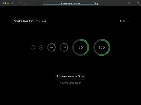
更多详细信息和源代码请参阅此推文:https://twitter.com/mfts0/status/1691110169319559169
好的,回到我们的扩展表。让我们将<Collapsible />组件添加到我们的第一个组件中,links-table
// components/links-table.tsx
import {
  Table, TableBody, TableCell, TableHead, TableHeader, TableRow,
} from "@/components/ui/table";

import {
  Collapsible, CollapsibleContent, CollapsibleTrigger,
} from "@/components/ui/collapsible";

import LinksVisitors from "@/components/links-visitors.tsx"

export default function LinksTable() {
  const links = [...] // these are link objects, we'll get there later

  return (
    <div className="w-full sm:p-4">
      <h2 className="p-4">All links</h2>
      <div className="rounded-md sm:border">
        <Table>
          <TableHeader>
            <TableRow>
              <TableHead className="font-medium">Name</TableHead>
              <TableHead className="font-medium">Link</TableHead>
              <TableHead className="font-medium">Views</TableHead>
            </TableRow>
          </TableHeader>
          <TableBody>
            {links ? (
              links.map((link) => (
                <Collapsible key={link.id} asChild>
                  <>
                    <TableRow>
                      <TableCell>{link.name}</TableCell>
                      <TableCell>{link.id}</TableCell>
                      <TableCell>{link.viewCount}
                        <CollapsibleTrigger asChild>
                          <div>{link.viewCount}</div>
                        </CollapsibleTrigger>
                      </TableCell>
                    </TableRow>
                    <CollapsibleContent asChild>
                      <LinksVisitors linkId={link.id} />
                    </CollapsibleContent>
                  </>
                </Collapsible>
              ))
            ) : null}
          </TableBody>
        </Table>
      </div>
    </div>
  );
}
值得注意的是,我们必须将其包装TableRow在片段()中,并在组件上<></>使用该属性,以使一切正常运行。asChild<Collapsible />
现在您已经拥有了一张设计完美、响应迅速、可扩展(或可折叠)的表格,可以提升您的数据呈现效果!
折叠表格视图

扩展表格视图

结论
您已成功使用 Next.js 和 Tailwindcss 构建了一个响应式、可扩展/折叠的表格,用于快速查看数据。本文提供了基础指南,但您可以进一步增强该表格的功能,例如添加排序功能、筛选器等!
感谢您与我同行。我是 Marc,开源软件的倡导者。我正满怀热情地致力于papermark.com 的开发——DocSend 的开源替代方案。
帮帮我!
如果您觉得本指南对您有所启发,并且对构建简单数据表有了更清晰的认识,请给我们一个 Star!您在评论中的反馈将推动我们不断前进 ❤️
https://github.com/mfts/papermark
