 后端开发教程 - Java、Spring Boot 实战 - msg200.com
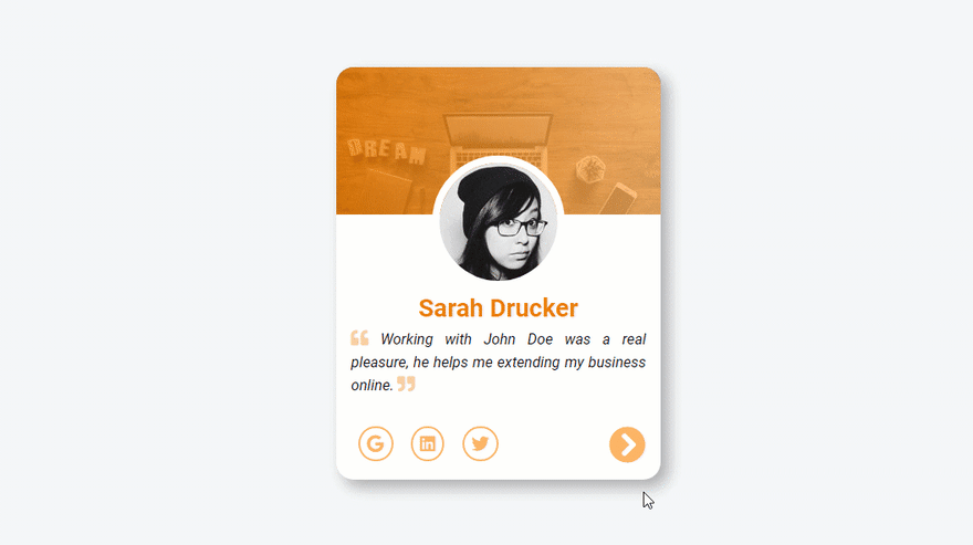
使用 HTML、CSS 和 JavaScript 制作动画推荐卡。
最初发布在我的博客上
在这篇文章中,我们将通过使用 HTML、CSS 和 JavaScript 构建动画推荐卡来体验 CSS 动画和 DOM 操作。
您可以在这里实时查看
HTML
我们首先将元素包装在main标签中。
<main>
  <!--This is the current testimonial-->
  <div class="testimonial-container testimonial-active">
    <div class="testimonial-header"></div>
    <div class="testimonial-body">
      <img alt="Avatar" src="" class="testimonial-avatar" />
      <h1></h1>
      <p></p>
    </div>
    <div class="testimonial-footer">
      <div>
        <span><i class="fab fa-google"></i></span>
        <span><i class="fab fa-linkedin"></i></span>
        <span><i class="fab fa-twitter"></i></span>
      </div>
      <div>
        <button id="next">
          <i class="fa fa-3x fa-chevron-circle-right"></i>
        </button>
      </div>
    </div>
  </div>
我们将使用两个主要组件div,第一个组件将用于实际的推荐卡,而下面代码块中的第二个组件将帮助我们显示下一张推荐卡。
请注意,HTML 内容将通过 javaScript 添加。
      <!--This is the next testimonial-->
      <div class="testimonial-ghost-container">
        <div class="testimonial-ghost-header"></div>
        <div class="testimonial-ghost-body">
          <img alt="Avatar" src="" />
          <h1></h1>
          <p></p>
        </div>
        <div class="testimonial-ghost-footer">
          <div>
            <span><i class="fab fa-google"></i></span>
            <span><i class="fab fa-linkedin"></i></span>
            <span><i class="fab fa-twitter"></i></span>
          </div>
          <div>
            <button id="ghost-next">
              <i class="fa fa-3x fa-chevron-circle-right"></i>
            </button>
          </div>
        </div>
      </div>
    </main>
正如我之前所说,这个按钮div一开始会被隐藏。但当我们切换到下一个客户评价时,它会同时显示两张客户评价卡片。
CSS
像往常一样,我们通过一些重置来开始 CSS 部分。
@import url("https://fonts.googleapis.com/css?family=Roboto:400,400i,700&display=swap");

* {
  margin: 0;
  padding: 0;
  box-sizing: border-box;
}

body {
  background: #f5f6f7;
  line-height: 1.6;
  font-family: "Roboto", sans-serif;
}

main {
  display: flex;
  justify-content: center;
  align-items: center;
  height: 100vh;
  width: 100%;
  max-width: 100%;
  position: relative;
}
然后,更改字体,将背景颜色设置body为浅灰色。接下来,main标签占用完整的宽度和高度,我们用它display: flex来将推荐卡放置在视口的中心。
.testimonial-container,
.testimonial-ghost-container {
  width: 22rem;
  height: 28rem;
  background: #fff;
  border-radius: 1.2rem;
  overflow: hidden;
  position: absolute;
}
.testimonial-active {
  z-index: 1;
  box-shadow: 0.5rem 0.5rem 1rem rgba(51, 51, 51, 0.2), 0.5rem 0.5rem 1rem rgba(51, 51, 51, 0.2);
}

.testimonial-header,
.testimonial-ghost-header {
  height: 10rem;
  background-image: linear-gradient(
      to right,
      rgba(239, 124, 0, 0.8),
      rgba(255, 181, 102, 0.8)
    ), url("https://shorturl.at/grwP6");
  background-size: cover;
  background-position: cover;
}
我们继续为两个卡片元素添加样式。在.testimonial-container和.testimonial-ghost-container类中,我们使用position: absolute;来将这两个元素按照标签位置依次排列main。然后,.testimonial-active类将帮助我们将活动的推荐卡片置于最前面。
接下来的两个类用于设置卡片标题的样式。它将使用一张双倍渐变色的图片作为背景。
.testimonial-avatar,
.testimonial-ghost-body img {
  border-radius: 100%;
  display: block;
  margin: auto;
  margin-top: -4rem;
  border: 0.5rem solid #fff;
  z-index: 100;
}

.testimonial-body,
.testimonial-ghost-body {
  padding: 0 1rem;
  text-align: center;
  margin-bottom: 1rem;
}
这部分设置了卡片头像的样式。我们使用负值属性-4rem将margin-top头像置于卡片头部的中间,并z-index确保元素始终位于头部的顶部。
.testimonial-ghost-header {
  background-image: linear-gradient(
      to right,
      rgba(119, 119, 119, 0.8),
      rgba(119, 119, 119, 0.8)
    ), url("https://shorturl.at/grwP6");
}

.testimonial-ghost-body img {
  filter: blur(2px);
}

.testimonial-ghost-body h1,
.testimonial-ghost-body p i,
.testimonial-ghost-footer button i,
.testimonial-ghost-footer span i {
  color: #777;
}

.testimonial-footer,
.testimonial-ghost-footer {
  display: flex;
  justify-content: space-between;
  padding: 1rem;
}
当发生更改时,之前的推荐卡样式会发生变化。头像会变得模糊filter: blur(2px);。卡片标题和元素颜色会变为深色,以保持美观。
.testimonial-active-animated {
  animation: moveRight 1.5s ease-in-out;
}

.testimonial-inactive-animated {
  animation: moveLeft 1.5s ease-in-out;
}

@keyframes moveRight {
  0% {
    transform: translateX(0);
    box-shadow: none;
  }
  50% {
    transform: translateX(-10rem);
    box-shadow: none;
  }
  100% {
    transform: translateX(0);
  }
}

@keyframes moveLeft {
  0% {
    transform: translateX(0);
    opacity: 1;
    z-index: 2;
  }
  50% {
    transform: translateX(18rem) scale(0.96);
    opacity: 0.7;
  }
  100% {
    transform: translateX(0) scale(0.98);
    opacity: 0.2;
  }
}
切换到下一个推荐时,此代码块至关重要。我们有两个动画:第一个动画使用属性moveRight将元素从左向右移动,transform并且box-shadow将被隐藏,以获得更自然的效果。
第二个动画使用 属性moveLeft从左向右移动并稍微缩小transform: translateX(18rem) scale(0.96)。它还具有淡入效果opacity。z-index动画开始时, 属性会将元素置于顶部。
和.testimonial-active-animated将.testimonial-active-animated附加到相应的推荐卡片上。
JavaScript
正如您在此处看到的,我们首先选择两个推荐容器。
const testimonialContainer = document.querySelector(".testimonial-container");
const testimonialGhost = document.querySelector(".testimonial-ghost-container");
const nextBtn = document.querySelector("#next");
const testimonials = [
  {
    name: "Sarah Drucker",
    text:
      "Working with John Doe was a real pleasure, he helps me extending my business online.",
    avatar: "https://shorturl.at/eqyGW"
  },
  {
    name: "Nicolas Jaylen",
    text:
      "My business was broken, then i start working with John Doe, and now everything works fine.",
    avatar: "https://shorturl.at/ptC58"
  },
  {
    name: "Awa Fall",
    text:
      "John Doe helps me a lot from designing my website to make it live in just 5 weeks.",
    avatar: "https://shorturl.at/lwBY1"
  }
];
let counter = 0;
然后,我们有一个用于监听点击事件的按钮和一个将根据变量动态显示的推荐数组counter。
const handleFirstTestimonial = () => {
  // Author avatar selection
  testimonialContainer.children[1].children[0].src = testimonials[0].avatar;
  // Testimonial Author selection
  testimonialContainer.children[1].children[1].innerHTML = testimonials[0].name;
  // Testimonial text selection
  testimonialContainer.children[1].children[2].innerHTML = `
  <i class="fas fa-quote-left"></i>
  ${testimonials[0].text}
  <i class="fas fa-quote-right"></i>
  `;
};
该handleFirstTestimonial()函数帮助我们显示数组中的第一条推荐。在这里,我们遍历 DOMtestimonialContainer元素来选择子元素。我们在数组中设置了头像、推荐的作者以及第一条推荐的文本testimonials。
const activeTestimonial = () => {
  testimonialContainer.classList.add("testimonial-active-animated");
  // Author avatar selection
  testimonialContainer.children[1].children[0].src =
    testimonials[counter].avatar;
  // Testimonial Author selection
  testimonialContainer.children[1].children[1].innerHTML =
    testimonials[counter].name;
  // Testimonial text selection
  testimonialContainer.children[1].children[2].innerHTML = `<i class="fas fa-quote-left"></i>
  ${testimonials[counter].text}
  <i class="fas fa-quote-right"></i>`;

  setTimeout(() => {
    // Remove the active animated class
    testimonialContainer.classList.remove("testimonial-active-animated");
  }, 1400);
};
然后,当用户切换到下一个推荐时,我们调用activeTestimonial()函数来处理它。然后,使用testimonialContainer遍历 DOM 并为卡片元素设置适当的数据。使用 来触发动画testimonialContainer.classList.add("testimonial-active-animated");,最后,在 1.4 秒后移除动画,以便能够再次播放动画。
const inactiveTestimonial = () => {
  testimonialGhost.classList.add("testimonial-inactive-animated");
  let newCounter = counter;
  if (newCounter === 0) {
    newCounter = testimonials.length;
  }
  // image selection
  testimonialGhost.children[1].children[0].src =
    testimonials[newCounter - 1].avatar;
  // title selection
  testimonialGhost.children[1].children[1].innerHTML =
    testimonials[newCounter - 1].name;
  // text selection
  testimonialGhost.children[1].children[2].innerHTML = `<i class="fas fa-quote-left"></i>
  ${testimonials[newCounter - 1].text}
  <i class="fas fa-quote-right"></i>`;
  setTimeout(() => {
    // Remove the active animated class
    testimonialGhost.classList.remove("testimonial-inactive-animated");
  }, 1400);
};
与 类似activeTestimonial(),该inactiveTestimonial函数将处理非活动推荐卡。我们使用 遍历 DOMtestimonialGhost来选择元素,并将数据设置为上一张推荐卡。
在这里,我们使用newCounter来处理testimonials数组。如果counter等于0,我们newCounter将数组中的最后一张推荐卡重新赋值给 。
nextBtn.addEventListener("click", () => {
  if (counter === testimonials.length - 1) {
    counter = 0;
    inactiveTestimonial();
    activeTestimonial();
  } else {
    counter++;
    inactiveTestimonial();
    activeTestimonial();
  }
});

handleFirstTestimonial();
为了实现所有神奇的功能,我们需要监听点击事件。并检查计数器是否等于数组的最后一个元素。如果是,则重新初始化counter并0调用所需的函数。否则,递增counter变量并调用inactiveTestimonial()和activeTestimonial()。
然后,在页面加载时,我们调用 函数来启动所有操作handleFirstTestimonial()。
就这些了
您可以在这里实时查看