 后端开发教程 - Java、Spring Boot 实战 - msg200.com
如何使用 React 和 Tailwind 创建侧边导航栏
让我们开始编码
概述
在我们的平台上实现侧边栏有多种方法,但每种方法的设计很大程度上取决于我们的页面布局以及侧边栏的用途。
显然,侧边栏只有一个用途,那就是在我们的应用中为用户提供导航。但是我们需要考虑一些原则,例如:
- 使用侧边栏来显示五个或更多目的地;
- 元素及其组必须是可识别的;
- 元素必须按正确顺序排列,最受欢迎或最重要的路线必须放在最前面。
这些是我考虑的一些因素,但无论如何我建议阅读这个Material Design 页面。
今天的例子
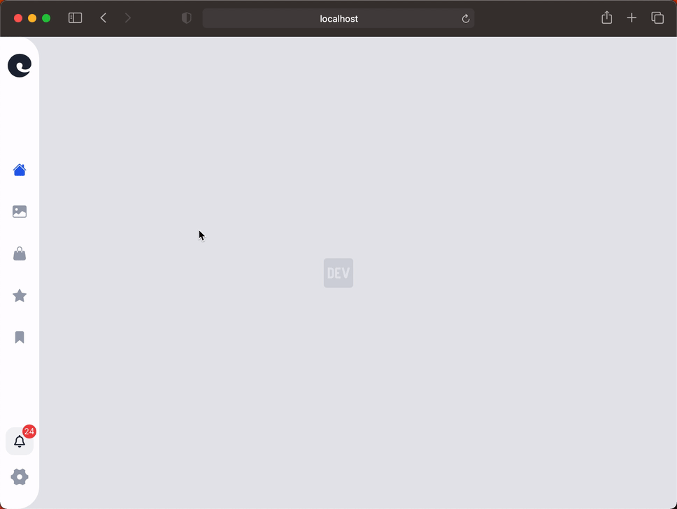
今天我们将创建一个单独的组件,它只是侧边栏,这个组件的宽度很小,以免占用屏幕上的太多空间,但它必须直观且非常简洁。
为了让我们了解我所说的内容,在本文结束时我希望您能得到这样的最终结果:
让我们开始编码
我们今天要使用的框架是 Tailwind CSS,除了这个框架之外,我们还将使用其他工具,例如 classnames 和 react-icons。
npm install classnames react-icons
之后,我们将创建一个文件,其中包含我们将要拥有的导航元素的名称。
// @src/data/navigation.js
export default ["Home", "Gallery", "Store", "Favorites", "Saved"];
现在我们可以开始处理侧边栏,更具体地说是设计它的样式,使用的样式如下:
/* @src/components/Sidebar.module.css */

.wrapper {
    @apply fixed left-0 top-0 bottom-0 z-50 w-14 bg-white flex flex-col h-screen justify-between items-center py-6 rounded-tr-4xl rounded-br-4xl;
}

.logo {
    @apply text-4xl text-gray-800;
}

.navListItems {
    @apply flex flex-col items-center w-full;
}

.navItem {
    @apply text-gray-400 hover:text-gray-800 text-xl py-4 cursor-pointer;
}

.navItemActive {
    @apply text-blue-600 hover:text-blue-700;
}

.tooltip {
    @apply absolute w-auto min-w-max left-16 text-base font-medium hidden;
}

.bottomWrapper {
    @apply flex flex-col justify-between items-center;
}

.notifications {
    @apply w-10 h-10 bg-gray-100 hover:bg-gray-200 cursor-pointer rounded-xl flex items-center justify-center text-gray-800 text-lg relative mb-4;
}

.badge {
    @apply h-5 w-5 flex justify-center items-center text-white absolute -top-1 -right-1 bg-red-500 text-xs rounded-full;
}

.settingsLogo {
    @apply text-3xl text-gray-400 hover:text-gray-800 cursor-pointer;
}
我们的组件将只接收一个 prop,即之前定义的导航数据(路由)。之后,我们将使用 useState 钩子来定义所选的路由(初始路由为 Home)。接下来,我们必须创建一个包含 switch 语句的函数,该函数将根据数组元素返回指定的图标。
// @src/components/Sidebar.jsx
import React, { useState, useCallback } from "react";
import { IoLogoEdge, IoBookmark } from "react-icons/io5";
import {
  BsImageFill,
  BsFillHandbagFill,
  BsFillStarFill,
  BsHouseFill,
} from "react-icons/bs";
import { RiSettings4Fill } from "react-icons/ri";
import { FaRegBell } from "react-icons/fa";
import classNames from "classnames";

import styles from "./Sidebar.module.css";

const Sidebar = ({ navigationData }) => {
  const [currentRoute, setCurrentRoute] = useState("Home");

  const renderIcon = useCallback((element) => {
    switch (element) {
      case "Home":
        return <BsHouseFill />;
      case "Gallery":
        return <BsImageFill />;
      case "Store":
        return <BsFillHandbagFill />;
      case "Favorites":
        return <BsFillStarFill />;
      case "Saved":
        return <IoBookmark />;
    }
  }, []);

  return (
    <nav className={styles.wrapper}>
      <span className={styles.logo}>
        <IoLogoEdge />
      </span>
      <ul className={styles.navListItems}>
        {navigationData.map((element, index) => (
          <li
            key={index}
            className={classNames([
              styles.navItem,
              currentRoute === element && styles.navItemActive,
              "group",
            ])}
            onClick={() => setCurrentRoute(element)}
          >
            {renderIcon(element)}
            <span
              className={classNames([styles.tooltip, "group-hover:inline"])}
            >
              {element}
            </span>
          </li>
        ))}
      </ul>
      <div className={styles.bottomWrapper}>
        <div className={styles.notifications}>
          <span className={styles.badge}>24</span>
          <FaRegBell />
        </div>
        <span className={styles.settingsLogo}>
          <RiSettings4Fill />
        </span>
      </div>
    </nav>
  );
};

export default Sidebar;
最后但并非最不重要的一点是,我们必须转到我们的入口文件(在本例中为 App.jsx),我们将拥有以下样式:
/* @src/App.module.css */

.container {
  @apply bg-gray-200;
}

.devLogo {
  @apply flex items-center justify-center text-5xl text-gray-300 h-screen;
}
现在在我们的 App.jsx 中,我们将导入我们的导航数据和我们创建的 Sidebar 组件,然后我们将传递指示的 props。
// @src/App.jsx
import React from "react";
import { FaDev } from "react-icons/fa";

import styles from "./App.module.css";
import Sidebar from "./components/Sidebar";
import navigationData from "./data/navigation";

const App = () => {
  return (
    <div className={styles.container}>
      <Sidebar navigationData={navigationData} />
      <div className={styles.devLogo}>
        <FaDev />
      </div>
    </div>
  );
};

export default App;
结论
一如既往,希望你觉得这篇文章有趣。如果你发现本文有任何错误,请在评论区指出。🧑🏻💻
祝你度过美好的一天!🙌
文章来源:https://dev.to/franciscomendes10866/how-to-create-a-sidebar-in-react-3dh6