 后端开发教程 - Java、Spring Boot 实战 - msg200.com
使用 HTML 创建可重用的 Web 组件
有没有想过用 HTML 创建一个带有简单页眉和页脚的网页?很简单,对吧?
但是如果您的应用程序扩大了,您需要为页眉和页脚重复相同的代码 5 次、10 次或 15 次,该怎么办?

记住软件开发的 DRY(不要重复自己)原则。

随着 Web 组件的引入,解决这个问题并创建可重用的 HTML 组件变得容易。
在本文中,我们将深入了解 Web 组件,这是创建自定义 HTML 元素的最简单方法。
什么是 Web 组件?
它是一套不同的技术,允许您创建可重复使用的自定义元素(其功能与您的其余代码分开封装)并在您的 Web 应用程序中使用它们。
它由三项主要技术组成:
-
HTML 模板:使用“template”和“slot”
元素,您可以编写不会在渲染页面上显示的标记模板。这些模板可以作为自定义元素结构的基础,多次重复使用。 -
自定义元素:一组 JavaScript API,允许您定义自定义元素及其行为,然后可以根据需要在用户界面中使用。
-
Shadow DOM:一组 JavaScript API,用于将封装的“影子”DOM 树附加到元素(与主文档 DOM 分开呈现)并控制相关功能。
在本文中,我们将讨论Shadow DOM 的实现。
影子 DOM是指浏览器将 DOM 元素的子树纳入文档的渲染中,但不会纳入主文档 DOM 树的能力。
它允许将隐藏的 DOM 树附加到常规 DOM 树中的元素——这个影子 DOM 树以影子根开始,在其下方可以附加到任何您想要的元素,方式与普通 DOM 相同。

以下是一些与影子 DOM 相关的术语:
- 影子宿主:影子 DOM 所附加到的常规 DOM 节点。
- 影子树:影子 DOM 内部的 DOM 树。
- 阴影边界:阴影 DOM 结束和常规 DOM 开始的地方。
- 影子根:影子树的根节点。
让我们通过一个简单的例子来理解这一点:
步骤 1:创建类定义
首先,在我们的 header.js 文件中,我们定义一个名为 Header 的类,它扩展了 HTMLElement:
class Header extends HTMLElement {
  constructor() {
    // Always call super first in constructor
    super();

    // write element functionality in here
    ...
  }
}
在类定义中,我们定义元素的构造函数,它定义了元素实例化时将具有的所有功能。
第 2 步:创建 Shadow Root
我们首先将影子根附加到自定义元素:
// Create a shadow root
const shadowRoot = this.attachShadow({ mode: 'open' });
“模式”有两个选项:“打开”*和“关闭”。
mode: open表示您可以使用在主页面上下文中编写的 JavaScript 访问影子 DOM。
如果将影子根附加到设置了 * mode: closed * 的自定义元素,则将无法从外部访问影子 DOM — myCustomElem.shadowRoot 将返回 null。
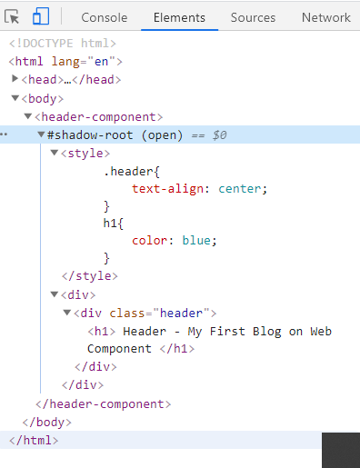
步骤3:创建Shadow DOM结构
接下来,我们使用一些 DOM 操作来创建元素的内部阴影 DOM 结构:
const headerTemplate = document.createElement('template');
headerTemplate.innerHTML = `

<div>
    <div class="header">
        <h1> Header - My First Blog on Web Component </h1>
    </div>
</div>`
步骤 4:将影子 DOM 附加到影子根
最后一步是将所有创建的元素附加到影子根。每次将自定义元素插入 DOM 时,
connectedCallback都会运行。
connectedCallback() {
        const shadowRoot = this.attachShadow({ mode: 'closed' });
        shadowRoot.appendChild(headerTemplate.content);
}
步骤 5:设置影子 DOM 的样式
之后,我们创建一个样式元素,并用一些 CSS 填充它以设置其样式:
const headerTemplate = document.createElement('template');
headerTemplate.innerHTML = `

<style>
    .header{
        text-align: center;
    }
    h1{
        color: blue;
    }
</style>

<div>
    <div class="header">
        <h1> Header - My First Blog on Web Component </h1>
    </div>
</div>
`
在上面的例子中,我们使用样式元素将样式应用于 Shadow DOM,但完全可以通过从“link”元素引用外部样式表来实现。
const headerTemplate = document.createElement('template');
headerTemplate.innerHTML = `
<link rel="stylesheet" href="https://maxcdn.bootstrapcdn.com/bootstrap/4.5.0/css/bootstrap.min.css">
<link href="css/style.css" rel="stylesheet">
```
Your resultant *header.js file* will look like this:
```javascript
const headerTemplate = document.createElement('template');
headerTemplate.innerHTML = `
<style>
.header{
text-align: center;
}
h1{
color: blue;
}
</style>
<div>
<div class="header">
<h1> Header - My First Blog on Web Component </h1>
</div>
</div>
`
class Header extends HTMLElement {
constructor() {
// Always call super first in constructor
super();
}
connectedCallback() {
const shadowRoot = this.attachShadow({ mode: 'open' });
shadowRoot.appendChild(headerTemplate.content);
}
}
customElements.define('header-component', Header);
```
**Step 6: Import your component into HTML file**
Create an *index.html* file and add your custom header component to it.
```html
<!DOCTYPE html>
<html lang="en">
<head>
<meta charset="UTF-8">
<meta name="viewport" content="width=device-width, initial-scale=1.0">
<title>Web Components</title>
<script src="header.js"></script>
</head>
<body>
<header-component></header-component>
</body>
</html>
```
Now run index.html in browser:
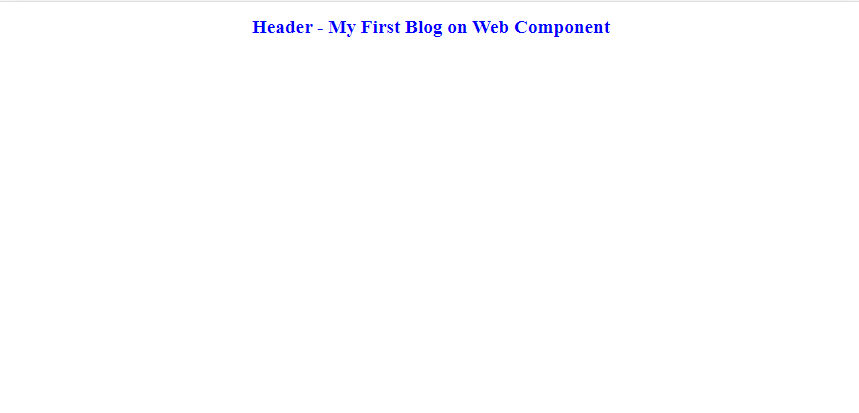
Congrats!! you have created your first custom HTML component.

Thank you for reading. This is the first time that I wrote any blog article. I hope you enjoyed reading it.
Please share it with your network. Don’t forget to leave your comments below.
[](https://www.buymeacoffee.com/anuradha2612)