 后端开发教程 - Java、Spring Boot 实战 - msg200.com
设置 React + Typescript Storybook 设计系统的快速指南
简短版本
DIY版本
您的第一个 Typescript 组件
是时候构建和发布你的(一键式)设计系统了
设计系统如今风靡一时——以下是如何创建您自己的设计系统。
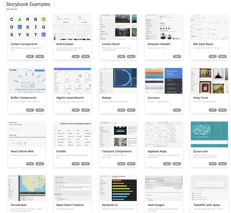
由于 React 秉承即插即用组件的理念,各家公司都争相构建并开源自己的组件库,这些组件库既可以显示在可热重载的 Storybook 上,也可以作为 npm 库导入。看看这些公司!
由于公司也注重可维护性,他们也喜欢用 Typescript 创建设计系统。Typescript 强制的 prop 类型帮助我们自动生成设计系统的文档,所以这是一个双赢的结果!
今天我们将讲解如何构建并发布一个 React + Typescript Storybook 设计系统,以及一些便捷的文档插件。最终效果如下:
简短版本
git clone https://github.com/sw-yx/react-typescript-storybook-starter
yarn
npm run storybook
在此处的 repo中阅读更多内容。
DIY版本
准备好了吗?出发!
假设您位于一个空文件夹中:
yarn init -y
yarn add -D @storybook/react @storybook/addon-info @storybook/addon-knobs storybook-addon-jsx @types/react babel-core typescript awesome-typescript-loader react-docgen-typescript-webpack-plugin jest "@types/jest" ts-jest
yarn add react react-dom
mkdir .storybook src
touch .storybook/config.js .storybook/addons.js .storybook/welcomeStory.js utils.js
我采用了“共置故事”的设置,即组件的故事与组件本身相邻。还有另一种设置,即故事位于完全独立的“故事”文件夹中。我发现,在处理组件及其关联的故事时,这种方式会格外麻烦。因此,我们将为该应用的其余部分设置共置故事。
要获得可运行的故事书,请将此 npm 脚本添加到您的package.json:
{
  "scripts": {
    "storybook": "start-storybook -p 6006 -c .storybook"
  }
}
我们没有什么强有力的理由要在端口 6006 上运行故事书,这只是看起来很常见的事情。
在.storybook/config.js:
import { configure } from '@storybook/react';
import { setAddon, addDecorator } from '@storybook/react';
import JSXAddon from 'storybook-addon-jsx';
import { withKnobs, select } from '@storybook/addon-knobs/react';
addDecorator(withKnobs);
setAddon(JSXAddon);

// automatically import all files ending in *.stories.js
const req = require.context('../src', true, /.stories.js$/);
function loadStories() {
  require('./welcomeStory');
  req.keys().forEach(filename => req(filename));
}

configure(loadStories, module);
在.storybook/addons.js:
import '@storybook/addon-knobs/register';
import 'storybook-addon-jsx/register';
在utils.js:
import { withInfo } from '@storybook/addon-info';
const wInfoStyle = {
  header: {
    h1: {
      marginRight: '20px',
      fontSize: '25px',
      display: 'inline'
    },
    body: {
      paddingTop: 0,
      paddingBottom: 0
    },
    h2: {
      display: 'inline',
      color: '#999'
    }
  },
  infoBody: {
    backgroundColor: '#eee',
    padding: '0px 5px',
    lineHeight: '2'
  }
};
export const wInfo = text =>
  withInfo({ inline: true, source: false, styles: wInfoStyle, text: text });
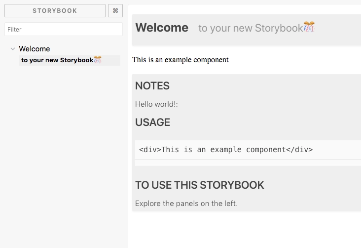
在.storybook/welcomeStory.js:
import React from 'react';

import { storiesOf } from '@storybook/react';
import { wInfo } from '../utils';

storiesOf('Welcome', module).addWithJSX(
  'to your new Storybook🎊',
  wInfo(`


    ### Notes

    Hello world!:

    ### Usage
    ~~~js
    <div>This is an example component</div>
    ~~~

    ### To use this Storybook

    Explore the panels on the left.
  `)(() => <div>This is an example component</div>)
);
让我们看看它如何工作!npm run storybook:
您的第一个 Typescript 组件
是时候制作一个 Typescript 组件了。
mkdir src/Button
touch src/Button/Button.tsx src/Button/Button.css src/Button/Button.stories.js
在src/Button/Button.tsx:
import * as React from 'react';
import './Button.css';
export interface Props {
  /** this dictates what the button will say  */
  label: string;
  /** this dictates what the button will do  */
  onClick: () => void;
  /**
   * Disables onclick
   *
   * @default false
   **/
  disabled?: boolean;
}
const noop = () => {}; // tslint:disable-line
export const Button = (props: Props) => {
  const { label, onClick, disabled = false } = props;
  const disabledclass = disabled ? 'Button_disabled' : '';
  return (
    <div
      className={`Button ${disabledclass}`}
      onClick={!disabled ? onClick : noop}
    >
      <span>{label}</span>
    </div>
  );
};
在src/Button/Button.css:
.Button span {
  margin: auto;
  font-size: 16px;
  font-weight: bold;
  text-align: center;
  color: #fff;
  text-transform: uppercase;
}
.Button {
  padding: 0px 20px;
  height: 49px;
  border-radius: 2px;
  border: 2px solid var(--ui-bkgd, #3d5567);
  display: inline-flex;
  background-color: var(--ui-bkgd, #3d5567);
}

.Button:hover:not(.Button_disabled) {
  cursor: pointer;
}

.Button_disabled {
  --ui-bkgd: rgba(61, 85, 103, 0.3);
}
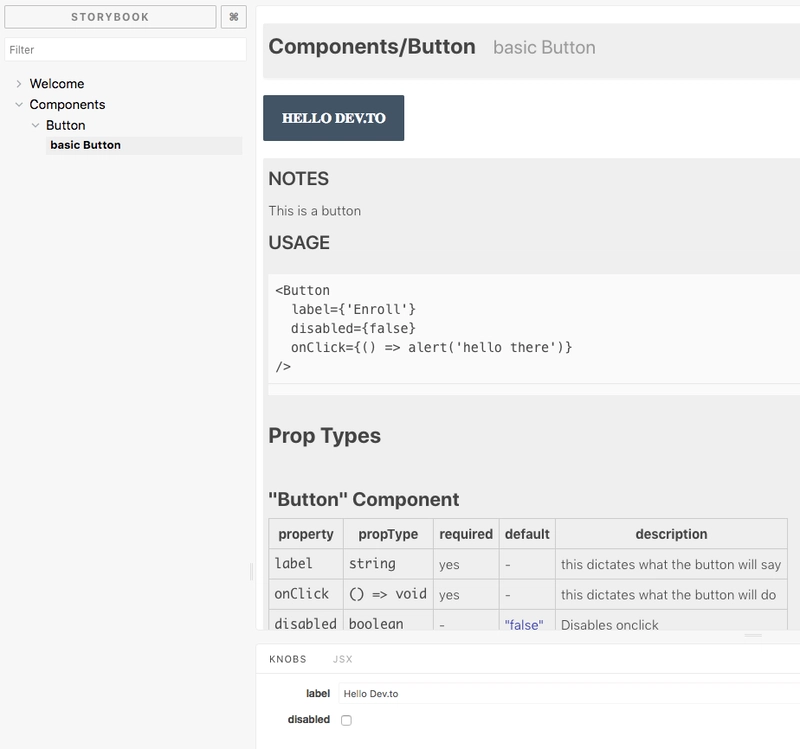
在src/Button/Button.stories.js:
import React from 'react';

import { storiesOf } from '@storybook/react';
import { Button } from './Button';
import { wInfo } from '../../utils';
import { text, boolean } from '@storybook/addon-knobs/react';

storiesOf('Components/Button', module).addWithJSX(
  'basic Button',
  wInfo(`

  ### Notes

  This is a button

  ### Usage
  ~~~js
  <Button
    label={'Enroll'}
    disabled={false}
    onClick={() => alert('hello there')}
  />
  ~~~`
)(() => (
    <Button
      label={text('label', 'Enroll')}
      disabled={boolean('disabled', false)}
      onClick={() => alert('hello there')}
    />
  ))
);
我们还必须让 Storybook 能够使用 TypeScript:
touch .storybook/webpack.config.js tsconfig.json
在webpack.config.js:
const path = require('path');
const TSDocgenPlugin = require('react-docgen-typescript-webpack-plugin');
module.exports = (baseConfig, env, defaultConfig) => {
  defaultConfig.module.rules.push({
    test: /\.(ts|tsx)$/,
    loader: require.resolve('awesome-typescript-loader')
  });
  defaultConfig.plugins.push(new TSDocgenPlugin());
  defaultConfig.resolve.extensions.push('.ts', '.tsx');
  return defaultConfig;
};
注意 - 您可能已经看过旧的说明,const genDefaultConfig = require('@storybook/react/dist/server/config/defaults/webpack.config.js');但该说明现已弃用。我们将改用完全控制模式 + 默认模式。
在tsconfig.json:
{
  "compilerOptions": {
    "outDir": "build/lib",
    "module": "commonjs",
    "target": "es5",
    "lib": ["es5", "es6", "es7", "es2017", "dom"],
    "sourceMap": true,
    "allowJs": false,
    "jsx": "react",
    "moduleResolution": "node",
    "rootDir": "src",
    "baseUrl": "src",
    "forceConsistentCasingInFileNames": true,
    "noImplicitReturns": true,
    "noImplicitThis": true,
    "noImplicitAny": true,
    "strictNullChecks": true,
    "suppressImplicitAnyIndexErrors": true,
    "noUnusedLocals": true,
    "declaration": true,
    "allowSyntheticDefaultImports": true,
    "experimentalDecorators": true
  },
  "include": ["src/**/*"],
  "exclude": ["node_modules", "build", "scripts"]
}
好的,就是这样。npm run storybook再一次!
繁荣!
是时候构建和发布你的(一键式)设计系统了
Typescript 只负责将 Typescript 编译成 JS 的代码,但你还需要上传 CSS 和其他资源。因此,在构建 Storybook 时,你需要进行额外的复制:
yarn add -D cpx
touch src/index.tsx
echo "node_modules" >> .gitignore
git init # version control is good for you
在您的 中package.json添加:
{
  "main": "build/lib/index.js",
  "types": "build/lib/index.d.ts",
  "files": [
    "build/lib"
  ],
  "scripts": {
    "storybook": "start-storybook -p 6006 -c .storybook",
    "build": "npm run build-lib && build-storybook",
    "build-lib": "tsc && npm run copy-css-to-lib",
    "build-storybook": "build-storybook",
    "copy-css-to-lib": "cpx \"./src/**/*.css\" ./build/lib"
  },
}
main请注意,您已经从 init 中获得了,因此请覆盖它。
在src/index.tsx:
export {Button} from './Button/Button'
将所有组件重新导出到一个文件中,以便可以将它们一起导入。这被称为桶状模式
现在,当您运行时npm run build,它只会构建您的设计系统,build而不需要任何故事书内容,并且当您运行时npm run build-storybook,它会构建一个您可以在任何地方托管的静态页面故事书!
我是否遗漏了什么?请告诉我!
鏂囩珷鏉ユ簮锛�https://dev.to/swyx/quick-guide-to-setup-your-react--typescript-storybook-design-system-1c51