 后端开发教程 - Java、Spring Boot 实战 - msg200.com
一个面向初学者的带有 Styled-components 的 React 网站 ✨
背景故事
我想学习如何从头开始创建 React 网站,但我真的不知道应该使用 CSS 模块还是样式组件。但在观看了 YouTube 上关于如何使用样式组件和 props 的教程后,我决定创建一个简单的网站来练习。有些东西我必须用 Google 来学习,比如如何使用全局样式、导入字体系列等。好消息是,学习如何使用 Google 也是行业中的一项技能,我并没有感到沮丧或认为自己在浪费时间。如果你是自学成才,我相信你已经习惯这样做了。下一步我需要做的是重构代码并使其简洁(我保证我会做到的🤗)。
完成网站后,我想如果我能分享一下我是如何从 Figma 线框到设计,最后到编码的,那就太好了。到目前为止,学习 React 的第三周很有趣,希望任何代码新手都会发现这些内容很有用。接下来我将通过创建数据文件并使用map方法来构建另一个代码更简洁的站点。
一些有用的提示
如果您还没有以下扩展程序,可以先下载它们,然后再开始。
styled-components 简介
- Styled-components使用带标签的模板字面量来设置组件的样式。示例
- 让我们创建一个按钮
// The wrapper will render the section which will contain the button
const FeatureWrapper = styled.section`
background-color: #f9f9f9;
padding: 20px;
display: flex;
justify-content: center;
align-items: center;
`;
// The FeatureButton component will render the button with thestyles below
const FeatureButton = styled.button`
border-radius: 20px;
background-color: #0F111C;
color: #fff;
padding: 18px 30px;
font-size: 20px;
outline: none;
cursor: pointer;
border: none;
`;
render(
<FeatureWrapper>
  <FeatureButton> Explore Components</FeatureButton>
</FeatureWrapper>
)
- 结果
使用 styled-components 制作 props
- 在 styled-component 中,你可以传递一个函数来根据它的 props 来改变它。示例
- 我们想要一个按钮样式组件,当按钮为主按钮时,背景颜色为橙色,当按钮为非主按钮时,背景颜色为黑色。此外,鼠标悬停时,黑色按钮的背景颜色为橙色,而主按钮的背景颜色为橙色时,背景颜色为黑色。
const ButtonWrapper = styled.section`
background-color: #f9f9f9;
padding: 20px;
display: flex;
justify-content: center;
align-items: center;
`;

const Button = styled.button`
border-radius: 20px;
background-color: background-color: ${({primary}) => primary? '#E38B06': '#000'};
color: color: ${({primary}) => primary ? '#000': '#fff'};
padding: 18px 30px;
font-size: 20px;
outline: none;
cursor: pointer;
border: none;
transition: transform .2s ease;
&:hover{
    background-color: ${({primary}) => primary? '#fff': '#E38B06'};
transform: translateY(-.5rem) scale(1.02);
 color: #000;
}
`;

render(
<div>
   <ButtonWrapper>
       <Button primary> Primary </Button>
       <Button> Not primary </Button>
   </ButtonWrapper>
</div>

)
- 结果
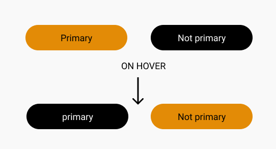
- 这样可以根据 props 更轻松地编写各种样式,从而更加动态。当 primary 为 true 时,按钮将具有橙色背景;如果为 false,则按钮将具有黑色背景。更多信息,请参阅Styled-component 文档。
让我们创建一个简单的网站

设计
你也可以查看 Figma 文件并查看设计图。(虽然没那么炫酷,但很基础,哈哈 😂)为了让你直观地了解网站应该是什么样子。这是设计图。
如果你想要代码,可以在我的Github上找到。

1)首先通过运行创建 React 应用
npm init react-app Homemade-website
2)删除src文件中的文件,保留App.js和index.js
|__src
|
|__App.js
|__index.js
3) 在源文件中创建 components 文件夹。我们将在这里创建主要组件,例如导航栏、首页部分、欢迎部分、个性化餐食部分和页脚部分。
在 components 文件夹中添加 index.js 以导出文件中的组件。它能让你的应用文件更简洁、更有条理。
在组件文件夹中,创建了一个 Navbar 文件夹。然后添加Navbar.js和Navbar.styles.js。
|--components
   |--Navbar
      |--Navbar.js
      |--Navbar.styles.js

    |--index.js

In the index.js folder, we will export all our components.
export {default as Navbar} from './Navbar/Navbar';
导入 styled-components 并为网站编写全局样式
- 在你的 React 项目中导入 styled-components
npm install --save styled-components
- 在 Src 文件夹中创建一个 GlobalStyles.js 文件夹。
|__src
|  |__components
|
|__App.js
|__GlobalStyles.js
|__index.js
- 添加字体系列和一些你想添加到网站的全局样式。我在这个网站上使用了 Nunito。更多信息请阅读样式组件文档
我不知道如何使用全局样式,尤其是如何导入字体系列,但文档和加入Styled-component 社区有所帮助。
- 这些样式将在全球范围内使用,为此,我添加了将在页面中使用的容器和按钮。
- Styled-components 的优点在于,您可以使用 props 来创建按钮等元素的不同变体。
import styled, {createGlobalStyle} from 'styled-components';

const GlobalStyles = createGlobalStyle`

@import url('https://fonts.googleapis.com/css2?family=Nunito:wght@300;400;800;900&family=Rubik:wght@800&display=swap');

*{
    margin: 0;
    padding: 0;
    box-sizing: inherit;
}

html {
    box-sizing: border-box;
    font-size: 62.5%;

    @media only screen and (max-width: 1200px){
        font-size: 58%;
    }
    @media only screen and (min-width: 1980px){
        font-size: 70%;
    }
}
body{
    font-family: 'Nunito', sans-serif;
    font-weight: 400;
    line-height: 1.6;
    font-size: 1.6rem;
    background: #F9F9F9;
    color: #333;

}
`;

export default GlobalStyles;

export const Container = styled.div`
margin: 0 auto;
padding: 0 50px;
max-width: 1300px;
width: 100%;

@media (max-width:400px){
    padding: 0 10px;
}
@media (max-width:991px) {
    padding: 0 30px;
}

@media (min-width: 1500px) {
    max-width: 1500px;
}

@media (min-width: 1800px) {
    max-width: 1800px;
    padding: 0 30px;
}
`;

export const Button = styled.button`
border-radius: ${({bigRadius}) => bigRadius ? '30px': '20px'};
background-color: ${({primary}) => primary? '#E38B06': '#000'};
color: ${({primary}) => primary ? '#000': '#fff'};
padding: ${({big}) => big? '18px 30px' : '10px 28px'};
font-size: ${({bigFont}) => bigFont? '20px': '18px'};
outline: none;
cursor: pointer;
border: none;
transition: all .5s ease;

&:hover{
    background-color: ${({primary}) => primary? '#fff': '#E38B06'};
    transform: translateY(-.5rem) scale(1.02);
    color: #000;
}
&:active{
    transform: translateY(.5rem);
}

@media only screen and (max-width:1000px) {
    /* width: 100%; */
    padding: ${({big}) => big? '18px 30px' : '10px 20px'};
}
@media only screen and (max-width:375px) {
    padding: ${({big}) => big? '12px 20px' : '10px 20px'};
    font-size: ${({bigFont}) => bigFont? '16px': '18px'};
}


`;

export const OutlineButton = styled.button`
border-radius: ${({bigRadius})=> bigRadius? '40px' : '30px'};
border: 2px solid #333;
color: #333;
outline: none;
padding: ${({big}) => big? '15px 60px' : '13px 55px'};
font-size: ${({fontBig}) => fontBig? '22px':'18px'};
transition: all .5s ease;
background-color: #fefefe;


&:hover {
    background-color: #333;
    color: #fff;
    border: none;
    transform: translateY(-.5rem) scale(1.02);
}
&:active{
    transform: translateY(.5rem);
}


@media only screen and (max-width: 1200px) {
    border-radius: ${({bigRadius})=> bigRadius? '20px' : '18px'};
    padding: ${({big}) => big? '9px 30px' : '8px 28px'};
    font-size: ${({fontBig}) => fontBig? '18px':'16px'};
}
`;

// add it to the App.js file and put it at the top.
<GlobalStyles/>
组件 1:让我们开始添加和设置导航栏的样式
1)让我们创建带有徽标和菜单图标的导航栏

- 我们需要导入 react-router 和一些 react 图标
- 导入 react-router 以便稍后使用链接加来浏览页面。
- 不知道为什么,创建导航花了比预期更长的时间。尤其是为了让它点击后生效。不过作为新手,这在意料之中。
npm install react-router-dom
- 导入反应图标
npm install react-icons --save-
- 在 Navbar.js 中写入下面的代码。
- 对于菜单图标,我们将使用它
useState来处理点击功能。 - 添加IconContext.Provider为菜单图标添加颜色。这得益于我们之前安装的 React 图标。
//In the Navbar.js file
import { BiMenu, BiX } from "react-icons/bi";
import {Button} from '../../Globalstyles';
import
{
    Nav,
    NavbarContainer,
    NavLogo,
    NavIcon
} from './Navbar.styles';
const Navbar = () => {
//click is the initial state and setclick will be the update state
    const [click, setClick] = useState(false);

//Create a function to handle the click state of the menu icon.
//if the menu icon was the menu bar at the beginning when clicked it will have the close icon
    const handleClick = () => setClick(!click);

    return (
        <div>
            <IconContext.Provider value={{ color: '#fff'}}> //turns the menu icon to white
                <Nav>
                    <NavbarContainer>
                        <NavLogo to="/">
                            <NavIcon/>
                            Home Made
                        </NavLogo>
                        <MenuIcon onClick={handleClick}>
                            {click ? <BiX/> : <BiMenu/>}
                        </MenuIcon>

                        <Menu onClick={handleClick} click={click}>
                            <MenuItem>
                                <MenuLink onClick={closeMenu} to="/">Home</MenuLink>
                            </MenuItem>
                            <MenuItem>
                                <MenuLink onClick={closeMenu} to="/about">About</MenuLink>
                            </MenuItem>
                            <MenuItem>
                                <MenuLink onClick={closeMenu} to="/recipe">Recipes</MenuLink>
                            </MenuItem>
                            <MenuItemBtn>
                                {button?(
                                    <MenuLinkBtn to="/order-now">
                                        <Button primary>Order Now</Button>
                                    </MenuLinkBtn>
                                ): (
                                    <MenuLinkBtn to="/order-now">
                                        <Button primary bigFont onClick={closeMenu}>Order Now</Button>
                                    </MenuLinkBtn>
                                )
                                }
                            </MenuItemBtn>
                        </Menu>

                    </NavbarContainer>


                </Nav>
            </IconContext.Provider>
        </div>
    )
}

export default Navbar;
- 在 Navbar.styles.js 中编写以下代码。我使用了 Flexbox 布局来布局导航栏。此外,我还使用了 Chrome 开发者工具来确保布局的精准。(不,我不仅知道如何放置它们,还仔细检查了各个元素,直到找到合适的布局。另外,我之前有设计图,这也帮了大忙。🤗)
import styled from 'styled-components';
import { Link } from 'react-router-dom';
import {BiRestaurant} from 'react-icons/bi';
import {Container} from '../../Globalstyles';


export const Nav = styled.nav`
font-size: 18px;
position: sticky;
top: 0;
z-index: 999;
height: 80px;
background-color: rgba(0, 0, 0, 0.5);
/* box-shadow: 0px 5px 20px rgba(0, 0, 0, 0.5); */
box-shadow: 0px 2px 10px rgba(0, 0, 0, 0.15);
display: flex;
justify-content: center;
align-items: center;
`;

export const NavbarContainer = styled(Container)`
display: flex;
justify-content: space-between;
align-items: center;
height: 80px;
${Container};
`;

export const NavLogo = styled(Link)`
color: #fff;
cursor: pointer;
display: flex;
align-items: center;
text-decoration: none;
font-size: 2.5rem;
font-weight: 800;
transition: all .5s ease;
&:hover{
    transform: scale(1.08);
}
`;

export const NavIcon = styled(BiRestaurant)`
margin-right: .8rem;
transition: all .5s ease;

&:hover {
    transform: scale(2);
}
`;

export const MenuIcon = styled.div`
display: none;

@media (max-width: 1000px) {
    display: block;
    position: absolute;
    top: 0;
    right: 0;
    transform: translate(-50%, 20%);
    font-size: 4rem;
    cursor: pointer;
}
`;

export const Menu = styled.ul`
display: flex;
align-items: center;
text-align: center;

@media only screen and (max-width:1000px) {
    display: flex;
    flex-direction: column;
    width: 100%;
    height: 100vh;
    position: absolute;
    top: 80px;
    left: ${({click}) => click ? '0' : '-100%'};
    background-color: rgba(0, 0, 0, 0.9);
    transition: all .5s ease;
}
`;

export const MenuItem = styled.li`
list-style: none;
height: 80px;


@media only screen and (max-width:1000px){
    width: 100%;
    &:hover {
        border: none;
    }
}
`;

export const MenuLink = styled(Link)`
text-decoration: none;
font-weight: bold;
font-size: 2rem;
color: #fff;
display: flex;
justify-content: space-between;
align-items: center;
padding: 1rem 2rem;
height: 100%;
transition: all .2s ease;

&:hover {
    color: #E38B06;
    transform: traslateY(-3rem);

}
&:active {
    transform: traslateY(3rem);
    color: #E38B06;
}

@media only screen and (max-width:1000px){
    display: block;
    padding: 3rem;
    text-align: center;
    transition: all .2s ease;
}
`;

export const MenuItemBtn = styled.li`
list-style: none;
@media screen and (max-width:1000px){
    display: flex;
    justify-content: center;
    align-items: center;
    width: 50%;
    height: 120px;
}
`;

export const MenuLinkBtn = styled(Link)`
text-decoration: none;
display: flex;
justify-content: center;
align-items: center;
padding: 8px 16px;
height: 100%;
width: 100%;
border: none;
outline: none;

`;
- 在 App.js 中你需要添加路由器
If not you will get this error
`Error: Invariant failed: You should not use <Link> outside a <Router>`

//Wrap your components inside the router.
import {BrowserRouter as Router,Switch,Route,Link} from "react-router-dom";
import {Navbar} from './components';
import GlobalStyles from './Globalstyles';
function App() {
  return (
    <Router>
      <GlobalStyles/>
      <Navbar/>

    </Router>
  );
}

export default App;
组件 2:英雄组件
此部分将包含导航栏、背景图像、文本和按钮。

- 创建 Hero 文件夹,添加
Hero.js和Hero.styles.js
|--components
   |--Navbar
      |--Navbar.js
      |--Navbar.styles.js
   |--Hero
      |--Hero.js
      |--Hero.styles.js

    |--index.js

In the index.js folder, we will export all our components.
export {default as Hero} from './Hero/Hero';
- 在 Hero.js 中,我们将从之前创建的 GlobalStyle 组件中导入 Button 组件。由于内容较少,我使用了 flexbox 布局。
import Navbar from '../Navbar/Navbar';
import {Button} from '../../Globalstyles';
import {
    HeroContainer,
    HeroContent,
    HeroContentText,
    HeroTitle,
    HeroTitleText,
    HeroSubTitle,
    HeroText,
    HeroBtn,

} from './Hero.styles';

const Hero = () =>{
    return(
        <div>
           <HeroContainer>
               <Navbar/>
               <HeroContent>
                   <HeroContentText>
                        <HeroTitle>
                            <HeroTitleText>Healthy</HeroTitleText>
                            <HeroTitleText>Meals All Day</HeroTitleText>
                        </HeroTitle>
                        <HeroSubTitle>For a longer Life</HeroSubTitle>
                        <HeroText>
                            Get a fresh and tasty recepies that are well balanced and
                            will improve your wellness, plus add nutrients to your body.
                        </HeroText>
                        <HeroBtn to="/order-now">
                           <Button primary big bigFont bigRadius>Pick your meals</Button>
                        </HeroBtn>
                   </HeroContentText>
               </HeroContent>
           </HeroContainer>
        </div>
    )
}

export default Hero;
- Hero 部分的样式 => Hero.styles.js
第 3 部分:工作原理部分

本节只有 3 张卡片,我使用了 Flexbox,但您可以使用网格来简化布局部分。要使文本居中,请务必使用 Flexbox。
display: flex;
justify-content: center;
align-items: center;
- 创建 Works 文件夹,添加,
Works.js我Works.styles.js不太擅长命名文件夹,哈哈,请耐心等待。
|--components
   |--Navbar
      |--Navbar.js
      |--Navbar.styles.js
   |--Hero
      |--Hero.js
      |--Hero.styles.js
   |--Works
      |--Works.js
      |--Works.styles.js

    |--index.js

In the index.js folder, we will export all our components.
export {default as Works} from './Works/Works';
- 让我们开始编写该部分的代码。在 Works.js 文件中添加以下代码。对于图标,我使用了之前安装的React-icons 。我为网站选择了Boxicons ,并将其包含在设计文件中。😊
import {
    WorksContainer,
    WorksContent,
    WorksTitle,
    WorksCardContent,
    WorksCard,
    WorksIconContainer,
    WorksIcon1,
    WorksIcon2,
    WorksIcon3,
    WorksCardTitle,
    WorksCardText
} from './works.styles';
const Works = () => {
    return (
        <div>
            <WorksContent>
                <WorksContainer>
                    <WorksTitle> How it works</WorksTitle>
                    <WorksCardContent>
                        <WorksCard>
                            <WorksIconContainer>
                                <WorksIcon1 className="Icon"/>
                            </WorksIconContainer>
                            <WorksCardTitle>Pick a meal</WorksCardTitle>
                            <WorksCardText>
                                There are different meals every week to choose from.
                                This gives you a variety of options to switch it up.
                            </WorksCardText>
                        </WorksCard>
                        <WorksCard>
                            <WorksIconContainer>
                                <WorksIcon2/>
                            </WorksIconContainer>
                            <WorksCardTitle>Customize it</WorksCardTitle>
                            <WorksCardText>
                               Choose your favourite recipes that you want to cook.
                               Pick the category you love.
                            </WorksCardText>
                        </WorksCard>
                        <WorksCard>
                            <WorksIconContainer>
                                <WorksIcon3/>
                            </WorksIconContainer>
                            <WorksCardTitle>Cook it up</WorksCardTitle>
                            <WorksCardText>
                               Order the meal you have chosen.
                               Fresh and packed ingredients straight to your doorstep.
                            </WorksCardText>
                        </WorksCard>
                    </WorksCardContent>
                </WorksContainer>
            </WorksContent>

        </div>
    )
}

export default Works;
- 作品样式部分 => Works.styles.js
第四部分:欢迎部分

这真的很简单,您可以使用网格进行布局,并像往常一样使用 flexbox 作为欢迎内容中的文本。
- 创建 Welcome 文件夹并添加
welcome.js文件。另外,记得像我之前演示的那样welcome.styles.js将其导出到文件。index.js - 为了这部分,我不得不去 Google 上搜索如何在 React 应用中导入本地图片。操作方法如下。
import PizzaImg from '../../images/pizza.png';
 <Img src={PizzaImg} alt=" Delious Pizza"/>
- 在welcome.js文件中,添加以下代码。
import {
    WelcomeContainer,
    WelcomeContent,
    WelcomeImg,
    WelcomeContentText,
    WelcomeContentTitle,
    WelcomeText,
    Img
} from './Welcome.styles';
import PizzaImg from '../../images/pizza.png';
const Welcome = () => {
    return (
        <div>
            <WelcomeContainer>
                <WelcomeContent>
                    <WelcomeImg>
                        <Img src={PizzaImg} alt=" Delious Pizza"/>
                    </WelcomeImg>
                    <WelcomeContentText>
                        <WelcomeContentTitle>Welcome</WelcomeContentTitle>
                        <WelcomeText>
                            Home made is a great way to make meals at home that are health and enjoyable.
                            We have a variety of categories to choose from that help meet your needs in your health journey.
                            You can customize the ingredients you want to be added to your meal. This can be due to health
                            resources, you don’t have to use everything on the list.
                        </WelcomeText>
                        <WelcomeText>
                            The order will be sent straight to your doorstep in less then
                            1hr pre-packed for you in portions.
                            Start cooking by following the visual guide in your order and serve your family a healthy meal.
                        </WelcomeText>
                    </WelcomeContentText>
                </WelcomeContent>


            </WelcomeContainer>

        </div>
    )
}

export default Welcome;
- 欢迎部分的样式 => Welcome.styles.js
第五部分:食谱部分

制作这个部分很有趣。灵感来自 Dribble。我很喜欢整体的布局效果。对于响应式设计来说,一开始有点麻烦,但我最终还是成功了。你可以查看我的Github链接。
-
创建 Recipe 文件夹,添加
recipe.js和recipe.styles.js文件。代码通常位于 Recipe.js 文件中,使用 styled-components 的样式位于 Recipe.styles.js 文件中。 -
在recipe.js文件中,你可以添加下面的代码。PS
:这是我需要重构的文件之一,代码甚至让我的眼睛都疼了,哈哈。😫
import {OutlineButton} from '../../Globalstyles';
import SalmonImg from '../../images/salmon.png';
import ChickenImg from '../../images/Chicken.svg';
import PizzaImg from '../../images/Italian-pizza.svg';
import PastaImg from '../../images/Pasta.svg';
import SaladImg from '../../images/salad.png';
import {
RecipeContainer,
RecipeWrapper,
RecipeTitle,
RecipeContentContainer,
RecipeTabContainer,
RecipeBtn,
RecipeCardWrapper,
RecipeFeature,
RecipeFeatureContent,
RecipeFeatureTitle,
RecipeFeatureText,
RecipeFeatureDetails,
RecipeFeatureItem,
RecipeItemTitle,
RecipeItemContent,
RecipeItemIcon,
RecipeItemText,
RecipeCardSection,
RecipeSmallCards,
RecipeCard,
RecipeCardContent,
RecipeCardHeading,
RecipeCardDetails,
RecipeCardItems,
RecipeCardTitle,
RecipeCardItem,
RecipeCardIcon,
RecipeCardText,
RecipeImg,
Img,
} from './Recipes.styles';
const Recipes = () => {
return (
<div>
<RecipeWrapper>
<RecipeContainer>
<RecipeTitle>Recipes</RecipeTitle>
<RecipeContentContainer>
<RecipeTabContainer>
<RecipeBtn to='/sea-food'>
<OutlineButton big bigFont bigRadius>Sea Food</OutlineButton>
</RecipeBtn>
<RecipeBtn to='/Vegetarian'>
<OutlineButton big bigFont bigRadius>Vegetarian</OutlineButton>
</RecipeBtn>
<RecipeBtn to='/meat'>
<OutlineButton big bigFont bigRadius>Meat and Poultry</OutlineButton>
</RecipeBtn>
<RecipeBtn to='/easy-preps'>
<OutlineButton big bigFont bigRadius>Easy meal preps</OutlineButton>
</RecipeBtn>
</RecipeTabContainer>
<RecipeCardWrapper>
<RecipeFeature>
<RecipeImg src={SalmonImg} alt="Salmon Recipe"/>
<RecipeFeatureContent>
<RecipeFeatureTitle>
Salmon and Hot Honey Butter
</RecipeFeatureTitle>
<RecipeFeatureText>
The hot honey kinda sounds like a hype name used before the 20s, (I used it back then).
It’s a perfect coating for the salmon to enrich it with sweetness and heat.
</RecipeFeatureText>
<RecipeFeatureDetails>
<RecipeFeatureItem>
<RecipeItemTitle>Serving</RecipeItemTitle>
<RecipeItemContent>
<RecipeItemIcon/>
<RecipeItemText>2</RecipeItemText>
</RecipeItemContent>
</RecipeFeatureItem>
<RecipeFeatureItem>
<RecipeItemTitle>Cook time</RecipeItemTitle>
<RecipeItemText>35-45 min</RecipeItemText>
</RecipeFeatureItem>
<RecipeFeatureItem>
<RecipeItemTitle>Difficulty level</RecipeItemTitle>
<RecipeItemText>20%</RecipeItemText>
</RecipeFeatureItem>
</RecipeFeatureDetails>
</RecipeFeatureContent>
</RecipeFeature>
<RecipeCardSection>
<RecipeSmallCards>
<RecipeCard>
<Img src={ChickenImg} alt="Chicken Recipe"/>
<RecipeCardContent>
<RecipeCardHeading>
Pretzel-Crusted Chicken
</RecipeCardHeading>
<RecipeCardDetails>
<RecipeCardItems>
<RecipeCardTitle>Serving</RecipeCardTitle>
<RecipeCardItem>
<RecipeCardIcon/>
<RecipeCardText>2</RecipeCardText>
</RecipeCardItem>
</RecipeCardItems>
<RecipeCardItems>
<RecipeCardTitle>Cook time</RecipeCardTitle>
<RecipeCardText>30-45 min</RecipeCardText>
</RecipeCardItems>
<RecipeCardItems>
<RecipeCardTitle>Difficulty level</RecipeCardTitle>
<RecipeCardText>20%</RecipeCardText>
</RecipeCardItems>
</RecipeCardDetails>
</RecipeCardContent>
</RecipeCard>
<RecipeCard>
<Img src={SaladImg} alt="Salad Recipe"/>
<RecipeCardContent>
<RecipeCardHeading>
Sesame Asian Salad
</RecipeCardHeading>
<RecipeCardDetails>
<RecipeCardItems>
<RecipeCardTitle>Serving</RecipeCardTitle>
<RecipeCardItem>
<RecipeCardIcon/>
<RecipeCardText>2</RecipeCardText>
</RecipeCardItem>
</RecipeCardItems>
<RecipeCardItems>
<RecipeCardTitle>Cook time</RecipeCardTitle>
<RecipeCardText>10-15 min</RecipeCardText>
</RecipeCardItems>
<RecipeCardItems>
<RecipeCardTitle>Difficulty level</RecipeCardTitle>
<RecipeCardText>10%</RecipeCardText>
</RecipeCardItems>
</RecipeCardDetails>
</RecipeCardContent>
</RecipeCard>
</RecipeSmallCards>
<RecipeSmallCards>
<RecipeCard>
<Img src={PizzaImg} alt="Pizza Recipe"/>
<RecipeCardContent>
<RecipeCardHeading>
Italian Pizza with Cheese
</RecipeCardHeading>
<RecipeCardDetails>
<RecipeCardItems>
<RecipeCardTitle>Serving</RecipeCardTitle>
<RecipeCardItem>
<RecipeCardIcon/>
<RecipeCardText>2</RecipeCardText>
</RecipeCardItem>
</RecipeCardItems>
<RecipeCardItems>
<RecipeCardTitle>Cook time</RecipeCardTitle>
<RecipeCardText>30-45 min</RecipeCardText>
</RecipeCardItems>
<RecipeCardItems>
<RecipeCardTitle>Difficulty level</RecipeCardTitle>
<RecipeCardText>20%</RecipeCardText>
</RecipeCardItems>
</RecipeCardDetails>
</RecipeCardContent>
</RecipeCard>
<RecipeCard>
<Img src={PastaImg} alt="Pasta Recipe"/>
<RecipeCardContent>
<RecipeCardHeading>
Pasta with creamy sause
</RecipeCardHeading>
<RecipeCardDetails>
<RecipeCardItems>
<RecipeCardTitle>Serving</RecipeCardTitle>
<RecipeCardItem>
<RecipeCardIcon/>
<RecipeCardText>2</RecipeCardText>
</RecipeCardItem>
</RecipeCardItems>
<RecipeCardItems>
<RecipeCardTitle>Cook time</RecipeCardTitle>
<RecipeCardText>10-15 min</RecipeCardText>
</RecipeCardItems>
<RecipeCardItems>
<RecipeCardTitle>Difficulty level</RecipeCardTitle>
<RecipeCardText>10%</RecipeCardText>
</RecipeCardItems>
</RecipeCardDetails>
</RecipeCardContent>
</RecipeCard>
</RecipeSmallCards>
</RecipeCardSection>
</RecipeCardWrapper>
</RecipeContentContainer>
</RecipeContainer>
</RecipeWrapper>
</div>
);
}
export default Recipes;
- 食谱部分的样式 => Recipes.styles.js
- 样式方面,我使用了 flexbox,因此代码量有所增加。不过你可以随意设置样式,比如使用网格布局。
第六部分:个性化膳食部分

这是一个类似于欢迎部分的简单部分。您可以使用网格或弹性框布局,无需担心。
记得创建一个文件夹,用于编写组件代码,并将其导出到 index.js 文件。
- 在meals.js文件中添加以下代码。(是的,我知道我文件夹命名不好,哈哈😪)
import {Button} from '../../Globalstyles';
import ChickenImg from '../../images/Big-chicken.svg';
import {
MealsContainer,
MealsWrapper,
MealsImage,
Img,
MealsContent,
MealsContentTitle,
MealsContentText,
MealsContentItems,
MealsContentList,
MealsContentDetails,
MealsContentIcon,
MealsContentCategory,
MealsContentBtn
} from './Meals.styles';
function Meals() {
return (
<div>
<MealsContainer>
<MealsWrapper>
<MealsImage>
<Img src={ChickenImg} alt= "Personalized Chicken meal"/>
</MealsImage>
<MealsContent>
<MealsContentTitle>Personalize your Meals</MealsContentTitle>
<MealsContentText>
Choose your weekly or daily meal plan from our meals to kick
start your month. All meanu are fresh and set for you in portion to make it easier to cook immediately.
</MealsContentText>
<MealsContentItems>
<MealsContentList>
<MealsContentDetails>
<MealsContentIcon/>
<MealsContentCategory> Vegetarian</MealsContentCategory>
</MealsContentDetails>
<MealsContentDetails>
<MealsContentIcon/>
<MealsContentCategory>Gluten-Free</MealsContentCategory>
</MealsContentDetails>
<MealsContentDetails>
<MealsContentIcon/>
<MealsContentCategory>Card-conscious</MealsContentCategory>
</MealsContentDetails>
<MealsContentDetails>
<MealsContentIcon/>
<MealsContentCategory>Calorie -conscious</MealsContentCategory>
</MealsContentDetails>
</MealsContentList>
<MealsContentList>
<MealsContentDetails>
<MealsContentIcon/>
<MealsContentCategory>15 mins pre-kit</MealsContentCategory>
</MealsContentDetails>
<MealsContentDetails>
<MealsContentIcon/>
<MealsContentCategory>Featured Meals</MealsContentCategory>
</MealsContentDetails>
<MealsContentDetails>
<MealsContentIcon/>
<MealsContentCategory>New recipes</MealsContentCategory>
</MealsContentDetails>
<MealsContentDetails>
<MealsContentIcon/>
<MealsContentCategory>Low fat meals</MealsContentCategory>
</MealsContentDetails>
</MealsContentList>
</MealsContentItems>
<MealsContentBtn to='/order-now'>
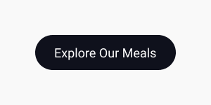
<Button big bigFont bigRadius>Explore Our Meals</Button>
</MealsContentBtn>
</MealsContent>
</MealsWrapper>
</MealsContainer>
</div>
)
}
export default Meals;
- 餐食部分样式 => Meals.styles.js
组件 7:页脚部分
这是网站的最后一个组件。页脚部分用弹性盒子更容易设计。只需从大块嵌套小块的角度来查看内容即可。你的眼睛应该像 Pesticide 的 Chrome 扩展程序一样,尝试查看布局的全局,小块嵌套大块等等。(哈哈,这个技巧对我来说很有效,而且它让编码更容易。🤗)
- 创建 footer 文件夹,添加
Footer.js和Footer.styles.js文件。在 footer.js 文件中添加以下代码。
import {
FooterSection,
FooterContainer,
FooterNewsletter,
FooterNewsletterTitle,
FooterNewsletterText,
FooterNewsletterForm,
FooterNewsletterInput,
FooterBtn,
FooterLinkContainer,
FooterLinksWrapper,
FooterLinks,
FooterLinkTitle,
FooterLink,
FooterCopyRight,
FooterLabel
} from './Footer.styles';
function Footer() {
return (
<div>
<FooterSection>
<FooterContainer>
<FooterNewsletter>
<FooterNewsletterTitle>Join our listing for execlusive discounts and new recipes</FooterNewsletterTitle>
<FooterNewsletterText>We create new recipes every week and cooking tips</FooterNewsletterText>
<FooterNewsletterForm>
<FooterLabel htmlFor="email">Email address</FooterLabel>
<FooterNewsletterInput name="email" id="email" type="email" placeholder="Email address" />
<FooterBtn>Submit</FooterBtn>
</FooterNewsletterForm>
</FooterNewsletter>
<FooterLinkContainer>
<FooterLinksWrapper>
<FooterLinks>
<FooterLinkTitle>About Us</FooterLinkTitle>
<FooterLink to='/'>Our Chefs</FooterLink>
<FooterLink to='/'>Our Farm</FooterLink>
<FooterLink to='/'>Testimonials</FooterLink>
<FooterLink to='/'>Terms of service</FooterLink>
</FooterLinks>
<FooterLinks>
<FooterLinkTitle>Services</FooterLinkTitle>
<FooterLink to='/about'>How it works</FooterLink>
<FooterLink to='/'>Meal prep kit</FooterLink>
<FooterLink to='/'>Gift cards</FooterLink>
<FooterLink to='/'>Orders</FooterLink>
</FooterLinks>
</FooterLinksWrapper>
<FooterLinksWrapper>
<FooterLinks>
<FooterLinkTitle>Resources</FooterLinkTitle>
<FooterLink to='/'>Kitchenware</FooterLink>
<FooterLink to='/'>Recipes</FooterLink>
<FooterLink to='/'>FAQ & Support</FooterLink>
<FooterLink to='/'>Affiliate Program</FooterLink>
</FooterLinks>
<FooterLinks>
<FooterLinkTitle>Contact</FooterLinkTitle>
<FooterLink to='/'>Instagram</FooterLink>
<FooterLink to='/'>Facebook</FooterLink>
<FooterLink to='/'>Youtube</FooterLink>
<FooterLink to='/'>Linkedin</FooterLink>
</FooterLinks>
</FooterLinksWrapper>
</FooterLinkContainer>
<FooterCopyRight to='https://github.com/muchirijane'> © Copyright 2020, Designed and coded with 💛 by Jane Tracy</FooterCopyRight>
</FooterContainer>
</FooterSection>
</div>
)
}
export default Footer;
- 页脚部分的样式 => Footer.styles.js
- 记得在 index.js 文件中导出页脚组件。
App.js文件
在 app.js 文件中将导入我们的组件。
import {BrowserRouter as Router,Switch,Route} from "react-router-dom";
import {Hero, Works,Welcome,Recipes,Meals,Footer} from './components';
import GlobalStyles from './Globalstyles';
function App() {
  return (
    <Router>
      <GlobalStyles/>
      <Hero/>
      <Works/>
      <Welcome/>
      <Recipes/>
      <Meals/>
      <Footer/>
    </Router>
  );
}

export default App;
- 完整代码请查看我的Github。恭喜你成功搭建了一个简单的 React 网站。由于篇幅过长,我无法贴出全部代码,但我尽量涵盖了最重要的部分。
综上所述
学习的唯一途径就是实践。打开 Figma 应用,开始画线框图并编写代码。一路走来,你会学到很多东西,因为你会在谷歌上找到一些你不懂或不知道怎么用的东西。为了给你一个简单的比喻,我谷歌了一下如何导入字体系列、导入本地图片等等。别觉得你做不到,是的,代码新手,你一定可以。🤗(我感觉五年后我会嘲笑我的代码。)
虽然这篇文章很长,但我确实付出了很多,希望它能对你有所帮助。我迫不及待地想了解更多关于 React 的知识。学习 React 的第三周非常棒。
如果您觉得这篇文章有用,请分享给您的同行或正在学习 React 的初学者,他们可能会觉得这篇文章对他们的学习之旅有所帮助。您也可以请我喝杯咖啡,支持我继续写更多文章。🙂