 后端开发教程 - Java、Spring Boot 实战 - msg200.com
2021 年 CSS 背景属性详解 || CSS 2021
目录 -->
YouTube :
所有房产
背景图像
背景尺寸
背景重复
背景位置
背景原点
休息一下
背景剪辑
背景附件
背景颜色
速记
致谢
结论
今天我们将学习 CSS背景属性的所有可能值以及简写方法。开始吧!🏅
目录 -->
YouTube :
所有房产
这是我们今天要讨论的所有属性的列表。最后的红色文本是简写

什么是背景属性?

CSS 背景属性使我们能够控制图像的大小和属性,以便我们可以为较小和较大的屏幕制作响应式图像。因此,我们可以轻松创建响应式网站。
例如,
- 属性background-size允许我们根据屏幕尺寸重置图像的宽度和高度。
- background-position允许我们告诉浏览器将图像放在屏幕上的什么位置。
- 还有更多!
遵循的步骤

在编码之前,您需要了解一些 HTML、CSS 以及如何使用 VS 代码。
要对属性及其值进行各种测试,请按照以下步骤操作👇
- 创建一个名为“BACKGROUND-PROJECT”的新文件夹。在 VS Code 上打开它。
- 创建 index.html 和 style.css 文件。
- 在 VS 代码上安装“实时服务器”。
- 启动实时服务器。
HTML
在 HTML 文件的body 标签内创建一个类名为“container”的 div 。
<div class="container"></div>
CSS
在 CSS 中,必须为容器设置高度,否则图片无法显示。在本例中,我们将其设置为 100vh,如下所示 ->
.container{
  height : 100vh;
}
下载项目的图像。
- 图片位于我的GitHub 存储库中
- 访问并复制链接☝️
- 转到downgit并粘贴您复制的链接
- 按照视频中的步骤操作👇->
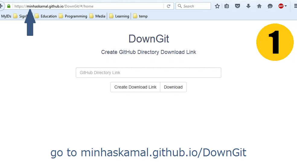
并且...我们已经准备好了!

让我们开始编码吧😊
背景图像
使用此属性,我们可以通过样式表添加图像。

我们可以通过两种方式使用背景图像->
- 通过在目录中定位图像路径
- 通过指定图片 URL
按目录路径
使用目录路径时的语法👇

在 CSS 上指定图像路径时,我们将有 3 种情况 ->
- 图像和 style.css 位于同一文件夹中
- 图片位于下一个文件夹中
- 图片位于上一个文件夹中
- 当image 和 style.css 位于同一文件夹中时,它看起来像这样👇请注意,kitty.png和style.css位于名为Background-project的同一父文件夹中

要找到 kitty.png 的文件路径,请在 style.css 上写入 ->
 .container{
   background-image : url("kitty.png");

   height: 100vh;
// set size & stop image repetition
   background-repeat : no-repeat;
   background-size : contain;
 }
- 当图片位于“下一个文件夹”时,style.css 位于“上一个文件夹”。注意图片👇上的 kitty.png 位于 Assets 文件夹,而 style.css 位于“上一个文件夹”。

要继续前进并找到 kitty.png 的文件路径,我们在 style.css 的引号后写一个点和斜线 (./)。然后我们写文件夹名称,然后是斜线 (/),最后是图像名称,像这样 👇 ->
 .container{
   background-image : url("./Assets/kitty.png");

   height: 100vh;
// set size & stop image repetition
   background-repeat : no-repeat;
   background-size : contain;
 }
- 如果图片位于“上一个文件夹”中,则我们需要返回。注意图片👇的style.css位于src文件夹,而kitty.png位于src 文件夹之外。

要返回并找到 kitty.png 的文件路径,我们在 style.css 的引号后写两个点和斜线 (../)。然后我们写上图片名称,像这样 👇
 .container{
   background-image : url("../kitty.png");

   height: 100vh;
// set size & stop image repetition
   background-repeat : no-repeat;
   background-size : contain;
 }
通过直接链接
这很简单。编写属性并在 url() 中插入链接。语法如下:

要处理直接链接的图像,我们写入 ->
//example ->
 .container{
    background-image : url("https://dev-to-uploads.s3.amazonaws.com/uploads/articles/szxp3jqyjyksrep1ep82.png");

  height: 100vh;
// set size & stop image repetition
   background-repeat : no-repeat;
   background-size : contain;
 }
休息一下

背景尺寸
我们可以使用此属性调整图像的大小。

您可以通过3 种方式使用背景尺寸->
- 使用覆盖/包含值
- 设置图像宽度和高度
- 使用自动
让我们开始讨论封面和包含值
熊尺寸:[718px X 614px]

覆盖
为了实现这一点,我们必须添加一张图片,设置高度并停止图片重复。就像在 CSS 中这样 👇
.container{
  background-image : url('cute-bear.png');
  background-repeat: no-repeat;
  background-size : cover;

// Must include the height
  height : 100vh;
}
当我们使用此属性时,即使我们调整窗口大小,它也会将图像拉伸到整个屏幕。观看视频 👇

包含
同样的步骤,我们必须添加一张图片,设置高度并停止图片重复。就像在 css 上这样👇
.container{
  background-image : url('cute-bear.png');
  background-repeat: no-repeat;
  background-size : contain;

// Must include the height
  height : 100vh;
}
即使我们调整窗口大小,此值也会保留图像大小(响应式图像)。观看下方视频 👇

图像宽度和高度
我们可以使用 background-size 属性设置图像的宽度和高度。

语法👇
.container{
// here, we see  width👇  &  👇 height
  background-size : 200px   200px;
}
另外,别忘了插入图片、设置高度以及停止图片重复。代码片段 ->
.container{
  background-image : url('cute-bear.png');
  background-repeat: no-repeat;

// here, we see  width👇 &  👇 height
  background-size : 200px  200px;

// Must include the height
  height : 100vh;
}
汽车
使用此值时,图像将保持其原始大小。即使我们调整窗口大小,它也不会改变。观看视频:

背景重复
此属性允许我们多次重复同一图像。

此属性有 6 个值:
- 重复
- 重复-x
- 重复-y
- 不重复
- 空间
- 圆形的
一目了然的每 6 个值的结果:
注意:小猫尺寸:[200px X 200px]


现在,让我们研究一下每个值分别对应什么。不过,在此之前请注意,我们需要使用 background-image 插入一张图片。就像这样:
.container{
   background-image : url('kitty.png');
   background-size : 200px 200px;
   background-repeat :  ; //we will play with values here

   height : 100vh;
}
重复
通过使用此值,只要屏幕空间没有结束,我们就可以沿X 轴和 Y 轴多次重复相同的图像。小猫尺寸:200px X 200px

重复-x
只要屏幕空间没有结束,这个值允许我们沿X 轴多次重复相同的图像。小猫尺寸:200px X 200px

重复-y
工作方式与“repeat-x”相同,但只要屏幕空间未结束,它就会沿Y 轴进行。Kitty 尺寸:200px X 200px

不重复
使用这个值,我们可以得到没有重复的原始图像。小猫尺寸:200px X 200px

空间
这在 X 轴和 Y 轴上都有效。我们可以看到,当我们调整窗口大小时,值之间的主要区别:space 和 round 。请注意,当我们调整窗口大小时,会出现空白区域。

圆形的
这在 X 轴和 Y 轴上都有效。注意,当我们调整窗口大小时,图像会被拉伸。

背景位置
此属性用于更改屏幕上图像的位置

语法👇
.container{
// This is       X-Axis👇  &  👇 Y-Axis
background-position : 300px  200px;
}
另外,别忘了插入图片、设置高度以及停止图片重复。我们使用 background-size 属性将小猫的尺寸设置为 200px x 200px。
.container{
  background-image: url("kitty-idea.png");
  background-size: 200px 200px;
  background-repeat: no-repeat;

// This is         X-Axis👇  & 👇 Y-Axis
  background-position : 300px 200px;
  height: 100vh;
}
结果 ->

您还可以使用这些值的组合 ->
- 顶部
- 左边
- 正确的
- 底部
- 百分比值
举个例子,让我们把小猫放在最右下角。代码片段如下:
.container{
  background-image: url("kitty-idea.png");
  background-size: 200px 200px;
  background-repeat: no-repeat;

// This is         X-Axis👇  & 👇 Y-Axis
  background-position : bottom right;
  height: 100vh;
}
结果 ->

计算屏幕可用空间,% 值决定图像的位置。代码片段 ->
.container{
  background-image: url("kitty-idea.png");
  background-size: 200px 200px;
  background-repeat: no-repeat;

// This is         X-Axis👇  & 👇 Y-Axis
  background-position : 25% 15%;
  height: 100vh;
}
结果 ->

背景原点
此属性允许我们在 CSS 盒模型中设置图像的原点。

这 4 个值是:
- 边框
- 填充框
- 内容框
- 继承
在标准 CSS 盒模型中,最外层是边框,然后是填充,最后是位于中心的内容本身。

各项属性结果一览 ->

为了重现这些结果,
- 首先我们需要一张图片,停止图片重复,设置容器和图片的高度和宽度。
- 完成后,我们将插入 40px 填充,否则我们无法看到填充框和内容框之间的区别。
- 然后,插入 25px 红色边框。设置边框样式为虚线,以便在屏幕上看到虚线边框。
- 将背景大小设置为 400px & 400px;
代码片段 ->
.container{
  background-image: url('cute-girl.png');
  background-repeat: no-repeat;
  background-size: 400px 400px;

// Change  values here  👇  to see difference
  background-origin: border-box;
  padding: 40px;
  border: 25px solid red;
  border-style: dashed;

// Width & height for container 👇
  width : 400px;
  height : 400px;
}
休息一下

背景剪辑
这和 background-origin 属性相同。主要区别在于,background-clip会剪切图片以适应盒子大小,而 background-origin会拉伸盒子内部的内容以适应盒子大小。

这 4 个值是:
- 边框
- 填充框
- 内容框
- 继承
各项属性结果一览 ->

为了重现这些结果,
- 首先我们需要一张图片,停止图片重复,设置容器和图片的高度和宽度。
- 完成后,我们将插入 40px 填充,否则我们无法看到填充框和内容框之间的区别。
- 然后,插入 25px 红色边框。设置边框样式为虚线,以便在屏幕上看到虚线边框。
- 将背景大小设置为 400px & 400px;
代码片段 ->
.container{
  background-image: url('cute-girl.png');
  background-repeat: no-repeat;
  background-size: 400px 400px;

// Change  values here  👇  to see difference
  background-clip: border-box;
  padding: 40px;
  border: 25px solid red;
  border-style: dashed;

// Width & height for container 👇
  width : 400px;
  height : 400px;
}
背景附件
此属性允许我们控制滚动时内容和图像的行为。

这 3 个值是:
- 滚动
- 固定的
- 当地的
当我们使用滚动时,图像是固定的,我们可以自由滚动我们的内容。固定值给我们在鼠标滚动时带来视差效果,只要我们的内容没有结束,本地就会产生多个图像。
在这里查看结果👇
背景颜色
这是用来用颜色填充背景

在众多选项中,最受欢迎的是 ->
- 按名称或十六进制值显示纯色
- 使用 RGB() 颜色函数
- 使用线性梯度()函数
按名称或十六进制值显示纯色
您可以使用颜色名称来设置背景颜色,像这样 ->
.container{
   background-color : red;

   height : 100vh;
}
或者,你可以使用十六进制颜色代码,像这样 ->
.container{
   background-color : #ff0000; //red color

   height : 100vh;
}
访问这些资源以获取更多颜色 ->
RBG() 颜色函数
您可以使用 RGB() 颜色函数来设置背景颜色 ->
.container{
// color name is "American River"
   background-color : rgb(99, 110, 114);

   height : 100vh;
}
或者,您可以使用 RGBA() 来设置颜色和不透明度->
.container{
// The 0.5 at last represents        50% 👇 opacity
   background-color :  rgba(99, 110, 114, 0.5);

   height : 100vh;
}
这是对名为“伊顿蓝”的颜色进行不同不透明度级别的实验👇

线性梯度()函数
用于创建多种颜色的渐变色。渐变色示例 ->

您可以访问此网站获取更多带有 css 代码片段的颜色资源 ->
要重新创建此背景颜色 ->

'#22c1c3' 代表左侧颜色,'#fdbb2d' 代表右侧颜色。'90deg' 表示两种颜色如何以一定角度排列以形成渐变。
代码片段 ->
.container{

   background: linear-gradient(90deg, #22c1c3, #fdbb2d);

   height : 100vh;
}
速记
这是名为 background 的简写顺序

在本实验中,我们将 kitty.png 放在浏览器上,背景为蓝色,X 轴和 Y 轴的坐标分别为 200px。代码片段 ->
.container{

   background-color : skyblue;
   background-image : url('kitty.png);
   background-repeat: no-repeat;
   background-attachment: fixed;
   background-position: 200px 200px;

   height : 100vh;
}
使用简写 -> 的代码片段
.container{

   background: skyblue url('kitty.png) no-repeat fixed 200px 200px;

   height : 100vh;
}
如果您想跳过一个值,只要保持这些属性的顺序就可以做到。
致谢
结论
这是您阅读到最后的奖牌❤️
非常感谢您的建议和批评❤️

-
YouTube /乔伊·沙希布
-
Twitter /JoyShaheb
-
Instagram /JoyShaheb