 后端开发教程 - Java、Spring Boot 实战 - msg200.com
十天学会 CSS3 — 第 1 天
我们开发人员经常在 CSS 方面遇到困难,会借助一些 CSS 框架,比如 Bootstrap 或 Foundation。使用它们本身并没有错,但当你开始遇到 CSS 问题时,往往会向团队中精通 CSS 的人寻求帮助。
要掌握 CSS,最好的方法就是使用它。因此,本教程包含一些实用示例,您可以学习并直接在项目中使用。本系列的灵感来自freecodecamp 频道上这个很棒的 YouTube 系列。
我们将使用这个简单的 HTML 标记并为其添加样式。请打开您常用的编辑器,创建一个index.html文件,并包含以下内容。
<!DOCTYPE html>
<html>
<head>
  <meta charset="utf-8">
  <title>CSS3 Fancy Buttons | Code 10 Things in 10 Days with CSS3</title>
  <link rel="stylesheet" href="sandbox.css">
  <link href="https://fonts.googleapis.com/css?family=Bubblegum+Sans|Nova+Mono|Roboto+Condensed" rel="stylesheet">
</head>

<body>
  <h1><small>Day #1</small> CSS3 Fancy Buttons</h1>
  <div class="sandbox">
    <h2>Sandbox <small>This is where you play</small></h2>
    <div class="content">
      <p><strong>Instructions:</strong> Use CSS3 to create visually attractive buttons of all different shapes, sizes
        and effects!</p>
      <section>
        <h4>Facebook Style</h4>
        <button type="button" name="button" class="facebook-style-btn facebook-style-dark">Button Dark</button>
        <button type="button" name="button" class="facebook-style-btn facebook-style-light">Button Light</button>
      </section>

      <section>
        <h4>3D Buttons</h4>
        <button type="button" name="button" class="btn-3d-1">3D Button 1</button>
        <button type="button" name="button" class="btn-3d-2">Circle!</button>
      </section>

      <section>
        <h4>Gradient Bordered Buttons</h4>
        <button type="button" name="button" class="gradient-button-1">Gradient button 1</button>
        <button type="button" name="button" class="gradient-button-2">Gradient button 2</button>
      </section>

      <section>
        <h4>Animated Buttons</h4>
        <button type="button" name="button" class="animated-button-1">Animated button 1</button>
        <button type="button" name="button" class="animated-button-2">Animated button 2</button>
      </section>

      <section>
        <h4>Toggle Switch UI Buttons</h4>
        <label for="toggle1" class="toggle-1">
          <input type="checkbox" id="toggle1" class="toggle-1__input" />
          <span class="toggle-1__button"></span>
        </label>

        <label for="toggle2" class="toggle-2">
          <input type="checkbox" id="toggle2" class="toggle-2__input" />
          <span class="toggle-2__button">Click me to activate</span>
        </label>
      </section>
    </div>
  </div>
</body>
</html>
接下来在同一目录中创建一个空的sandbox.css文件。我们先来设置一下 Facebook 风格的按钮。
.facebook-style-btn{
    border-radius: 2px;
    font-size: 0.9rem;
    padding: 6px 12px;
}
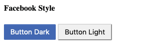
现在我们的index.html在浏览器中看起来如下所示。
 Facebook 风格的按钮
接下来我们将为第一个按钮添加更多样式。
.facebook-style-dark{
    box-shadow: inset 0 1px 0 0 #4d73bf;
    background: #4267b2;
    border: solid 1px #4267b2;
    color: white;
    text-shadow: 0 1px 0 #3359a5;
}

.facebook-style-dark:hover{
    background: #2b54a7;
}

.facebook-style-dark:active{
    background: #1d4698;
    border-color: #1d4698;
}
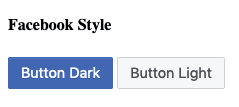
现在,我们的深色按钮如下所示,并且也具有悬停和活动状态。
 Facebook深色按钮
现在,让我们为 Facebook 灯光按钮添加样式。
.facebook-style-light{
    background: #f6f7f9;
    border: 1px solid #ced0d4;
    color: #4b4f56;
}

.facebook-style-light:hover{
    background: #e9ebee;
}

.facebook-style-light:active{
    background: #d8dade;
    border-color: #d8dade;
}
我们的灯光按钮看起来像。
 Facebook 灯
现在,我们将设计一些炫酷的 3D 按钮。CSS 代码如下。
.btn-3d-1 {
    position: relative;
    background: orangered;
    border: none;
    color: white;
    padding: 15px 24px;
    font-size: 1.4rem;
    box-shadow: -6px 6px 0 hsl(16, 100%, 30%);
    outline: none;
  }

    .btn-3d-1:hover {
      background: hsl(16, 100%, 45%);
    }

    .btn-3d-1:active {
      background: hsl(16, 100%, 40%);
      top: 3px;
      left: -3px;
      box-shadow: -3px 3px 0 hsl(16, 100%, 30%);
    }
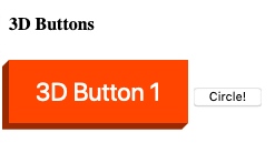
一旦我们点击它,它就会向下移动。这是因为我们设置了position:relative,并且在激活状态下,我们将顶部设置为3px,左侧设置为-3px。它会因此移动。
 3D按钮
3D按钮
现在,上面的 3D 按钮缺少一点,那就是阴影的边缘与按钮不匹配。我们将通过创建一个小三角形并将其移动到该位置来实现同样的效果。我们将使用 ::before 和 ::after 来创建这两个三角形。
.btn-3d-1::before {
        position: absolute;
        display: block;
        content: "";
        height: 0;
        width: 0;
        border: solid 6px transparent;
        border-right: solid 6px hsl(16, 100%, 30%);
        border-left-width: 0px;
        background: none;
        top: 0px;
        left: -6px;
      }

      .btn-3d-1::after {
        position: absolute;
        display: block;
        content: "";
        height: 0;
        width: 0;
        border: solid 6px transparent;
        border-top: solid 6px hsl(16, 100%, 30%);
        border-bottom-width: 0px;
        background: none;
        right: 0;
        bottom: -6px;
      }

        .btn-3d-1:active::before {
          border: solid 3px transparent;
          border-right: solid 3px hsl(16, 100%, 30%);
          border-left-width: 0px;
          left: -3px;
        }

        .btn-3d-1:active::after {
          border: solid 3px transparent;
          border-top: solid 3px hsl(16, 100%, 30%);
          border-bottom-width: 0px;
          bottom: -3px;
        }
我们现在将看到正确的按钮,其边缘已连接。
 3D按钮最终版
接下来,我们将创建第二个 3D 按钮,它是一个具有按压功能的圆形按钮。将以下代码添加到 CSS 中。
.btn-3d-2 {
    position: relative;

    background: #ecd300; /* For browsers that do not support gradients */
    background: radial-gradient(hsl(54, 100%, 50%), hsl(54, 100%, 40%)); /* Standard syntax */

    font-size: 1.4rem;
    text-shadow: 0 -1px 0 #c3af07;
    color: white;
    border: solid 1px hsl(54, 100%, 20%);
    border-radius: 100%;
    height: 120px;
    width: 120px;
    z-index: 4;
    outline: none;

    box-shadow: inset 0 1px 0 hsl(54, 100%, 50%),
                    0 2px 0 hsl(54, 100%, 20%),
                    0 3px 0 hsl(54, 100%, 18%),
                    0 4px 0 hsl(54, 100%, 16%),
                    0 5px 0 hsl(54, 100%, 14%),
                    0 6px 0 hsl(54, 100%, 12%),
                    0 7px 0 hsl(54, 100%, 10%),
                    0 8px 0 hsl(54, 100%, 8%),
                    0 9px 0 hsl(54, 100%, 6%);
}
现在,按钮看起来像。
 圆圈 3D
圆圈 3D
现在,我们将为我们的 3D 圆圈添加悬停效果和活动效果。
.btn-3d-2:hover {
    background: #ecd300;
    background: radial-gradient(hsl(54, 100%, 45%), hsl(54, 100%, 35%));
}

.btn-3d-2:active {
    background: #ecd300;
    background: radial-gradient(hsl(54, 100%, 43%), hsl(54, 100%, 33%));
    top: 2px;
    box-shadow: inset 0 1px 0 hsl(54, 100%, 50%),
                0 2px 0 hsl(54, 100%, 20%),
                0 3px 0 hsl(54, 100%, 18%),
                0 4px 0 hsl(54, 100%, 16%),
                0 5px 0 hsl(54, 100%, 14%),
                0 6px 0 hsl(54, 100%, 12%),
                0 7px 0 hsl(54, 100%, 10%);
}
现在,当你点击圆形按钮时,顶部的 2px 将会起作用,并且在 box-shadow 中,我们减少了两层。因此,它将显示按下状态。
现在,我们将讨论渐变边框按钮。我们将从按钮 1 的 CSS 开始。
.gradient-button-1 {
    position: relative;
    z-index: 1;
    display: inline-block;
    padding: 20px 40px;
    font-size: 1.4rem;
    box-sizing: border-box;
    background-color: #e7eef1;
    border: 10px solid transparent;
**    border-image: linear-gradient(to top right, orangered, yellow);
    border-image-slice: 1;**
    color: orangered;
  }

  .gradient-button-1:hover {
    background-image: linear-gradient(to top right, orangered, yellow);
    color: white;
  }
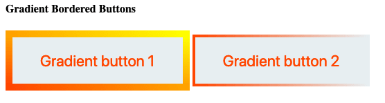
这里,一个重要的属性是高亮属性。它是按钮轮廓边框的属性。
 渐变按钮
渐变按钮
当悬停时,我们用悬停属性填充按钮。
 渐变按钮悬停
现在,我们将制作渐变按钮 2。它将与按钮 1 完全相同。
.gradient-button-2 {
    position: relative;
    z-index: 1;
    display: inline-block;
    padding: 20px 40px;
    font-size: 1.4rem;
    box-sizing: border-box;
    background-color: #e7eef1;
    border: 4px solid transparent;
**    border-image: linear-gradient(to right, orangered, transparent);
    border-image-slice: 1;**
    color: orangered;

  }
  .gradient-button-2:hover {
    background-size: 100%;
    background-image: linear-gradient(to right, orangered, transparent);
    **border-right-style: none;**
    color: white;
  }
按钮如下所示。区别在于border-image中的右侧。
 渐变按钮 2
此外,在悬停时我们设置了border-right-style: none,结果如下所示。
 渐变按钮 2 悬停
现在,我们开始制作动画按钮。先从按钮 1 开始。我们将使用一个图案图像,当我们将鼠标悬停在按钮上时,图案就会移动。
.animated-button-1 {
    position: relative;
    display: inline-block;
    padding: 20px 40px;
    font-size: 1.4rem;
    background-color: #00b3b4;

    background-image: url(pattern.png);
    background-size: 40px 40px;
    border: 1px solid #555;
    color: white;
    transition: all 0.3s ease;
  }

  .animated-button-1:hover {
    animation: loading-button-animation 2s linear infinite;
  }

  @keyframes loading-button-animation {
    from {
      background-position: 0 0;
    }
    to {
      background-position: 40px 0;
    }
  }
为了使图案移动,我们使用动画中的@keyframes并移动背景。
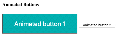 动画按钮1
动画按钮1
现在,我们将制作动画按钮 2。我们将在没有任何关键帧动画的情况下制作此动画。
.animated-button-2 {
    position: relative;
    display: inline-block;
    padding: 20px 40px;
    font-size: 1.4rem;
    background-color: #00b3b4;
    background-size: 20px 20px;
    border: 1px solid #555;
    color: white;
    transition: all 0.3s ease;
  }
  .animated-button-2:after {
    position: absolute;
    top: 50%;
    right: 0.6em;
    transform: translate(0, -50%);
    content: "»";
    **opacity: 0;**
    transition: all 0.3s ease;
  }
  .animated-button-2:hover {
    padding: 20px 60px 20px 20px;
  }
  .animated-button-2:hover:after {
    right: 1.2em;
    **opacity: 1;**
  }
但是,借助后元素“»”的不透明度设置为 0。
 悬停前
悬停前
当我们将鼠标悬停在按钮上时,我们会移动一些填充并使元素“»”的不透明度变为:1 。
 动画箭头
动画箭头
接下来我们将制作切换 UI 按钮。但是如果我们查看 HTML,它实际上是一个复选框,我们正在将其转换为按钮的样子。
<label for="toggle1" class="toggle-1">
          <input type="checkbox" id="toggle1" class="toggle-1__input" />
          <span class="toggle-1__button"></span>
        </label>
切换按钮的 CSS 如下。
.toggle-1 {
    font-family: Helvetica, Arial, sans-serif;
    display: inline-block;
    vertical-align: top;
    margin: 0 15px 0 0;
  }
  .toggle-1__input {
    display: none;
  }
  .toggle-1__button {
    position: relative;
    display: inline-block;
    font-size: 14px;
    line-height: 20px;
    text-transform: uppercase;
    background-color: #f2395a;
    border:1px solid #f2395a;
    color: #ffffff;
    width: 80px;
    height: 30px;
    transition: all 0.3s ease;
    cursor: pointer;
  }
  .toggle-1__button:before {
    position: absolute;
    top: 6px;
    left: 40px;
    right: auto;
    display: inline-block;
    height: 20px;
    padding: 0 3px;
    background-color: #ffffff;
    color: #f2395a;
    content: "off";
    transition: all 0.3s ease;
  }
  .toggle-1__input:checked + .toggle-1__button {
    background-color: #00b3b4;
    border:1px solid #00b3b4;
  }
  .toggle-1__input:checked + .toggle-1__button:before {
    left: 5px;
    content: "on";
    color: #00b3b4;
  }
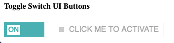
从上面可以明显看出,包括开启和关闭在内的所有内容都是由 CSS 创建的。
 关闭
关闭
 切换至
切换至
最后,我们将创建切换按钮 2。它也将是一个复选框。
<label for="toggle2" class="toggle-2">
          <input type="checkbox" id="toggle2" class="toggle-2__input" />
          <span class="toggle-2__button">Click me to activate</span>
        </label>
切换按钮 2 的 CSS 如下所示。
.toggle-2 {
    font-family: Helvetica, Arial, sans-serif;
    font-size: 1rem;
    display: inline-block;
    vertical-align: top;
    margin: 0 15px 0 0;
  }
  .toggle-2__input {
    display: none;
  }
  .toggle-2__button {
    position: relative;
    display: inline-block;
    line-height: 20px;
    text-transform: uppercase;
    background-color: #ffffff;
    color: #aaaaaa;
    border: 1px solid #cccccc;
    padding: 5px 10px 5px 30px;
    transition: all 0.3s ease;
    cursor: pointer;
  }
  .toggle-2__button:before {
    position: absolute;
    top: 10px;
    left: 10px;
    right: auto;
    display: inline-block;
    width: 10px;
    height: 10px;
    background-color: #cccccc;
    content: "";
    transition: all 0.3s ease;
  }
  .toggle-2__input:checked + .toggle-2__button {
    background-color: #00b3b4;
    border-color: #00b3b4;
    color: #ffffff;
  }
  .toggle-2__input:checked + .toggle-2__button:before {
    background-color: #ffffff;
  }
这里,我们有一个漂亮的可点击按钮。
 可点击的切换按钮
单击按钮将改变背景。
 切换按钮 2 已更改。
第一天的学习就到此结束了,我们学习了如何创建不同类型的按钮。你可以在这个 GitHub链接中找到上述代码。
文章来源:https://dev.to/nabendu82/css3-in-10-days-day-1-23da