 后端开发教程 - Java、Spring Boot 实战 - msg200.com
如何使用 HTML 和 CSS 创建马来西亚国旗🇲🇾
马来西亚62岁啦!🎉马来西亚,生日快乐!🎂
为了庆祝这个重要的日子,我决定仅使用 HTML 和 CSS 创建马来西亚国旗,不使用任何 JavaScript、SVG,当然也不使用任何图像。
嗯……不过技术上我可以用表情符号吧?或者我可以用这个 NPM 包?
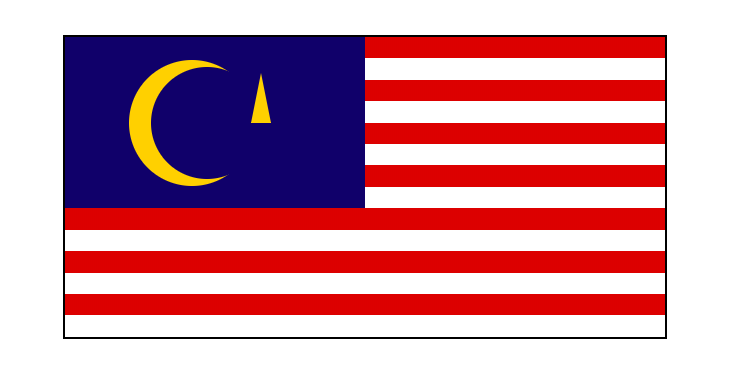
马来西亚国旗 - Jalur Gemilang 🇲🇾
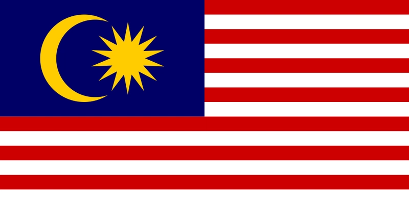
马来西亚国旗,又称马来语:Jalur Gemilang(“荣耀条纹”),由14 条红白相间的条纹和蓝色方框组成,蓝色方框上有新月和14 角星,被称为 Bintang Persekutuan(联邦之星)。
以下是我需要使用 HTML 和 CSS 创建的组件:
- 14 条红白相间的条纹:听起来很简单😎
- 新月:嗯,里面有一个大圆圈和一个小圆圈?🤔
- 14 角星:我完全不知道该怎么做🤭
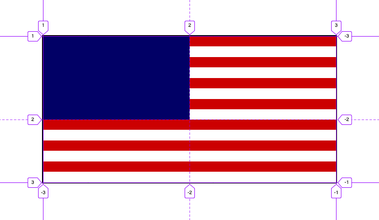
步骤 1:使用 CSS 网格创建旗帜布局
首先,我将使用CSS Grid创建旗帜布局。
这非常简单,我将使用grid-template-rows和grid-template-columns属性来创建具有 2 行 2 列的标志布局。
然后,我将使用grid-column: span 2将底部列扩展为整行(或 2 列)。
| <style> | |
| :root { | |
| --white: #fff; | |
| --black: #000; | |
| --blue: #010066; | |
| } | |
| .flag { | |
| display: grid; | |
| grid-template-rows: 4fr 3fr; | |
| grid-template-columns: 50% 50%; | |
| background-color: var(--white); | |
| border: 2px solid var(--black); | |
| width: 600px; | |
| height: 300px; | |
| } | |
| .top-left { | |
| background-color: var(--blue); | |
| } | |
| .bottom { | |
| grid-column: span 2; | |
| } | |
| </style> | |
| <div class="flag"> | |
| <div class="top-left"></div> | |
| <div class="top-right"></div> | |
| <div class="bottom"></div> | |
| </div> |

第 2 步:14 条交替的红白条纹
辉煌条纹由7 条红色条纹和 7 条白色条纹组成。其中 8 条条纹位于右上四分之一,其余 6 条条纹位于旗帜的底部。
我现在需要做的是创建 14<div>并使用 CSS :nth-child(even)和 :nth-child(odd)规则来设置条纹样式。
但是还有其他更好的方法吗?🤔
嗯...如何使用repeating-linear-gradient?
该
repeating-linear-gradient()CSS 函数创建由重复线性渐变组成的图像。它与 类似linear-gradient(),参数也相同,但它会在所有方向上无限重复颜色停止,以覆盖整个容器。- MDN Web 文档
| <style> | |
| .top-right { | |
| background: repeating-linear-gradient( | |
| 0deg, | |
| var(--red), | |
| var(--white) 0 12.5%, /* 12.5% = 100% divide by 8 stripes */ | |
| var(--red) 12.5% 25% | |
| ); | |
| } | |
| .bottom { | |
| background: repeating-linear-gradient( | |
| 0deg, | |
| var(--red), | |
| var(--white) 0 16.7%, /* 16.7% = 100% divide by 6 stripes */ | |
| var(--red) 16.7% 33.3% | |
| ); | |
| } | |
| </style> | |
| <body> | |
| <div class="top-right"></div> | |
| <div class="bottom"></div> | |
| </body> |
这样,我repeating-linear-gradient就不用写 14 了,就能创建 14 条红白条纹<div>!CSS 太棒了!🎉
第 3 步:新月形
可以使用带有内阴影的圆圈来创建新月,这可以使用inset值来完成。(感谢谷歌!)
| <style> | |
| .moon { | |
| position: relative; | |
| width: 120px; | |
| height: 120px; | |
| margin-right: -4px; | |
| border-radius: 50%; | |
| box-shadow: inset 15px 0px 0 7px var(--yellow); | |
| } | |
| </style> | |
| <div class="moon"></div> |
| <style> | |
| .moon { | |
| position: relative; | |
| width: 120px; | |
| height: 120px; | |
| margin-right: -4px; | |
| border-radius: 50%; | |
| box-shadow: inset 15px 0px 0 7px var(--yellow); | |
| } | |
| </style> | |
| <div class="moon"></div> |
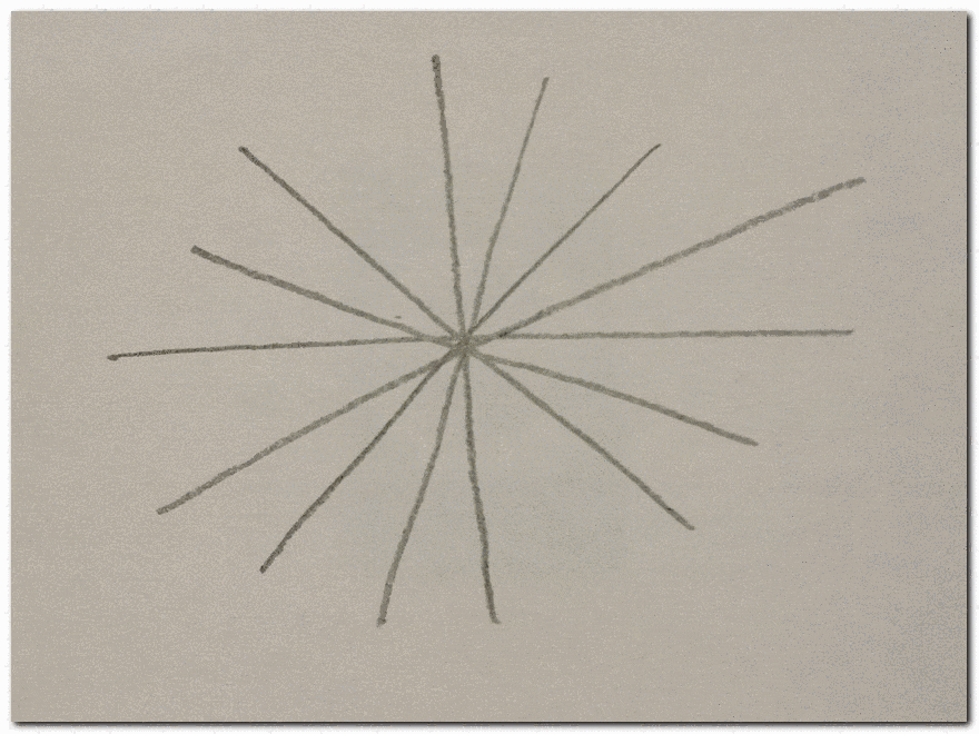
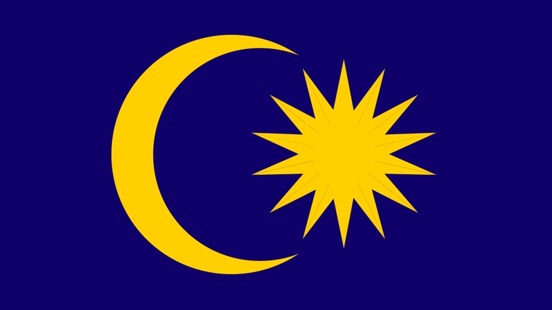
步骤 4:十四角星
就在那一刻,我意识到我完全不知道如何使用 CSS 创建一个 14 角星。(而且我也忘了如何手绘这个 14 角星🤦♀️)

因此,经过一些简单的研究(即谷歌搜索),我发现了 3 种绘制 14 角星的方法:
方法 1:画 7 条线,然后在每条线尖之间画一个“V”。
- 😀 在纸上画起来非常容易
- 😕 不知道如何用 CSS 重新创建它
方法二:用圆围成14个三角形。
- 😀 易于在纸上绘制
- ☹️ 很难用 CSS 重新创建它

方法 3: 7 个具有不同旋转值的长菱形。
- 🤷♀️ 我猜没人用这种方法在纸上画画吧?
- 😍 使用 CSS 重新创建它非常容易
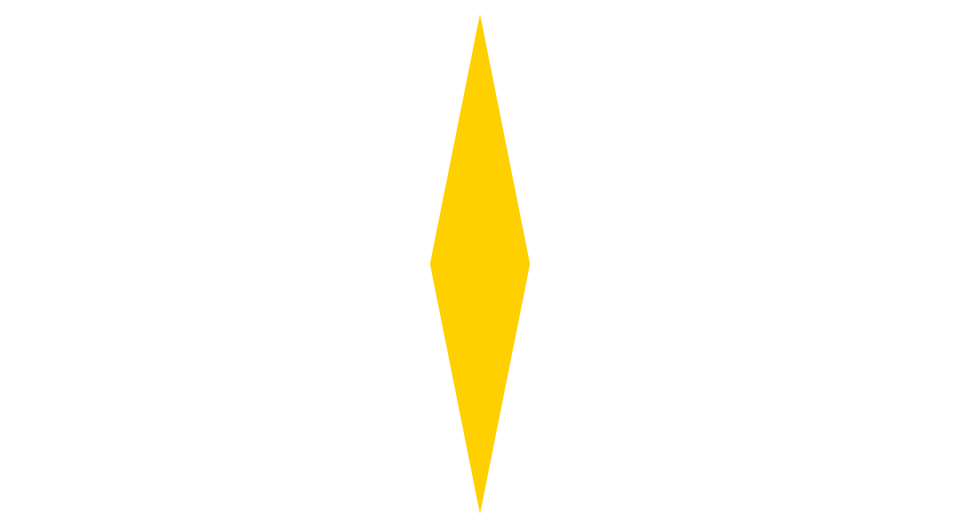
好的,现在我已经找到了使用 CSS 创建 14 角星的方法,下一步是创建具有不同旋转值的 14 个长菱形。
长菱形可以用两个等腰三角形来创建。代码如下:
| <style> | |
| .star { | |
| position: relative; | |
| width: 0; | |
| height: 0; | |
| margin-top: -50px; | |
| border-left: 10px solid transparent; | |
| border-right: 10px solid transparent; | |
| border-bottom: 50px solid var(--yellow); | |
| } | |
| .star:before { | |
| content: ""; | |
| position: absolute; | |
| border-left: 10px solid transparent; | |
| border-right: 10px solid transparent; | |
| border-top: 50px solid var(--yellow); | |
| left: -10px; | |
| top: 50px; | |
| } | |
| </style> | |
| <div class="stars"> | |
| <div class="star-container"> | |
| <div class="star"></div> | |
| </div> | |
| </div> |
下一步是将长菱形再复制6次,并为其添加CSS旋转函数。最终代码如下:
| <style> | |
| .star-container:nth-child(2) { | |
| transform: rotate(calc(180deg / 7)); | |
| } | |
| .star-container:nth-child(3) { | |
| transform: rotate(calc(180deg / 7 * 2)); | |
| } | |
| .star-container:nth-child(4) { | |
| transform: rotate(calc(180deg / 7 * 3)); | |
| } | |
| .star-container:nth-child(5) { | |
| transform: rotate(calc(180deg / 7 * 4)); | |
| } | |
| .star-container:nth-child(6) { | |
| transform: rotate(calc(180deg / 7 * 5)); | |
| } | |
| .star-container:nth-child(7) { | |
| transform: rotate(calc(180deg / 7 * 6)); | |
| } | |
| </style> | |
| <div class="stars"> | |
| <div class="star-container"> | |
| <div class="star"></div> | |
| </div> | |
| <div class="star-container"> | |
| <div class="star"></div> | |
| </div> | |
| <div class="star-container"> | |
| <div class="star"></div> | |
| </div> | |
| <div class="star-container"> | |
| <div class="star"></div> | |
| </div> | |
| <div class="star-container"> | |
| <div class="star"></div> | |
| </div> | |
| <div class="star-container"> | |
| <div class="star"></div> | |
| </div> | |
| <div class="star-container"> | |
| <div class="star"></div> | |
| </div> | |
| </div> |
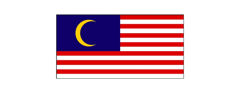
结果🇲🇾
好了,我已经成功使用 30 行 HTML 和约 120 行 CSS 创建了马来西亚国旗。🎉
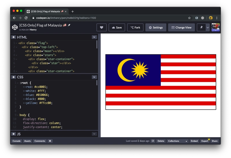
您可以在 CodePen 上查看完整代码:codepen.io/limhenry/pen/mdbEGYg
下一步是什么?
然而,这还不够完美。还有一些地方可以改进:
😤 问题 #1:亚像素渲染
如果您在 Firefox 中打开CodePen 链接,您可能会注意到亚像素渲染问题(14 角星中的奇怪线条)。
不过,实际上可以使用transform: translateZ(1px);(参见第 111 行)来修复它。这样,浏览器将使用硬件加速或 GPU 加速来渲染它,而不是使用浏览器较慢的软件渲染引擎。
😅 问题 #2:旗帜无响应
这可以用几行 JavaScript 代码来完成,但也许我可以为此写另一篇文章? 🤔
不管怎样,我该去吃一些椰浆饭了😋 马来西亚生日快乐!🎉