 后端开发教程 - Java、Spring Boot 实战 - msg200.com
使用 React Native 创建自定义动画标签栏
如果你觉得 React Navigation 默认的标签栏组件太过平淡,或者只是想创建一个更现代的外观,那么你和我一样。在本指南中,我将向你展示如何创建自定义标签栏,并与 React Navigation 配合使用。
编辑:我扩展了这个示例,并将代码发布到了 GitHub 上。链接:
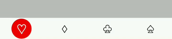
最终产品的外观如下
具体步骤如下。首先,我们初始化一个新项目,并安装一些依赖项。之后,我们将在终端中运行一些命令。
$ react-native init CustomTabBar
$ cd CustomTabBar
$ npm install react-navigation react-native-gesture-handler react-native-pose
React Navigation 自 v3 起需要 react-native-gesture-handler,因此我们必须安装它,而 react-native-pose 是一个很棒的库,我们将使用它来使动画变得非常简单。
现在,为了让 react-native-gesture-handler 在 Android 上运行,还需要一个链接步骤。所有步骤的说明都写在了https://reactnavigation.org/docs/en/getting-started.html#installation上,所以我将跳过设置部分。
现在我们可以真正启动应用程序并编写标签栏了。
首先,我们将创建一个目录结构来帮助保持事物井然有序。
/android
/ios
...
/src
  /AppEntry.js
  /router
    /router.js
    /index.js
  /components
  /screens
/index.js
首先,我们将创建一个src目录,将我们的代码与项目根目录中的其他文件(package.json、app.json、.gitignore 等)分开。screens、components和router目录的含义不言自明。
App.js我们从项目根目录中删除默认文件并更改index.js为导入/src/AppEntry.js
/* /index.js */


/** @format */

import { AppRegistry } from "react-native";
import App from "./src/AppEntry";
import { name as appName } from "./app.json";

AppRegistry.registerComponent(appName, () => App);
现在我们要使用 react-navigation 创建路由器,但首先我们需要创建一些虚拟屏幕。我们将创建一个通用的 Screen 组件,它接受一个名称并显示该名称来模拟多个屏幕。
我们向文件中添加一些导出内容/src/screens/index.js,如下所示
/* /src/screens/index.js */

import React from "react";

import Screen from "./Screen";

export const HomeScreen = () => <Screen name="Home" />;
export const SearchScreen = () => <Screen name="Search" />;
export const FavoritesScreen = () => <Screen name="Favorites" />;
export const ProfileScreen = () => <Screen name="Profile" />;
现在我们创建屏幕组件。
/* /src/screens/Screen.js */

import React from "react";
import { Text, View, StyleSheet } from "react-native";

const S = StyleSheet.create({
  container: {
    flex: 1,
    backgroundColor: "#bbbbbb",
    justifyContent: "center",
    alignItems: "center"
  },
  text: { fontSize: 28, color: "#222222", textAlign: "center" }
});

const Screen = ({ name }) => (
  <View style={S.container}>
    <Text style={S.text}>This is the "{name}" screen</Text>
  </View>
);

export default Screen;
是时候创建路由器了。
首先让我们将导出添加到/src/router/index.js
/* /src/router/index.js */

export { default as Router } from "./router";
现在,让我们在 中创建基本的 BottomTabNavigator router.js。我们将导入我们的屏幕,并使用createBottomTabNavigator创建一个默认的标签导航器。
/* /src/router/index.js */

import { createAppContainer, createBottomTabNavigator } from "react-navigation";

import {
  HomeScreen,
  SearchScreen,
  FavoritesScreen,
  ProfileScreen
} from "../screens";

const TabNavigator = createBottomTabNavigator({
  HomeScreen,
  SearchScreen,
  FavoritesScreen,
  ProfileScreen
});

export default createAppContainer(TabNavigator);
现在我们在AppEntry.js
/* /src/AppEntry.js */

import React from "react";

import { Router } from "./router";

export default () => <Router />;
当我们重新加载应用程序时,我们应该看到这个屏幕:

默认标签栏支持图标,所以我们来添加一些图标。本教程将使用 ASCII 字符,但在实际应用中,您可以使用 react-native-vector-icons 或自定义图标字体。
name让我们创建一个接受道具并color返回图标的Icon 组件。
/* /src/components/index.js */

export { default as Icon } from "./Icon";
/* /src/components/Icon.js */

import React from "react";
import { Text } from "react-native";

const iconMap = {
  home: "♡",
  search: "♢",
  favorites: "♧",
  profile: "♤"
};

const Icon = ({ name, color, style, ...props }) => {
  const icon = iconMap[name];

  return <Text style={[{ fontSize: 26, color }, style]}>{icon}</Text>;
};

export default Icon;
现在我们可以在路由器中使用这个组件了。我们将屏幕更改router.js为接受带有 prop 的对象navigationOptions。默认标签栏将 tintColor 传递给图标组件,因此我们使用它来设置图标颜色。
/* /src/router/router.js */

const TabNavigator = createBottomTabNavigator({
  HomeScreen: {
    screen: HomeScreen,
    navigationOptions: {
      tabBarIcon: ({ tintColor }) => <Icon name="home" color={tintColor} />
    }
  },
  SearchScreen: {
    screen: SearchScreen,
    navigationOptions: {
      tabBarIcon: ({ tintColor }) => <Icon name="search" color={tintColor} />
    }
  },
  FavoritesScreen: {
    screen: FavoritesScreen,
    navigationOptions: {
      tabBarIcon: ({ tintColor }) => <Icon name="favorites" color={tintColor} />
    }
  },
  ProfileScreen: {
    screen: ProfileScreen,
    navigationOptions: {
      tabBarIcon: ({ tintColor }) => <Icon name="profile" color={tintColor} />
    }
  }
});
它看起来是这样的

现在我们的标签栏看起来好多了,但它仍然是 React-navigation 的默认标签栏。接下来我们将添加实际的自定义标签栏组件。
让我们首先创建一个自定义的 TabBar 组件,该组件仅呈现一些文本并记录道具,以便我们实际看到从导航器获取的道具。
/* /src/components/index.js */

export { default as Icon } from "./Icon";
export { default as TabBar } from "./TabBar";
/* /src/components/TabBar.js */

import React from "react";
import { Text } from "react-native";

const TabBar = props => {
  console.log("Props", props);

  return <Text>Custom Tab Bar</Text>;
};

export default TabBar;
我们需要设置路由器,使其使用自定义标签栏。我们可以将以下配置作为 createBottomTabNavigator 的第二个参数添加进去。
/* /src/router/router.js */

...
import { Icon, TabBar } from "../components";

const TabNavigator = createBottomTabNavigator(
  {
    HomeScreen: { /* ... */ },
    SearchScreen: { /* ... */ }
  },

  {
    tabBarComponent: TabBar,
    tabBarOptions: {
      activeTintColor: "#4F4F4F",
      inactiveTintColor: "#ddd"
    }
  }
);
...
如果我们检查标签栏的日志,我们会发现导航状态navigation.state也包含路由信息。此外,还有renderIcon函数onTabPress以及许多其他我们可能需要的内容。此外,我们还注意到tabBarOptions我们在路由器配置中设置的内容是如何作为 props 注入到组件中的。
现在我们可以开始编写标签栏了。首先,我们尝试重新创建默认的标签栏。我们将在容器上设置一些样式,将标签按钮排成一行,并为每个路由渲染一个标签按钮。我们可以使用该renderIcon函数来渲染正确的图标——仔细研究源代码后发现,它需要一个形状为 的对象{ route, focused, tintColor }。我们添加 onPress 处理程序和辅助功能标签,瞧——我们就有了一个默认的标签栏。
/* /src/components/TabBar.js */

import React from "react";
import { View, Text, StyleSheet, TouchableOpacity } from "react-native";

const S = StyleSheet.create({
  container: { flexDirection: "row", height: 52, elevation: 2 },
  tabButton: { flex: 1, justifyContent: "center", alignItems: "center" }
});

const TabBar = props => {
  const {
    renderIcon,
    getLabelText,
    activeTintColor,
    inactiveTintColor,
    onTabPress,
    onTabLongPress,
    getAccessibilityLabel,
    navigation
  } = props;

  const { routes, index: activeRouteIndex } = navigation.state;

  return (
    <View style={S.container}>
      {routes.map((route, routeIndex) => {
        const isRouteActive = routeIndex === activeRouteIndex;
        const tintColor = isRouteActive ? activeTintColor : inactiveTintColor;

        return (
          <TouchableOpacity
            key={routeIndex}
            style={S.tabButton}
            onPress={() => {
              onTabPress({ route });
            }}
            onLongPress={() => {
              onTabLongPress({ route });
            }}
            accessibilityLabel={getAccessibilityLabel({ route })}
          >
            {renderIcon({ route, focused: isRouteActive, tintColor })}

            <Text>{getLabelText({ route })}</Text>
          </TouchableOpacity>
        );
      })}
    </View>
  );
};

export default TabBar;
它看起来是这样的:

现在我们知道可以灵活地创建自己的标签栏了,因此我们可以开始实际扩展它。我们将使用 react-native-pose 创建一个动画视图,用于突出显示活动路由——我们称之为“聚光灯”。
首先,我们可以移除标签。然后在标签栏后面添加一个绝对视图来放置聚光灯。我们使用 Dimensions API 计算聚光灯的偏移量。
/* /src/components/TabBar.js */

import posed from "react-native-pose";

const windowWidth = Dimensions.get("window").width;
const tabWidth = windowWidth / 4;
const SpotLight = posed.View({
  route0: { x: 0 },
  route1: { x: tabWidth },
  route2: { x: tabWidth * 2 },
  route3: { x: tabWidth * 3 }
});

...
const S = StyleSheet.create({
  /* ... */
  spotLight: {
    width: tabWidth,
    height: "100%",
    backgroundColor: "rgba(128,128,255,0.2)",
    borderRadius: 8
  }
});

  /* ... */


    <View style={S.container}>
      <View style={StyleSheet.absoluteFillObject}>
        <SpotLight style={S.spotLight} pose={`route${activeRouteIndex}`} />
      </View>

      {routes.map((route, routeIndex) => {
        /* ... */
      }}
    </View>
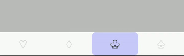
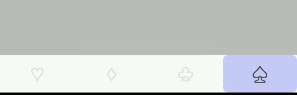
它看起来是这样的:
请注意,我们从未指定动画的持续时间和行为。Pose 会处理这些,并提供合理的默认值。
现在,我们将为活动图标添加一些缩放效果。让我们创建另一个已摆好姿势的视图 (View)。
/* /src/components/TabBar.js */

...

const Scaler = posed.View({
  active: { scale: 1.25 },
  inactive: { scale: 1 }
});

...
现在我们可以像这样将图标包装在我们的 Scaler 组件中。
/* /src/components/TabBar.js */

<Scaler style={S.scaler} pose={isRouteActive ? "active" : "inactive"}>
  {renderIcon({ route, focused: isRouteActive, tintColor })}
</Scaler>
我们得到了这个效果。
我们的标签栏看起来已经很不错了。剩下要做的就是稍微完善一下,更改一下配色方案,调整一下聚光灯,这样我们的组件就完成了。

现在,我们还有一些可以改进的地方。例如,当前的实现假设标签导航器中始终有 4 个屏幕,聚光灯颜色在标签栏组件中是硬编码的,并且样式应该可以通过路由器上的 tabBarOptions 配置进行扩展,但我暂时不讨论这些。
TabBar 组件的完整源代码
/* /src/components/TabBar.js */

import React from "react";
import {
  View,
  Text,
  StyleSheet,
  TouchableOpacity,
  Dimensions
} from "react-native";
import posed from "react-native-pose";

const windowWidth = Dimensions.get("window").width;
const tabWidth = windowWidth / 4;
const SpotLight = posed.View({
  route0: { x: 0 },
  route1: { x: tabWidth },
  route2: { x: tabWidth * 2 },
  route3: { x: tabWidth * 3 }
});

const Scaler = posed.View({
  active: { scale: 1.25 },
  inactive: { scale: 1 }
});

const S = StyleSheet.create({
  container: {
    flexDirection: "row",
    height: 52,
    elevation: 2,
    alignItems: "center"
  },
  tabButton: { flex: 1 },
  spotLight: {
    width: tabWidth,
    height: "100%",
    justifyContent: "center",
    alignItems: "center"
  },
  spotLightInner: {
    width: 48,
    height: 48,
    backgroundColor: "#ee0000",
    borderRadius: 24
  },
  scaler: { flex: 1, alignItems: "center", justifyContent: "center" }
});

const TabBar = props => {
  const {
    renderIcon,
    activeTintColor,
    inactiveTintColor,
    onTabPress,
    onTabLongPress,
    getAccessibilityLabel,
    navigation
  } = props;

  const { routes, index: activeRouteIndex } = navigation.state;

  return (
    <View style={S.container}>
      <View style={StyleSheet.absoluteFillObject}>
        <SpotLight style={S.spotLight} pose={`route${activeRouteIndex}`}>
          <View style={S.spotLightInner} />
        </SpotLight>
      </View>

      {routes.map((route, routeIndex) => {
        const isRouteActive = routeIndex === activeRouteIndex;
        const tintColor = isRouteActive ? activeTintColor : inactiveTintColor;

        return (
          <TouchableOpacity
            key={routeIndex}
            style={S.tabButton}
            onPress={() => {
              onTabPress({ route });
            }}
            onLongPress={() => {
              onTabLongPress({ route });
            }}
            accessibilityLabel={getAccessibilityLabel({ route })}
          >
            <Scaler
              pose={isRouteActive ? "active" : "inactive"}
              style={S.scaler}
            >
              {renderIcon({ route, focused: isRouteActive, tintColor })}
            </Scaler>
          </TouchableOpacity>
        );
      })}
    </View>
  );
};

export default TabBar;
以及路由器配置
/* /src/router/router.js */

...

const TabNavigator = createBottomTabNavigator(
  /* screen config ommited */,
  {
    tabBarComponent: TabBar,
    tabBarOptions: {
      activeTintColor: "#eeeeee",
      inactiveTintColor: "#222222"
    }
  }
);

...