 后端开发教程 - Java、Spring Boot 实战 - msg200.com
RN 屏幕转换:创建一个可转换为屏幕的按钮
让我们开始吧
屏幕变换动画
按钮动画
将 AddButton 放在标签栏中
iPhone 10+ 的插图
我最近在 AppStore 和 PlayStore 上发布了一款名为Sweepy的 React Native 应用。在开发过程中,我在 Twitter 上分享了我的开发进度。我对那条展示这个动画的推文印象非常深刻:
在今天的文章中,我将向你展示我是如何做到这一点的。如果你太忙没时间阅读,想直接看最终的代码,这里有我创建的GitHub 仓库。在我的教程中,我放慢了所有 GIF 的播放速度,以便你更好地观看动画。
让我们开始吧
让我们初始化我们的项目。我将使用 TypeScript 编写代码。如果您对如何使用 TypeScript 和 Airbnb linter 设置 React Native 项目感兴趣,可以查看我的另一篇教程。
首先,我们安装 react-navigation 及其依赖项:
yarn add @react-navigation/native react-native-reanimated react-native-gesture-handler react-native-screens react-native-safe-area-context @react-native-community/masked-view
我们将使用底部标签导航器,因此让我们安装@react-navigation/bottom-tabs 以及@react-navigation/stack:
yarn add @react-navigation/bottom-tabs @react-navigation/stack
如果您为 iOS 开发,请不要忘记运行 pod install。
cd ios && pod install
让我们从 App.tsx 开始。首先在文件顶部导入“react-native-gesture-handler”,并创建一个路由器。如您在示例中所见,我设置了一个堆栈导航器,其中包含一个 BottomTabNavigator 和一个模态屏幕,它们都位于同一个根堆栈中。
import 'react-native-gesture-handler';
import React from 'react';
import { NavigationContainer } from '@react-navigation/native';
import { createBottomTabNavigator } from '@react-navigation/bottom-tabs';
import { createStackNavigator } from '@react-navigation/stack';
import { View, Text } from 'react-native';

type TabBarStackParamList = {
  Home: undefined,
}

type RootStackParamList = {
  TabBar: TabBarStackParamList,
  Modal: undefined,
}


const HomeScreen = () => (
  <View style={{ flex: 1, justifyContent: 'center', alignItems: 'center' }}>
    <Text>Home</Text>
  </View>
);

const ModalScreen = () => (
  <View style={{
    flex: 1, justifyContent: 'center', alignItems: 'center', backgroundColor: 'navy',
  }}
  >
    <Text>Modal</Text>
  </View>
);

const TabBarStack = createBottomTabNavigator<TabBarStackParamList>();
const TabBarStackScreen = () => (
  <TabBarStack.Navigator>
    <TabBarStack.Screen name="Home" component={HomeScreen} />
  </TabBarStack.Navigator>
);

const RootStack = createStackNavigator<RootStackParamList>@();

// we are nesting TabBarStack in RootStack as a screen
const App = () => (
  <NavigationContainer>
    <RootStack.Navigator headerMode="none" mode="modal">
      <RootStack.Screen name="TabBar" component={TabBarStackScreen} />
      <RootStack.Screen name="Modal" component={ModalScreen} />
    </RootStack.Navigator>
  </NavigationContainer>
);

export default App;
现在让我们添加一个按钮来启动模态窗口。我会把它放在一个单独的文件夹中:src/components/add-button/index.tsx:
import React from 'react';
import { TouchableOpacity, Text, StyleSheet } from 'react-native';

// I put the button in absolute position because I want it to be on top of everything behind it

const styles = StyleSheet.create({
  container: {
    backgroundColor: 'navy',
    width: 55,
    height: 55,
    borderRadius: 28,
    position: 'absolute',
    right: 20,
    alignItems: 'center',
    justifyContent: 'center',
    bottom: 20,
    zIndex: 1,
    elevation: 1,
  },

  text: {
    color: 'white',
    fontSize: 24,
    fontWeight: 'bold',
  },
});

type AddButtonProps = {
  onAdd: () => void,
}

const AddButton = ({ onAdd } : AddButtonProps) => (
  <TouchableOpacity
    style={styles.container}
    onPress={onAdd}
  >
    <Text style={styles.text}>
      +
    </Text>
  </TouchableOpacity>
);

export default AddButton;
如你所见,我们的按钮有一个名为 onAdd 的 prop。点击按钮后,此函数将被调用。现在,我们将此 AddButton 组件添加到主屏幕:
// in App.tsx
...
import { NavigationContainer, CompositeNavigationProp } from '@react-navigation/native';
import { createBottomTabNavigator, BottomTabNavigationProp } from '@react-navigation/bottom-tabs';
import { createStackNavigator, StackNavigationProp } from '@react-navigation/stack';
import AddButton from './src/components/add-button';
...
type TabBarStackParamList = {
  Home: undefined,
}

type RootStackParamList = {
  TabBar: TabBarStackParamList,
  Modal: undefined,
}

interface HomeScreenProps {
  navigation: CompositeNavigationProp<
  BottomTabNavigationProp<TabBarStackParamList, 'Home'>,
  StackNavigationProp<RootStackParamList>
>;
}
// I hope I did all type checking properly.
// If not, let me know in the comment section.

const HomeScreen = ({ navigation }: HomeScreenProps) => {
  const onAdd = () => {
    navigation.navigate('Modal');
  };

  return (
    <>
      <View style={{ flex: 1, justifyContent: 'center', alignItems: 'center' }}>
        <Text>Home</Text>
      </View>
      <AddButton onAdd={onAdd} />
    </>
  );
};
...
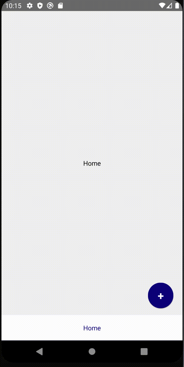
我们完成了基础工作,它看起来应该是这样的: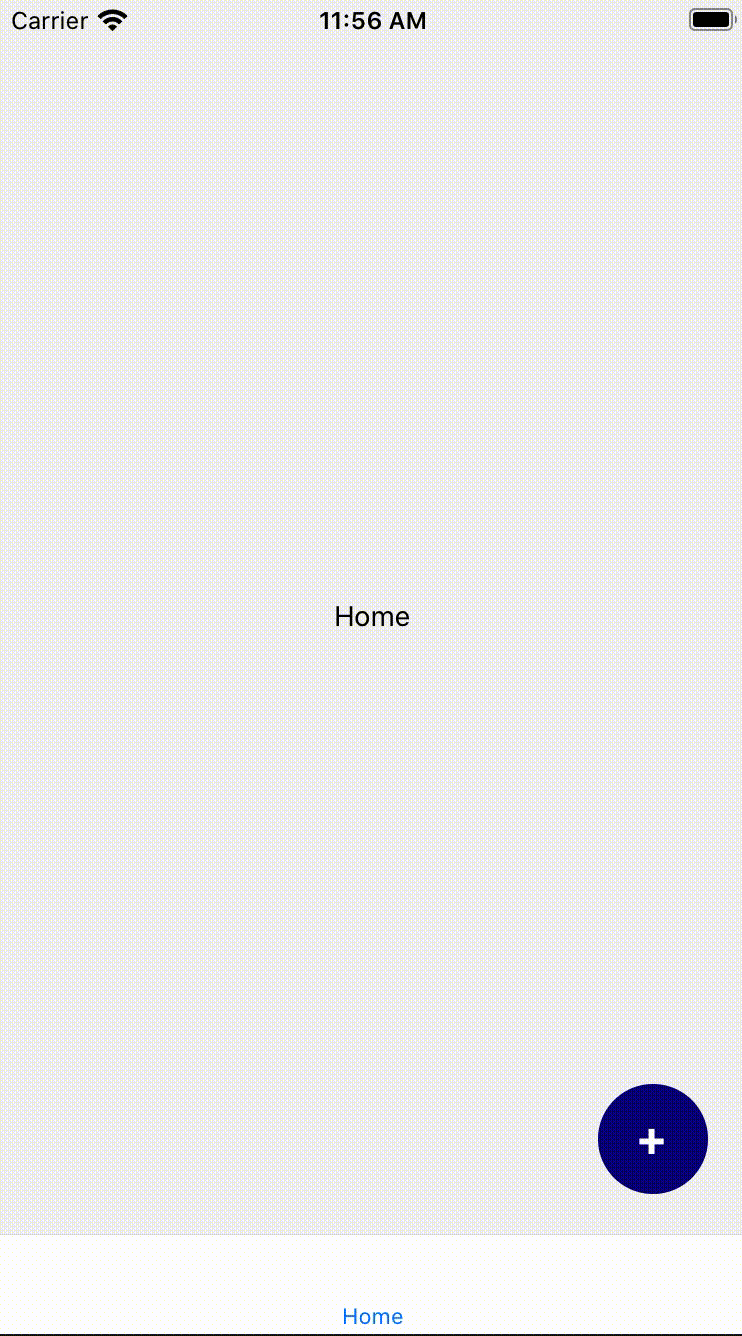
屏幕变换动画
现在,我们将编写一个自定义屏幕过渡效果,用于两个屏幕(主屏幕和模态窗口)之间的切换。我们希望实现淡入淡出动画,这样当屏幕打开或关闭时,透明度也会随之改变。为此,我们将使用RootStack.Navigator中的screenOptions属性。
// in App.js
...
const opacityTransition: object = {
  gestureDirection: 'horizontal', // we will swipe right if we want to close the screen;
  transitionSpec: {
    open: {
      animation: 'timing',
    },
    close: {
      animation: 'timing',
      config: {
        duration: 300,
      },
    },
  },
  cardStyleInterpolator: ({ current } : {current: {progress: number}}) => ({
    cardStyle: {
      opacity: current.progress,
    }, // updates the opacity depending on the transition progress value of the current screen
  }),
};
...
const App = () => (
  <NavigationContainer>
    {/* Don't forget to set headerMode="none" and mode="modal" */}
    <RootStack.Navigator headerMode="none" mode="modal" screenOptions={{ ...opacityTransition }}>
      <RootStack.Screen name="TabBar" component={TabBarStackScreen} />
      <RootStack.Screen name="Modal" component={ModalScreen} />
    </RootStack.Navigator>
  </NavigationContainer>
);
如果您想了解更复杂的屏幕动画,建议您阅读React-navigation 的相关文档。
以下是此步骤的结果:
按钮动画
我们将缩放按钮,使其呈现出按钮变成屏幕的效果。我将使用 RN 中预置的 React Native 动画库。
in src/components/add-button/index.tsx
import { Animated } from 'react-native';

const AddButton = ({ onAdd } : AddButtonProps) => {
  const [scaleValue] = useState(new Animated.Value(0));
  const onButtonClicked = () => {
    // Don't forget about the callback function for Animated.timing.
    // After we finish scaling, we need to set the scale value back to 0;
    // If we don't do that, when we go back to the Home screen our button will still be scaled
    Animated.timing(scaleValue, {
      toValue: 1,
      useNativeDriver: true,
      duration: 700,
    }).start(() => { scaleValue.setValue(0); });
    onAdd();
  };

// You can test different input and output values.
// Just don't forget that inputRange is from 0 to 1 and outputRange starts from 1;
// These ranges looks the best for me
  const scaleValueInterpolation = scaleValue.interpolate({
    inputRange: [0, 0.25, 1],
    outputRange: [1, 20, 30],
  });

  return (
    <>
      <Animated.View
        style={[styles.container,
          { transform: [{ scale: scaleValueInterpolation }] },
        ]}
      />
      <TouchableOpacity
        style={styles.container}
        onPress={onButtonClicked}
      >
        <Text style={styles.text}>
          +
        </Text>
      </TouchableOpacity>
    </>
  );
};

export default AddButton;
为什么我没有把 TouchableOpacity 包裹在 Animated.View 中?我只是不想在 + 号上出现缩放效果。 对我来说,只有容器缩放看起来更好,所以我决定把动画缩放容器放在 TouchableOpacity 后面。 这是我们目前的结果: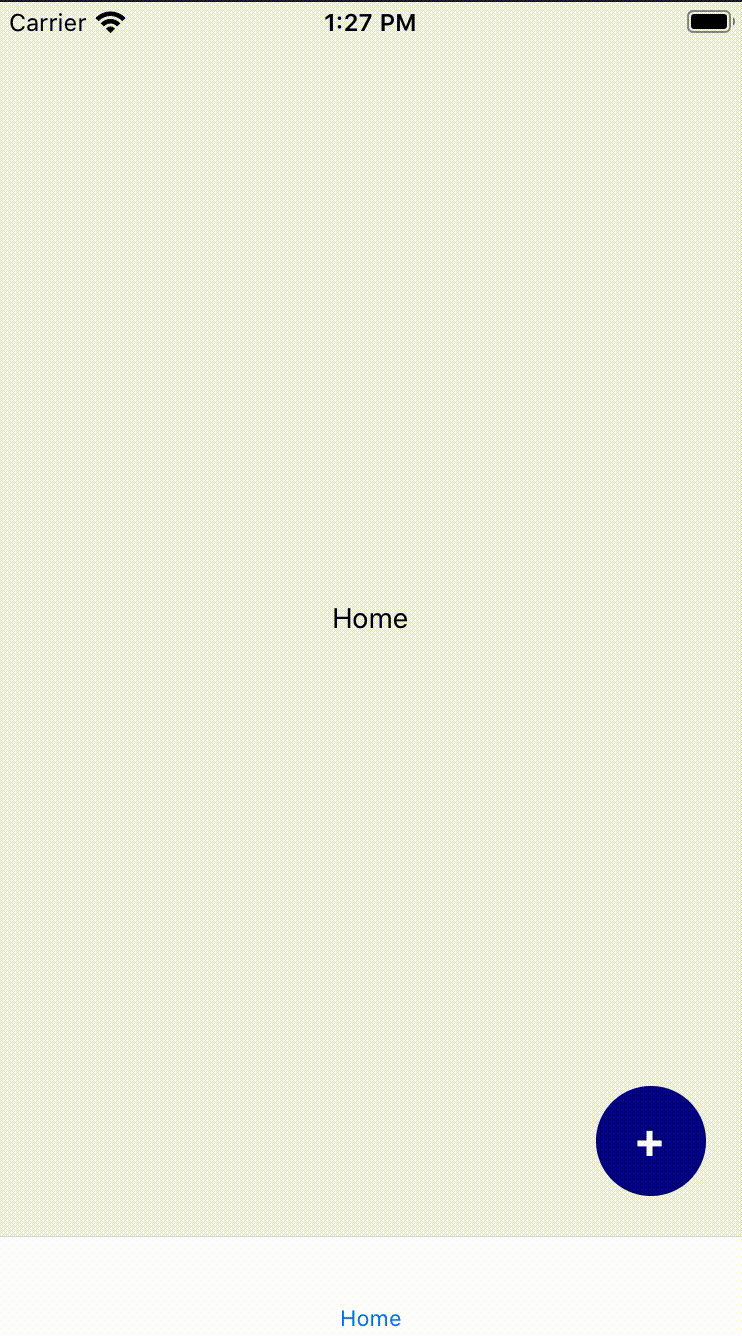

将 AddButton 放在标签栏中
正如我们在视频中看到的,按钮缩放动画没有与标签栏重叠,看起来不太美观。所以,让我们创建一个自定义标签栏,并将我们的 AddButton 组件放入其中。我将在src/components/tab-bar/index.tsx中创建 TabBar 组件:
import React from 'react';
import {
  TouchableOpacity, StyleSheet, View, Text,
} from 'react-native';
import { BottomTabBarProps } from '@react-navigation/bottom-tabs';
import { SafeAreaView } from 'react-native-safe-area-context';
import AddButton from '../add-button';


const styles = StyleSheet.create({
  tabButton: { flex: 1, justifyContent: 'center', alignItems: 'center' },
});


const TabBar = ({ state, descriptors, navigation } : BottomTabBarProps) => {
  const onAdd = () => {
    navigation.navigate('Modal');
  };

  return (
    <>
      {/* show the AddButton only if it's the first screen (Home screen) */}
      {(state.index === 0) && (
        <AddButton onAdd={onAdd} />
      )}
      <SafeAreaView style={{ backgroundColor: 'white' }}>
        <View style={{ height: 55, flexDirection: 'row' }}>
          {/* here we are mapping through the routes, defining its labels, configure the onPress functions */}
          {state.routes.map((route, index) => {
            const { options } = descriptors[route.key];
            let label;
            if (options.tabBarLabel === undefined) {
              if (options.title === undefined) {
                label = route.name;
              } else { label = options.title; }
            } else { label = options.tabBarLabel; }
            const isFocused = state.index === index;

            const onPress = () => {
              const event = navigation.emit({
                type: 'tabPress',
                target: route.key,
                canPreventDefault: true,
              });

              if (!isFocused && !event.defaultPrevented) {
                navigation.navigate(route.name);
              }
            };

            const onLongPress = () => {
              navigation.emit({
                type: 'tabLongPress',
                target: route.key,
              });
            };

            return (
              <TouchableOpacity
                accessibilityRole="button"
                accessibilityState={isFocused ? { selected: true } : { selected: false }}
                accessibilityLabel={options.tabBarAccessibilityLabel}
                testID={options.tabBarTestID}
                onPress={onPress}
                onLongPress={onLongPress}
                style={styles.tabButton}
                key={route.key}
              >
                <Text style={{ color: isFocused ? 'navy' : 'grey' }}>
                  {label}
                </Text>
              </TouchableOpacity>
            );
          })}
        </View>
      </SafeAreaView>
    </>

  );
};

export default TabBar;
现在我们需要将自定义标签栏放入路由器中,并从 HomeScreen 中删除 AddButton。
// in App.tsx
...
const HomeScreen = () => (
  <>
    <View style={{ flex: 1, justifyContent: 'center', alignItems: 'center' }}>
      <Text>Home</Text>
    </View>
  </>
);
...
const TabBarStack = createBottomTabNavigator<TabBarStackParamList>();
const TabBarStackScreen = () => (
  <TabBarStack.Navigator tabBar={(props) => <TabBar {...props} />}>
    <TabBarStack.Screen name="Home" component={HomeScreen} />
  </TabBarStack.Navigator>
);
...
另外,我们现在需要将 AddButton 放得稍微高一点,因为我们应该考虑到 TabBar 的高度。
// in src/components/add-button/index.tsx
const styles = StyleSheet.create({
  container: {
    backgroundColor: 'navy',
    width: 55,
    height: 55,
    borderRadius: 28,
    position: 'absolute',
    right: 20,
    alignItems: 'center',
    justifyContent: 'center',
    // bottom: 20,
    bottom: 75,
    zIndex: 1,
    elevation: 1,
  },
});
快完成了!现在我们需要考虑 iPhone 10 及更高版本的机型,因为它们有不同的 insets,我们需要考虑到它们。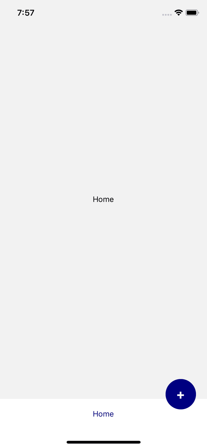
iPhone 10+ 的插图
为此,我们将使用已为 react-navigation 安装的 react-native-safe-area-context 创建一个名为 withInsets 的高阶组件。该库中的 SafeAreaConsumer 将为 iPhone 10+ 提供底部 insets。让我们在src/components/with-insets/index.tsx中创建一个新文件。
import React, { ComponentType } from 'react';
import { SafeAreaConsumer } from 'react-native-safe-area-context';

export type withInsetsProps = {
  insets: {
    bottom: number,
  }
};

const withInsets = (BaseComponent: ComponentType<any>) => (props: any) => (
  <SafeAreaConsumer>
    {(insets) => (
      <BaseComponent
        insets={{ bottom: insets?.bottom }}
        {...props}
      />
    )}
  </SafeAreaConsumer>
);

export default withInsets;
现在我们需要用 withInsets 包装我们的 TabBar 组件并将 insets 传递给 AddButton:
// in src/components/tab-bar/index.tsx
...
import withInsets, { withInsetsProps } from '../with-insets';
...
export type TabBarProps = BottomTabBarProps & withInsetsProps;

const TabBar = ({
  state, descriptors, navigation, insets,
} : TabBarProps) => {
  ...
  return (
    {(state.index === 0) && (
        <AddButton onAdd={onAdd} bottomInset={insets.bottom} />
     )}
     ...
  )
};

export default withInsets(TabBar);
下一步是在我们的 AddButton 组件中添加此插图:
// in src/components/add-button/index.tsx
...
type AddButtonProps = {
  onAdd: () => void,
  bottomInset: number
}

const AddButton = ({ onAdd, bottomInset } : AddButtonProps) => {
...
return (
    <>
      <Animated.View
        style={[styles.container,
          {
            transform: [{ scale: scaleValueInterpolation }],
            bottom: 70 + bottomInset,
          },
        ]}
      />
      <TouchableOpacity
        style={[styles.container, { bottom: 70 + bottomInset }]}
        onPress={onButtonClicked}
      >
        <Text style={styles.text}>
          +
        </Text>
      </TouchableOpacity>
    </>
  );
};

export default AddButton;
以下是 iPhone 10 及更高版本的最终结果: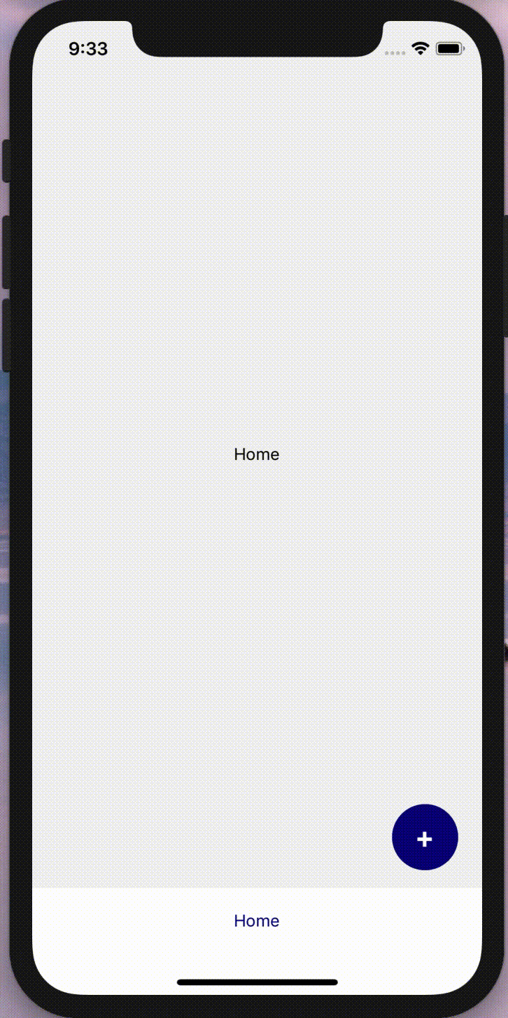
以下是它在 Android 上的样子: