 后端开发教程 - Java、Spring Boot 实战 - msg200.com
CSS 中的简单微交互(第一部分):汉堡菜单图标
无论您是设计师还是面向用户的开发者,您可能已经注意到微交互的重要性。让我们思考一下什么是微交互——它是一种围绕单个时刻或用例进行的交互,与应用程序其他部分正在发生的事情无关。因此,我认为有必要独立地审视它们,看看它们本身是如何运作和呈现的。
这是微交互系列的第一篇,将全面探讨汉堡菜单图标——网络上最常用的元素之一。我们将讲解三种最流行的动效,以及如何在 CSS 中复制它们。(部分 JS 代码仅用于切换类名)。
堆叠和旋转
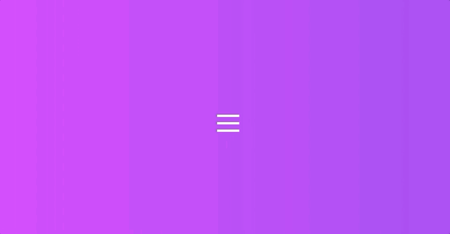
这是在许多应用程序和网站中可以看到的最广泛使用的交互之一,让我们来分析一下发生了什么。
- 将 3 块巧克力棒从中间叠放在一起
- 隐藏其中一个栏
- 将 2 个可见条旋转至 X
- 关闭时反向交互
让我们从准备 HTML 开始,我将使用 slim,因为它更简洁,但当然,您可以使用纯 HTML 或任何您喜欢的预处理器!
我们先在容器内绘制三个条形元素。大多数示例都以此为基础:
body
  .hamburger
    .bar
    .bar
    .bar
现在,对于 CSS,让我们通过将我们的条定位为看起来折叠(默认图标)来创建基础:
.hamburger {
  height: 2.3rem;
  width: 3rem;
  display: inline-block;
  cursor: pointer;
  position: relative;
}
.bar {
  border-bottom: 0.33rem solid white;
  position: absolute;
  display: block;
  width: 100%;
  &:first-of-type {
    top: 0;
  }
  &:nth-of-type(2) {
    top: 1rem;
  }
  &:nth-of-type(3) {
    top: 2rem;
  }
}
我们将通过切换 CSS 类来实现交互,这里有一个可以处理该问题的简短 JS:
const hamburger = document.querySelector('.hamburger');
hamburger.addEventListener('click', function(){
  hamburger.classList.toggle('opened');
});
现在基础已经准备好了,让我们直接开始动画吧。它由两部分组成:堆叠和旋转。我们将避免使用关键帧,而是设置 transition 属性,使其在不同时间触发。您可以将逗号分隔的值作为 传递。我们将像这样type-of-transition duration delay添加它:.opened .bar
transition:
  top 100ms,
  transform 100ms 230ms,
  opacity 100ms;
是时候为类应用样式了.opened,我们将淡出中间的栏,并移动和旋转顶部和底部的栏,先形成一条线,然后再形成 X。我们还将应用反向过渡时间,以便 X 变回堆叠图标。
.opened {
  .bar {
    transition:
      top 100ms,
      transform 100ms 230ms,
      opacity 100ms;
    &:first-of-type {
      top: 1em;
      transform: rotate(45deg);
    }
    &:nth-of-type(2) {
      opacity: 0;
    }
    &:nth-of-type(3) {
      top: 1em;
      transform: rotate(-45deg);
    }
  }
}
为了让它更有趣,我们还可以通过为和添加 transition-timing-function 来为动画添加一点快照.hamburger .bar效果.opened .bar
transition-timing-function: cubic-bezier(1, 0.05, 0.62, 1.78);
最终结果:
滑动和旋转

这种交互和上面的类似,只不过有人可能会说它更原始(或者更高效!),所有动画都可以一步完成。不过,我们先来看看整体上应该怎么做。
- 滑出中间栏并降低其不透明度
- 旋转另外 2 个条形,形成 X
我们将从前面的示例的基础开始,直接为条形元素添加效果。
我们的条形的初始位置是相同的,不同的是这次我们将添加transition: all以简化我们的代码,因为不需要多步动画,就像这样
.hamburger {
  height: 2.3rem;
  width: 3rem;
  display: inline-block;
  margin: 0 auto;
  cursor: pointer;
  position: relative;

  .bar {
    border-bottom: 0.33rem solid white;
    position: absolute;
    display: block;
    width: 100%;
    transition: all 350ms;
    transition-timing-function: cubic-bezier(1, 0.05, 0.62, 1.78);
    &:first-of-type {
      top: 0;
    }
    &:nth-of-type(2) {
      top: 1rem;
    }
    &:nth-of-type(3) {
      top: 2rem;
    }
  }
}
我们还将调整我们的opened类,特别是第二个元素,它现在需要向左滑出并变得透明:
.opened {
  .bar {
    &:first-of-type {
      top: 1em;
      transform: rotate(45deg);
    }
    &:nth-of-type(2) {
      opacity: 0;
      transform: translateX(-30px);
    }
    &:nth-of-type(3) {
      top: 1em;
      transform: rotate(-45deg);
    }
  }
}
最终结果:
翻动

翻转汉堡按钮是使用预制自定义图标的绝佳方式,也是我经常看到的一种设计。它的机制很简单,一侧是汉堡图标,另一侧是关闭图标,点击(或执行某些操作)时会翻转。
为了实现这一点,我们首先需要调整我们的 HTML(Slim)
body
  .hamburger
    .hamburger-button
      .icon-opened
        .bar
        .bar
        .bar
    .hamburger-button.hamburger-button-back
      .icon-closed
        .bar
        .bar
这应该会创建两个元素,一个元素我们将设计成条形图标的样子,另一个元素的形状像一个 x,用于.hamburger-button包裹背景和icon-包含条形元素的内部元素。没错,代码量确实不少,但这只是因为我们用 CSS 创建图标,如果你使用 SVG 图标,看起来应该会简单得多!
现在,让我们为外部元素添加 CSS
.hamburger {
  margin: 0 auto;

  &-button {
    border-radius: 100px;
    display: inline-block;
    cursor: pointer;
    background: linear-gradient(to right, #485563, #29323c);
    // the padding along with the inner wrap adds up to 6rem*6rem circle
    padding: 1.85rem 1.5rem;
  }
}
现在让我们添加图标。有些内容可以合并成更简洁的代码,但这里我们不会这么做,因为我想让代码尽可能容易理解和遵循。
  .icon-opened {
    height: 2.3rem;
    width: 3rem;
    position: relative;
    .bar {
      border-bottom: 0.33rem solid white;
      position: absolute;
      display: block;
      width: 100%;
      &:first-of-type {
        top: 0;
      }
      &:nth-of-type(2) {
        top: 1rem;
      }
      &:nth-of-type(3) {
        top: 2rem;
      }
    }
  }
  .icon-closed {
    height: 2.3rem;
    width: 3rem;
    position: relative;
    .bar {
      border-bottom: 0.33rem solid white;
      position: absolute;
      display: block;
      width: 100%;
      &:first-of-type {
        top: 1em;
        transform: rotate(45deg);
      }
      &:nth-of-type(2) {
        top: 1em;
        transform: rotate(-45deg);
      }
    }
  }
此时,您应该有两个图标彼此相邻,就像这样。

到这里,我们就可以开始制作动画了。JavaScript 代码和之前一样,只是在外部.hamburger元素上切换一个 class。我们将利用 CSS 3D 变换属性和定位。
首先,我们需要翻转 X 图标并将其放置在按钮的背面。为此,我们将.hamburger-button元素设置为绝对定位,并为元素添加 transform 属性-back。我们还会添加backface-visibility: hidden;,这个属性名听起来很容易理解,但它会隐藏元素的背面,通常应用于“可翻转”元素,以防止 z-indexing 和图层故障引起的闪烁。
 &-button {
    border-radius: 100px;
    display: inline-block;
    cursor: pointer;
    background: linear-gradient(to right, #485563, #29323c);
    // the padding along with the inner wrap adds up to 6rem*6rem circle
    padding: 1.85rem 1.5rem;
    position: absolute;
    top: 0;
    left: 0;
    backface-visibility: hidden;
    &-back {
      transform: rotateY(180deg);
    }
  }
我们还将为我们的主要.hamburger元素添加预定义的尺寸和过渡属性,并transform-style: preserve-3d确保嵌套元素也在 3D 空间中呈现。
.hamburger {
  margin: 0 auto;
  width: 6rem;
  height: 6rem;
  transition: all 300ms ease-in;
  transform-style: preserve-3d;
}
现在唯一要做的就是在添加类.hamburger时翻转整个元素!opened
最终结果:
这三个微交互完全可以用 CSS 实现,无需 SVG 或任何 JS 库。虽然它们非常简单,但可以通过添加一些额外的旋转、过渡时间和其他属性,使其看起来更流畅或更复杂。如果你浏览网页,就会发现大多数汉堡图标都会使用上述方法之一作为其交互的基础,这理所当然!上述方法无需使用关键帧或复杂的库,同时提供了一个简单的解决方案。你还知道其他一些易于复制的汉堡图标交互吗?如果有,我也非常乐意听听!
鏂囩珷鏉ユ簮锛�https://dev.to/saintasia/easy-micro-interactions-in-css-pt1-hamburger-menu-icons-541j