 后端开发教程 - Java、Spring Boot 实战 - msg200.com
重建:Spotify(第一部分)
你好🌍
免责声明
第一步
将设计切割成更小的碎片
对左侧边栏进行编码💻
进一步检查侧边栏
悬停动画
总结
你好🌍
这是“重塑 Spotify”系列的第一部分!
我会记录我一路走来的所有步骤,希望有人能从中受益。如果你觉得我还有更好的改进,欢迎留言 🙂。
免责声明
我会利用 Inspect 元素的魔力来处理那些我认为在本系列文章中并不真正重要的属性。例如:背景颜色、文本颜色和滚动条(宽度)。
最后,所有字体系列都将使用 Open Sans,所有图标都将使用LineIcons。如果我找不到完全相同的图标,我会使用一个类似的图标。
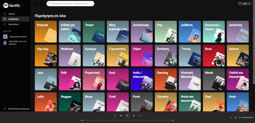
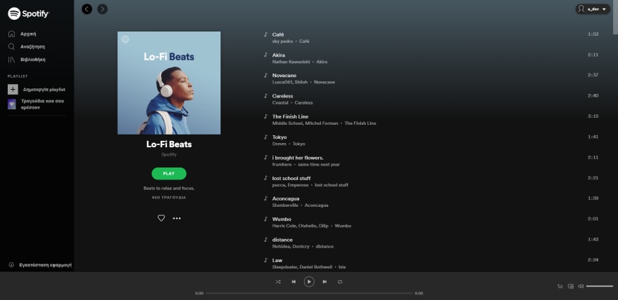
在本系列文章中,我将重新创建open.spotify.com 的UI。您可以在以下图片中看到该 UI: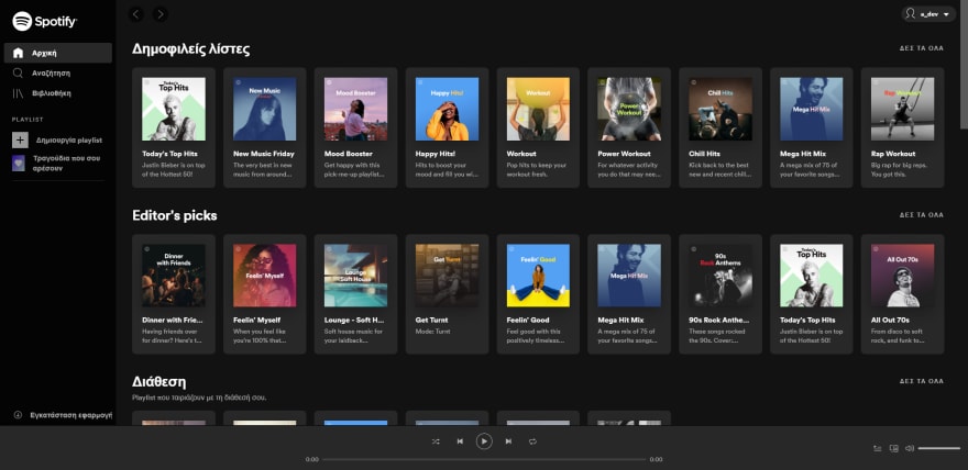
第一步
第一步是浏览open.spotify.com网页应用的页面。
我的目标是:
- 了解哪些组件始终可见(左侧边栏)。
- 粗略估计组件的总数。
- 了解应用程序的总体外观和感觉。
将设计切割成更小的碎片

浏览该应用程序,我发现有 4 个主要组件始终存在
- 左侧边栏
- 顶部栏
- 保存每个页面之间数据的主要区域
- 音乐播放栏
当然,主组件(父组件)由许多子组件组成。
例如:查看左侧边栏,我们可以看到它里面有一些子组件。
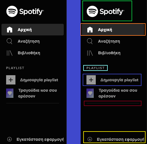
具体如下:
- 徽标/品牌
- 具有一个图标和文本的菜单项
- 标题文本
- 包含图像和文本的菜单项
- 分隔符
- 安装底部的应用程序链接
对左侧边栏进行编码💻
我首先创建一个作为左侧边栏的项目,并为其指定适当的宽度和位置。
html {
    font-size: 16px;
}

body {
    margin: 0;
    color: #fff;
}

* {
    box-sizing: border-box;
    font-family: 'Open Sans', sans-serif;
    letter-spacing: -0.35px;
}

.sidebar {
    background-color: rgba(4, 4, 4);
    position: fixed;
    height: 100%;
    width: 230px;
}
<nav class="sidebar"></nav>

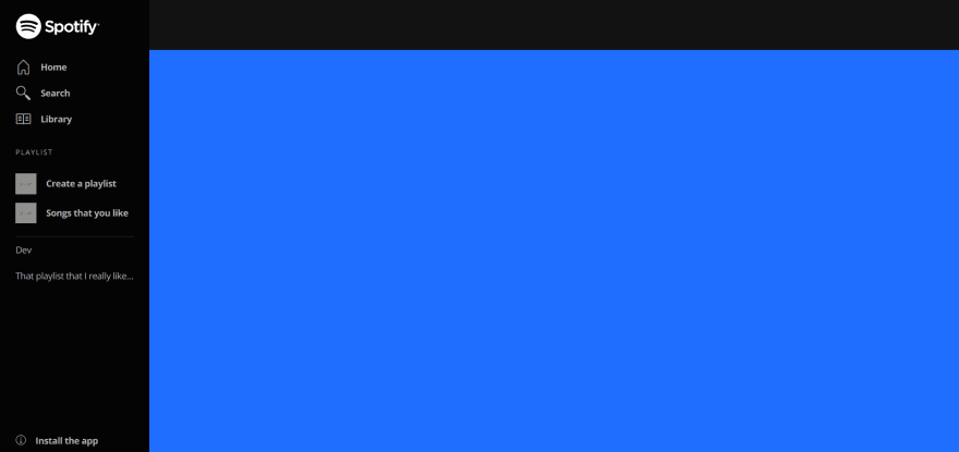
我继续创建顶部栏和主区域。此时,我喜欢给组件设置不同的背景颜色和完整高度,这样我就能轻松发现是否有放错位置。
.sidebar {
    background-color: rgba(4, 4, 4);
    position: fixed;
    height: 100%;
    width: 230px;
}

main {
    min-height: 100vh;
    background: dodgerblue;
}

.header {
    position: fixed;
    top: 0;
    left: 230px; /* sidebar width */
    right: 0;
    height: 80px;
    background-color: rgb(18, 18, 18);
}
<nav class="sidebar"></nav>
<div class="header"></div>
<main></main>

别担心,我保证它会开始看起来像 Spotify 网络应用程序。
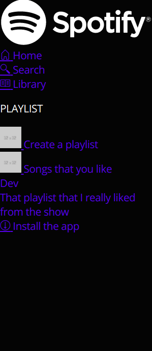
我们回到侧边栏,现在我们再进一步。完成后,侧边栏将包含图 5 中所有不同的标记元素。
进一步检查侧边栏
看着侧边栏,我试着思考所有需要的内边距和外边距。例如,主元素中似乎有一个左内边距。如果你查看侧边栏,你会发现里面的所有元素都从同一水平方向开始。
因此,我从父元素开始添加内边距。接下来,我插入 SVG 格式的 Spotify 徽标,并为主菜单项(主页、浏览、库)创建 HTML。
<nav class="sidebar">
    <div class="brand">
        <svg viewBox="0 0 1134 340" class="spotify-logo--text"><title>Spotify</title><path fill="currentColor" d="M8 171c0 92 76 168 168 168s168-76 168-168S268 4 176 4 8 79 8 171zm230 78c-39-24-89-30-147-17-14 2-16-18-4-20 64-15 118-8 162 19 11 7 0 24-11 18zm17-45c-45-28-114-36-167-20-17 5-23-21-7-25 61-18 136-9 188 23 14 9 0 31-14 22zM80 133c-17 6-28-23-9-30 59-18 159-15 221 22 17 9 1 37-17 27-54-32-144-35-195-19zm379 91c-17 0-33-6-47-20-1 0-1 1-1 1l-16 19c-1 1-1 2 0 3 18 16 40 24 64 24 34 0 55-19 55-47 0-24-15-37-50-46-29-7-34-12-34-22s10-16 23-16 25 5 39 15c0 0 1 1 2 1s1-1 1-1l14-20c1-1 1-1 0-2-16-13-35-20-56-20-31 0-53 19-53 46 0 29 20 38 52 46 28 6 32 12 32 22 0 11-10 17-25 17zm95-77v-13c0-1-1-2-2-2h-26c-1 0-2 1-2 2v147c0 1 1 2 2 2h26c1 0 2-1 2-2v-46c10 11 21 16 36 16 27 0 54-21 54-61s-27-60-54-60c-15 0-26 5-36 17zm30 78c-18 0-31-15-31-35s13-34 31-34 30 14 30 34-12 35-30 35zm68-34c0 34 27 60 62 60s62-27 62-61-26-60-61-60-63 27-63 61zm30-1c0-20 13-34 32-34s33 15 33 35-13 34-32 34-33-15-33-35zm140-58v-29c0-1 0-2-1-2h-26c-1 0-2 1-2 2v29h-13c-1 0-2 1-2 2v22c0 1 1 2 2 2h13v58c0 23 11 35 34 35 9 0 18-2 25-6 1 0 1-1 1-2v-21c0-1 0-2-1-2h-2c-5 3-11 4-16 4-8 0-12-4-12-12v-54h30c1 0 2-1 2-2v-22c0-1-1-2-2-2h-30zm129-3c0-11 4-15 13-15 5 0 10 0 15 2h1s1-1 1-2V93c0-1 0-2-1-2-5-2-12-3-22-3-24 0-36 14-36 39v5h-13c-1 0-2 1-2 2v22c0 1 1 2 2 2h13v89c0 1 1 2 2 2h26c1 0 1-1 1-2v-89h25l37 89c-4 9-8 11-14 11-5 0-10-1-15-4h-1l-1 1-9 19c0 1 0 3 1 3 9 5 17 7 27 7 19 0 30-9 39-33l45-116v-2c0-1-1-1-2-1h-27c-1 0-1 1-1 2l-28 78-30-78c0-1-1-2-2-2h-44v-3zm-83 3c-1 0-2 1-2 2v113c0 1 1 2 2 2h26c1 0 1-1 1-2V134c0-1 0-2-1-2h-26zm-6-33c0 10 9 19 19 19s18-9 18-19-8-18-18-18-19 8-19 18zm245 69c10 0 19-8 19-18s-9-18-19-18-18 8-18 18 8 18 18 18zm0-34c9 0 17 7 17 16s-8 16-17 16-16-7-16-16 7-16 16-16zm4 18c3-1 5-3 5-6 0-4-4-6-8-6h-8v19h4v-6h4l4 6h5zm-3-9c2 0 4 1 4 3s-2 3-4 3h-4v-6h4z"></path></svg>
    </div>
    <div class="menu">
        <div class="menu--item">
            <a href="#">
                <i class="lni-home"></i> <span class="menu--item--text">Home</span>
            </a>
        </div>
        <div class="menu--item">
            <a href="#">
                <i class="lni-search"></i> <span class="menu--item--text">Search</span>
            </a>
        </div>
        <div class="menu--item">
            <a href="#">
                <i class="lni-library"></i> <span class="menu--item--text">Library</span>
            </a>
        </div>
    </div>
    <p class="sidebar--header">PLAYLIST</p>
    <div class="menu menu-extra">
        <div class="menu--item">
            <a href="#">
                <img src="http://via.placeholder.com/32x32" alt="">
                <span class="menu--item--text">Create a playlist</span>
            </a>
        </div>
        <div class="menu--item">
            <a href="#">
                <img src="http://via.placeholder.com/32x32" alt="">
                <span class="menu--item--text">Songs that you like</span>
            </a>
        </div>
    </div>
    <div class="separator"></div>
    <div class="menu menu-playlist">
        <div class="menu--item">
            <a href="#">
                <span class="menu--item--text">Dev</span>
            </a>
        </div>
        <div class="menu--item">
            <a href="#">
                <span class="menu--item--text">That playlist that I really liked from the show</span>
            </a>
        </div>
    </div>
    <div class="sidebar--download-app">
        <a href="#">
            <i class="lni-arrow-down-circle"></i> <span>Install the app</span>
        </a>
    </div>
</nav>
无需任何 CSS,侧边栏看起来如下图所示:
现在让我们考虑一下必要的样式。
- 侧边栏本身需要 padding-left 和 padding-top。
- 徽标需要具有特定的宽度和填充底部(以在徽标和菜单项之间创建一些距离
- 菜单项需要具有特定的字体大小、颜色和高度。它们还需要处于活动状态(应用背景)和悬停状态(颜色变浅)。
.sidebar {
    background-color: rgba(4, 4, 4);
    padding: 24px 24px 0 24px;
    position: fixed;
    height: 100%;
    width: 230px;
}

.sidebar .brand {
    padding-bottom: 18px;
}

.sidebar .brand svg {
    width: 131px;
}

.sidebar .menu .menu--item {
    font-size: 1.5rem;
    position: relative; /* Needed for the .active state to add the background */
}

.sidebar .menu.menu-extra .menu--item:not(:first-child) {
    margin-top: 5px;
}

.sidebar .menu .menu--item a,
.sidebar .sidebar--download-app a {
    text-decoration: none;
    color: #B3B3B3;
    width: 100%;
    display: flex;
    align-items: center;
    height: 40px;
    transition: all 350ms;
}

.sidebar .menu.menu-extra .menu--item a img {
    opacity: 0.7;
    transition: all 350ms;
}

.sidebar .menu.menu-extra .menu--item:hover a img {
    opacity: 1;
}

.sidebar .menu .menu--item.active a,
.sidebar .menu .menu--item:hover a,
.sidebar .sidebar--download-app:hover a {
    color: #fff;
}
/* Active state of the menu  item, adds a background color to the element */
.sidebar .menu .menu--item.active:before {
    content: ' ';
    position: absolute;
    top: 0;
    height: 100%;
    left: 8px;
    left: -16px; /* -(Sidebar's padding left) + 8px */
    right: -16px; /* -(Sidebar's padding left) + 8px */
    background: rgb(40, 40, 40);
    z-index: -1;
    border-radius: 5px;
}

.menu--item--text,
.sidebar--download-app a span {
    font-size: 0.88rem;
    font-weight: 700;
    margin-left: 15px;
}

.sidebar--header {
    margin-top: 1.5rem;
    margin-bottom: 1.3rem;
    font-size: 0.68rem;
    letter-spacing: 1.5px;
    color: #B3B3B3;
}

.sidebar .separator {
    height: 1px;
    width: 100%;
    border-top: 1px solid #303030;
    margin-top: 16px;
}

.sidebar .menu.menu-playlist .menu--item--text {
    font-weight: 400;
    margin-left: 0;
    /*
        Add ellipsis when the text is bigger than the width of the sidebar
        Read more: https://developer.mozilla.org/en-US/docs/Web/CSS/text-overflow
    */
    text-overflow: ellipsis;
    white-space: nowrap;
    overflow: hidden;
}

.sidebar .menu.menu-playlist a {
    cursor: default;
}

.sidebar--download-app {
    position: absolute;
    bottom: 0;
}
当前的 UI 看起来像这样,我们可以看到它需要改变但它正在开始成形。
悬停动画

如动图所示,当用户将鼠标悬停在菜单项上时,颜色和图像会变得更亮。这个效果创建起来非常简单,实现它的代码如下:
/* Start the menu item with a gray color */
.sidebar .menu .menu--item a,
.sidebar .sidebar--download-app a {
    color: #B3B3B3;
    /*
        All changes will take 350ms to finish.
        Read More: https://css-tricks.com/almanac/properties/t/transition/
    */
    transition: all 350ms;
}
/* When the user hovers -> change the color */
.sidebar .menu .menu--item.active a,
.sidebar .menu .menu--item:hover a {
    color: #fff;
}
/*
    Changing the opacity of the image gives the brighter effect. This happens because the background is dark.
*/
.sidebar .menu.menu-extra .menu--item a img {
    opacity: 0.7;
    transition: all 350ms;
}

.sidebar .menu.menu-extra .menu--item:hover a img {
    opacity: 1;
}
总结
我想让这些帖子简短易懂,所以这篇就到此为止吧。如果你对这篇文章有任何疑问或建议,请在评论区告诉我 🙂!
在下一篇文章中,我将设计顶部栏并添加两个小型 Javascript 交互。
文章来源:https://dev.to/tsanak/recreate-spotify-part-1-141