 后端开发教程 - Java、Spring Boot 实战 - msg200.com
通过构建三个项目学习 CSS 媒体查询
目录 -->
什么是 CSS 媒体查询?
如何设置项目
语法
让我们使用 CSS 媒体查询来做一些项目
结论
今天我们将学习如何使用 CSS 媒体查询构建响应式网站,并通过 3 个项目进行练习。开始吧🏅
目录 -->
讨论主题一览:

如果您愿意,也可以在 YouTube 上观看此教程:
原始帖子来自Free Code Camp
什么是 CSS 媒体查询?

CSS 媒体查询使我们能够创建适用于所有屏幕尺寸(从桌面到移动屏幕)的响应式网站。因此,学习这个主题是必须的。
这是媒体查询的魔力的演示👇

我们将在项目 2 中构建它。布局称为卡片布局。更多布局示例请点击此处!
如何设置项目

对于这个项目,你需要了解一些 HTML、CSS 知识,并知道如何使用 VS Code。跟我一起学习 ->
- 创建名为“Project-1”的文件夹
- 打开 VS Code
- 创建index.html、style.scss和main.js文件
- 安装 Live Server 和 SASS 编译器
- 运行实时服务器和 SASS 编译器
HTML
在 HTML 上,将此代码写入 body 标签内 👇
<div class = "container"></div>
我们还需要知道窗口的确切大小。这里有一个演示来说明我的意思 👇
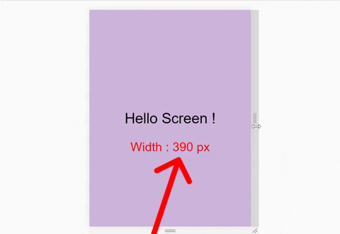
因此,在 html 文件中写入以下行,->
<div id="size"></div>
SCSS
我们将使用 SCSS,而不是 CSS。但是……什么是 SCSS?

SCSS 是 CSS 的预处理器,比常规 CSS 更强大。使用 SCSS 我们可以 ->
- 像树的分支一样嵌套我们的选择器,更好地管理我们的代码。
- 将各种值存储到变量中
- 使用 Mixins 来停止代码重复并节省时间
还有更多!
在 SCSS 上,我们将删除默认浏览器设置,更改 box-sizing、font-size 和 font-family,就像这样👇
*{
  margin : 0px;
  padding : 0px;
  box-sizing : border-box;

  body{
    font-size : 35px;
    font-family : sans-serif;
  }
}
别忘了设置.container 类的高度。否则我们将无法达到预期的效果 ->
.container{
  height : 100vh;
}
还记得我们在 HTML 中写的附加 id 吗?我们将在这里设置它的样式并将其放置在浏览器中 ->
#size {
  position: absolute;

// positioning screen size below our main text
  top : 60%;
  left: 50%;

  transform: translateX(-50%);

  color : red;
  font-size : 35px;
}
JavaScript
每次调整窗口大小时,我们都需要更新 id 中的屏幕尺寸。因此,请在 main.js 文件中编写以下代码 ->
// 'screen' is name 👇 of a function
window.onresize = screen;
window.onload = screen;

// Function named 'screen' 👇

function screen() {
  Width = window.innerWidth;
  document.getElementById("size").innerHTML
   = "Width : " + Width + " px"
}
下载项目图片

响应式网站也意味着响应式图片。我们也将在这个项目中将图片变为响应式。图片在我的GitHub 仓库中。获取方法如下:
- 访问并复制上面的链接☝️
- 转到downgit并粘贴您复制的链接
- 按照此视频中的步骤操作👇

好了……一切就绪!开始编程吧😊

语法
媒体查询的语法
@media screen and (max-width: 768px){
  .container{
   //Your code's here
  }
}
图解说明 ->

我们将语法分为 4 个部分:
- 媒体查询声明
- 媒体类型
- min-width & max-width 函数
- 代码本身
为了理解语法的所有 4 个部分,让我们开始我们的第一个项目

我们将构建这个☝️小项目,该项目通过每次调整一小步来改变窗口大小,从而实现背景颜色的变化。开始吧!
HTML
在我们的 HTML 中放置一些文本,像这样 ->
<div class = "container">

   <div class = "text">
      Hello Screen !
   </div>

</div>
SCSS
现在,我们将在变量中存储 4 种颜色代码,如下所示👇
$color-1 : #cdb4db ; // Mobile
$color-2 : #fff1e6 ; // Tablet
$color-3 : #52b788 ; // Laptop
$color-4 : #bee1e6 ; // Desktop
更多颜色请访问coolors.co
现在,来到底部,定位 .container 和 .text 类。我们还会像这样将文本居中👇
.container{
//To place text at center

  display : grid;
  place-items : center;

  background-color : $color-1;
  height : 100vh;
}

.text{
 // keep it blank for now
}
到目前为止,一切都很好 !

1.媒体查询声明规则
媒体查询以@media声明开头。这样做的主要目的是告诉浏览器我们指定了一个媒体查询。在 CSS 中,可以这样写 👇
@media
2. 媒体类型
这用于指定我们正在使用的设备的特性。这 4 个值分别是 ->
- 全部
- 打印
- 屏幕
- 演讲
一目了然地了解每个 4 个值的用途👇

我们在@media声明后声明媒体类型。像这样👇
@media screen
常见问题解答:为什么我们要写“与”运算符?

假设我们在餐厅点了一份“汉堡和披萨”。注意,这两个订单之间用[and]隔开。
同样,媒体类型、最小宽度和最大宽度函数本质上是我们提供给浏览器的条件。如果只有一个条件,我们就不会写“与”运算符。像这样 ->
@media screen {
  .container{
     // Your code here
  }
}
如果有 2 个条件,我们写“and”运算符。像这样 ->
@media screen and (max-width : 768px) {
  .container{
     // Your code here
  }
}
你也可以跳过媒体类型,只使用 min-width 和 max-width。像这样 ->
//Targeting screen sizes between 480px & 768px

@media (min-width : 480px) and (max-width : 768px) {
  .container{
     // Your code here
  }
}
如果有 3 个或更多条件,则可以使用逗号,如下所示 ->
//Targeting screen sizes between 480px & 768px

@media screen, (min-width : 480px) and (max-width : 768px) {
  .container{
     // Your code here
  }
}
3. min-width & max-width 函数
让我们讨论一下媒体查询中最重要的组件,屏幕断点。
说实话,由于市面上屏幕尺寸种类繁多,所以并没有一个标准的屏幕断点指南。不过,在我们的项目中,我们将遵循官方 Bootstrap 5屏幕断点值。

这是CSS-Tricks上每个设备屏幕分辨率的列表。
最大宽度:
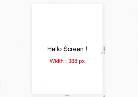
使用这个函数,我们创建了一个边界。只要我们在边界内,这个函数就会起作用。这里有一个示例 👇
我们的边界是 500px

请注意,当我们达到 500px 以上时,浅紫色是如何被禁用的。
要重新创建此内容,请在 SCSS 上编写这些内容
.container{
  background-color: white ;
  height: 100vh;
  display: grid;
  place-items: center;
}
在底部插入媒体查询,像这样👇
@media screen and (max-width : 500px){
  .container{
    background-color: $color-1;
  }
}
最小宽度:
我们也在这里创建了一个边界。但是,如果我们超出边界,这仍然有效。这里有一个示例 👇
我们的边界是 500px
请注意,当我们达到 500px 宽度以上时,浅紫色是如何启用的。
要重新创建此内容,请在 SCSS 上编写这些内容
.container{
  background-color: white ;
  height: 100vh;
  display: grid;
  place-items: center;
}
在底部插入媒体查询,像这样👇
@media screen and (min-width : 500px){
  .container{
    background-color: $color-1;
  }
}
总而言之,请记住
- max-width在设置边界内设置样式

- min-width设置设置边界之外的样式

代码本身:
让我们一起完成我们的项目 1!
我们将有 4 个屏幕断点
- 移动设备 -> 576px
- 平板电脑 -> 768px
- 笔记本电脑 -> 992px
- 桌面 -> 1200px
是的,我们遵循了官方的Bootstrap 5屏幕断点。每个断点将获得以下颜色 ->

对于 4 种设备类型,我们将有 4 个媒体查询。在接触这 4 个媒体查询之前,首先将断点值存储在变量中。像这样 👇
注意:不要忘记加上$符号
$mobile  : 576px;
$tablet  : 768px;
$laptop  : 992px;
$desktop : 1200px;
我们的 .container 类应该是这样的👇
.container{
  background-color: white ;
  height: 100vh;
  display: grid;
  place-items: center;
}
我们已经完成了 50%!现在让我们设置 4 个媒体查询 👇
但是等等...

编写媒体查询时,需要遵循顺序。从最大的显示屏开始写入,到最小的显示屏。
桌面 - 1200px
对于桌面屏幕,请在 SCSS 上编写这些内容👇
// using variable here which is  👇 1200px
@media screen and (max-width: $desktop){
  .container{
    background-color: $color-4;
  }
}
结果 ->

笔记本电脑 - 992px
对于笔记本电脑屏幕,请在 SCSS 上编写这些内容👇
// using variable here which is  👇 992px
@media screen and (max-width: $laptop){
  .container{
    background-color: $color-3;
  }
}
结果 ->

平板电脑 - 768px
对于平板电脑屏幕,请在 SCSS 上编写这些内容👇
// using variable here which is  👇 768px
@media screen and (max-width: $tablet){
  .container{
    background-color: $color-2;
  }
}
结果 ->

移动设备 - 576px
对于移动屏幕,请在 SCSS 上编写这些内容👇
// using variable here which is  👇 576px
@media screen and (max-width : $mobile){
  .container{
    background-color: $color-1;
  }
}
结果 ->

休息一下
恭喜你完成了项目 1,不过首先,请休息一下。这是你应得的!

让我们使用 CSS 媒体查询来做一些项目
项目-2 响应式作品集
我们将构建一个小型响应式网站👇
桌面视图

移动视图

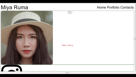
好了,开始写代码吧!首先,我们先来学习一下桌面视图,一步步来。
开始之前
在我们的“Project-1”文件夹中创建一个名为“images”的文件夹。将从我的GitHub 仓库下载的所有图片放入“images”文件夹中。
HTML
步骤 - 1
我们将为网站创建 3 个部分。将这些代码写入 HTML 中
<div class="container">

    <div class="header"></div>

    <div class="main"></div>

    <div class="footer"></div>

</div>
步骤 - 2
我们将把徽标和菜单项放在 .header div 中
<div class="header">

      <div class="header__logo">Miya Ruma</div>

      <div class="header__menu">
          <div class="header__menu-1"> Home </div>
          <div class="header__menu-2"> Portfolio </div>
          <div class="header__menu-3"> Contacts </div>
      </div>

  </div>
步骤 - 3
我们将图像和文本放在 .main div 中
<div class="main">

     <div class="main__image"></div>

     <div class="main__text">

       <div class="main__text-1">Hello 👋</div>

       <div class="main__text-2">I'm <span>Miya Ruma</span></div>

       <div class="main__text-3">A Designer From</div>

       <div class="main__text-4">Tokyo, Japan</div>

     </div>

</div>
步骤 - 4
我们将把社交媒体图标放在 .footer div 中
<div class="footer">

   <div class="footer__instagram">
      <img src="./images/instagram.png" alt="">
   </div>

   <div class="footer__twitter">
      <img src="./images/twitter-sign.png" alt="">
   </div>

    <div class="footer__dribbble">
       <img src="./images/dribbble-logo.png" alt="">
    </div>

    <div class="footer__behance">
       <img src="./images/behance.png" alt="">
    </div>

</div>
SCSS

步骤1
删除 SCSS 中的所有内容并写入这些 ->
* {
  // placing Margin to left & right
  margin: 0px 5px;

  padding: 0px;
  box-sizing: border-box;

  body {
    font-family: sans-serif;
  }
}
目前结果 ->

步骤2
选择我们在样式表中用 HTML 创建的所有类。
.container{}

.header{}

.main{}

.footer{}
步骤3
现在选择父类的所有子类。
.header{

  &__logo{}

  &__menu{}
}

.main{

  &__image{}

  &__text{}
}

.footer{

  [class ^="footer__"]{}

}
注意: .header 中嵌套的 &__logo 是 .header__logo 的快捷方式
步骤4
定义桌面布局的 .container
.container{

// Defining height
  height: 100vh;

  display: flex;

  flex-direction: column;
}
将 display: flex; 应用于 .header 和菜单项,使其表现得像一行,而不是一列
.header{
  display: flex;
  flex-direction: row;

  &__logo{}

  &__menu{
    display: flex;
    flex-direction: row;
  }
}
划分每个部分并创建边框以查看我们正在做的事情
.header{
  display: flex;

// The border & height
  border: 2px solid red;
  height: 10%;

// Other selectors are here

}

.main{

//The border & height
  border: 2px solid black;
  height: 80%;

// Other selectors are here

}

.footer{

// Border & height
  border: 2px solid green;
  height: 10%;

// Other selectors are here
}
结果 ->

步骤5
让我们使用 flex-box 属性和适当的字体大小来完成 .header 部分的样式
.header {
// height
  height: 10%;

  display: flex;
// Aligning logo & menu at center
  align-items: center;

// space between logo & menu
  justify-content: space-between;

  &__logo {
    font-size: 4vw;
  }

  &__menu {
    display: flex;
    font-size: 2.5vw;

// to put gap between menu items
    gap: 15px;
  }
}
结果 ->

步骤6

让我们在 .main 部分内添加图像并为图像和文本创建一个分区。
.main {
  // image & text will act like a row
  display: flex;
  flex-direction: row;

  //The border & height
  border: 2px solid black;
  height: 80%;

  &__image {
    //Adding the image
    background-image: url("./images/Portrait.png");
    // will cover half of screen width
    width: 50%;
  }

  &__text {
    // will cover half of screen width
    width: 50%;
  }
}
目前的结果并不理想,但不要失去希望!

步骤 7 - 图像
将图像样式设置为响应式 ->
.main{
  &__image{
  //make image fluid
    background-size: contain;

  // stop image repetition
    background-repeat: no-repeat;

  // position the image
    background-position: left center;
  }
}
目前结果 ->

从4k 分辨率到智能手表屏幕,图像都可响应。不信?打开 Chrome 开发者工具,亲自测试一下就知道了。
步骤 8 - 文本
现在让我们来设置文本样式。把它放到正中央
.main{

  &__text {
    // will cover half of screen width
    width: 50%;
    display: flex;
    flex-direction: column;

// To bring it at the center
    justify-content: center;
    align-items: center;
  }

// To color The name
  span{
    color: red;
  }

}
.main{


  &__text{

// To add gaps between texts vertically
    gap: 15px;

// font size for "hello"
    &-1{
      font-size: 10vw;
    }

// font size for other texts
    &-2,&-3,&-4{
      font-size: 5vw;

    }

  }
}
结果 ->

- 到目前为止,您可以删除我们在页眉、主页脚类中放置的所有边框
步骤 9:页脚部分
首先,像这样调整图像大小 ->
.footer{
  [class^="footer__"] {
    img {
      width: 5.3vw;
    }
  }
}
然后,将图像定位到我们想要的位置,图标之间留出一些间隙 ->
.footer{
  display: flex;
  flex-direction: row;

// To align icons along x-axis
  align-items: center;
// placing image to the right side
  justify-content: flex-end;
// Gap between icons
  gap: 20px;

// margin to right side of icons
  margin-right: 10%;
}
结果,没有指南 ->

步骤 10:移动布局
快到了!

在 650px 标记处创建媒体查询并设置 .header 类的样式如下 ->
@media (max-width: 650px) {

  .header {

// To place logo at center
    justify-content: center;

    &__logo {
      font-size: 40px;
    }
//hiding the menu on mobile device
    &__menu {
      display: none;
    }
  }
}
步骤11
现在,将 .main 部分放在正中心 ->
@media (max-width: 650px){
// styles of header section of step-10...

// main section here
  .main {
    flex-direction: column;
    justify-content: center;
    align-items: center;
}
步骤12:
为移动设备布局设置图片和文字的样式。像这样 ->
@media (max-width: 650px){

 .main {
   &__image {
// Image size
      height: 200px;
      width: 200px;
      background-size: 100%;

// To have rounded image
      border-radius: 100%;
      background-position: center;
    }

// Styles for the text ->
    &__text {
      width: 100%;

      &-1 {
        display: none;
      }
      &-2, &-3, &-4 {
        font-size: 30px;
      }
    }
}
步骤13
最后一步,让我们为移动布局设置页脚部分样式 ->
@media (max-width: 650px){
  .footer {
// placing icons along the X-axis
    justify-content: center;
    margin: 0px;

    [class^="footer__"] {

// Resizing images for mobile layout
      img {
        width: 45px;
        height: 45px;
      }
    }
  }
}
结果 ->

休息一下
到目前为止做得很好!休息一下😊

项目-3 卡片布局
在项目 3 中,我们将构建这个 ->

开始吧!
SCSS
在你的样式表上,删除所有内容,但不要删除 #size 的样式。然后写下这些 ->
* {
  margin: 0px;
  padding: 0px 10px;
  box-sizing: border-box;

  body {
    font-family: sans-serif;
    font-size: 55px;
  }
}

#size{
  position: absolute;
// Positioning the text
  top: 60%;
  left: 50%;
  transform: translateX(-50%);
// color & size of text
  color: red;
  font-size: 40px;
}
HTML
你的 HTML 在 body 标签中看起来应该是这样的👇
<div class="container">
   // We'll place code here
</div>

// This will show our window width Live
<div id="size"></div>
现在,在 .container 中创建 3 个类,类名为 .row-*,像这样👇
<div class="container">

   <div class="row-1">
   </div>

   <div class="row-2">
   </div>

   <div class="row-3">
   </div>
</div>
每行将有 3 个带有类名 .box-* 的框,如下所示👇
是的,在框内插入字母
<div class="container">

   <div class="row-1">
       <div class="box-1">A</div>
       <div class="box-2">B</div>
       <div class="box-3">C</div>
   </div>

   <div class="row-2">
       <div class="box-4">D</div>
       <div class="box-5">E</div>
       <div class="box-6">F</div>
   </div>

   <div class="row-3">
       <div class="box-7">G</div>
       <div class="box-8">H</div>
       <div class="box-9">I</div>
   </div>
</div>
我们已经完成了 HTML 部分,结果应该看起来像这样👇

SCSS
按照这些小步骤一步一步来
步骤1
为了同时选择和设置所有框和行的样式,我们在 CSS 上执行这些操作👇
.container{
  // styles here
}

[class ^="row-"]{
  // Styles applied on all rows
}

[class ^="box-"]{
  // Styles applied on all boxes
}
步骤2
盒子应该表现得像一行。写下这些 ->
[class ^="row-"]{
  display: flex;
  flex-direction: row;
}
结果👇

步骤3
扩展方框的宽度和高度,并将字母放在中间。关注我 ->
[class ^="box-"]{

  background-color: #c4c4c4;
  border: 2px solid black;

// Defining the size of the boxes
  width : (100%)/3;
  height: (100vh)/3;

// Place letter at the center
  display: grid;
  place-items: center;
}
结果 ->

步骤4
在行之间创建间隙。关注我 ->
.container{
  display: flex;
  flex-direction: column;
  height: 100vh;

// Creating gap between rows
  gap: 30px;
}
现在在盒子之间创建间隙 ->
[class ^="row-"]{
  display: flex;
  flex-direction: row;

// Creating gap between boxes
  gap : 30px;
}
结果 ->

步骤 5 -> 移动端布局
创建将在 650px 标记处应用的媒体查询
@media (max-width: 650px){
  // We'll write code here
}
将移动屏幕上的框的方向从行更改为列,并将框拉伸至宽度的 100% ->
@media (max-width: 650px){

//Change orientation
  [class ^="row-"]{
    flex-direction: column;
  }

// Change width of boxes
  [class ^="box-"]{
    width: 100%;
  }
}
最终结果 ->

顺便说一下,项目 2 是我这篇文章的一部分。如果你有兴趣学习和实践 Flexbox 和媒体查询,那就去吧!
结论
这是您阅读到最后的奖牌❤️
非常感谢您的建议和批评❤️

-
YouTube /乔伊·沙希布
-
Twitter /JoyShaheb
-
Instagram /JoyShaheb