 后端开发教程 - Java、Spring Boot 实战 - msg200.com
在 React Native 中使用样式化组件

太长不看了;
- 介绍
- 关于 styled-components
- 安装 styled-components
- 使用 styled-components
- styled-components 中的 props
- 构建应用程序 - 杂货店 UI
- 添加用户头像
- React Native 中的绝对定位
- 在 React Native 中添加图标
- 添加水平ScrollView
- 添加垂直ScrollView
- 构建卡片组件
- 结论
介绍
无论您是 Web 开发者还是移动应用开发者,您都知道,如果没有大量的样式设计,您的应用程序的 UI 可能会很糟糕。设计应用程序的样式非常重要。对于一款移动应用来说,拥有赏心悦目的设计和合理的色彩运用至关重要,这一点无论怎么强调都不为过。
如果您正在尝试 React Native,或者已经初次涉足,请务必了解,您可以通过多种方式为 React Native 应用设置样式。我已经在下面的文章中讨论了设置 React Native 组件样式的基础知识和一些不同的方法。例如,要创建新的样式对象,您可以使用StyleSheet.create()方法并对其进行封装。快来了解一下吧👇
https://hackernoon.com/styling-the-react-native-way-3cc6d3ef52d0
本教程将介绍如何使用💅 Styled Components来为你的 React Native 应用添加样式。没错,styled-components 是一个第三方库。使用它取决于个人喜好,但它也是一种设置组件样式的方法,而且很多人可能会觉得它很容易上手。尤其是如果你之前在其他框架中使用过这个库的话。一个常见的用例就是 React。
什么是 Styled Components?
Styled Components 是一个CSS-in-JS库,它强制开发者为每个组件编写自己的样式,并将两者放在一个地方。这种强制执行为一些开发者带来了一些快乐,优化了他们的体验和输出。
在 React Native 中,组件的样式已经通过创建 JavaScript 对象完成,如果不封装它们,在大多数情况下,您的组件及其样式最终都会集中在一个地方。
React Native 在设计应用样式时倾向于遵循一定的约定。例如,所有 CSS 属性名称都应遵循以下camelCase约定background-color:
backgroundColor: 'blue`
有些 Web 开发者对这些约定感到不适应。使用像 Styled Components 这样的第三方库可以让你得心应手。除了属性和 React Native 自身的 Flexbox 规则之外,你无需在约定的上下文之间频繁切换。
在后台,样式化组件只是将 CSS 文本转换为 React Native 样式表对象。你可以在这里查看它是如何实现的。
故事讲完了,我们开始工作吧!
安装样式组件
要在 React Native 项目中安装 styled-components 库,我们首先需要一个 React Native 项目。为了快速入门,我将使用 awesome Expo。请确保您已expo-cli安装。
# To install expo-cli

npm install -S expo-cli

# Generate a project

expo init [YourApp-Name]
运行最后一条命令时,命令行提示符会提示你几个问题。第一个是,Choose a template我选择的是expo-template-blank,然后输入应用的显示名称,然后使用npm或yarn安装依赖项。我选择的是 npm。
安装所有依赖项后,您可以在您喜欢的代码编辑器中打开此项目。下一步是安装最新版本的styled-components库。
npm install -S styled-components
这就是安装过程。
使用样式化组件
App.js立即打开文件并进行一些修改。
import React from 'react';
import { StyleSheet, Text, View } from 'react-native';

export default class App extends React.Component {
    render() {
        return (
            <View style={styles.container}>
                <Text>Open up App.js to start working on your app!</Text>
            </View>
        );
    }
}

const styles = StyleSheet.create({
    container: {
        flex: 1,
        backgroundColor: '#fff',
        alignItems: 'center',
        justifyContent: 'center'
    }
});
如果您使用的是 macOS ,请在您常用的终端窗口运行以下命令:npm run ios。对于 Linux 和 Windows 用户,命令为:npm run android但请确保您在后台运行了 Android 虚拟设备。我们的代码目前如下所示。

让我们对其进行一些修改,并使用我们新安装的库。首先,请像下面这样导入库。
import styled from 'styled-components';
像下面这样修改组件的渲染函数。将View和替换Text为Container和Title。这些新元素将使用 styled-components 的语义进行自定义。
export default class App extends React.Component {
    render() {
        return (
            <Container>
                <Title>React Native with 💅 Styled Components</Title>
            </Container>
        );
    }
}
styled-components利用带标签的模板字面量,通过反引号为组件添加样式。在 React 或 React Native 中使用 创建组件时styled-components,每个组件都会被附加样式。
const Container = styled.View`
    flex: 1;
    background-color: papayawhip;
    justify-content: center;
    align-items: center;
`;

const Title = styled.Text`
    font-size: 20px;
    font-weight: 500;
    color: palevioletred;
`;
请注意,其中包含的是 React Native View,但附带有样式。
App.js更改后文件的完整代码。
import React from 'react';
import styled from 'styled-components';

export default class App extends React.Component {
    render() {
        return (
            <Container>
                <Title>React Native with 💅 Styled Components</Title>
            </Container>
        );
    }
}

const Container = styled.View`
    flex: 1;
    background-color: papayawhip;
    justify-content: center;
    align-items: center;
`;

const Title = styled.Text`
    font-size: 24px;
    font-weight: 500;
    color: palevioletred;
`;
在上面的代码片段中,请注意我们没有导入 React Native 核心组件,例如View、Text或StyleSheet对象。就这么简单。它使用flexbox与 React Native 布局相同的模型。这样做的好处是,你可以使用与 Web 开发中相同且易于理解的语法。
在样式化组件中使用 Props
您经常会发现自己在为应用创建自定义组件。这确实能让您更好地遵循 DRY 原则。使用styled-components也一样。您可以通过构建需要props父组件的自定义组件来利用这种编程模式。props这些属性通常被称为特定组件的附加属性。为了演示这一点,请创建一个名为 的新文件CustomButton.js。
在这个文件中,我们将创建一个自定义按钮,它需要诸如 之类的属性backgroundColor,textColor以及按钮本身的文本。您将使用TouchableOpacity和Text来创建这个自定义按钮,但无需react-native使用功能组件导入库CustomButton。
import React from 'react';
import styled from 'styled-components';

const CustomButton = props => (
    <ButtonContainer
        onPress={() => alert('Hi!')}
        backgroundColor={props.backgroundColor}
    >
        <ButtonText textColor={props.textColor}>{props.text}</ButtonText>
    </ButtonContainer>
);

export default CustomButton;

const ButtonContainer = styled.TouchableOpacity`
    width: 100px;
    height: 40px
    padding: 12px;
    border-radius: 10px;
    background-color: ${props => props.backgroundColor};
`;

const ButtonText = styled.Text`
    font-size: 15px;
    color: ${props => props.textColor};
    text-align: center;
`;
通过将插值函数传递${props => props...}给样式组件的模板字面量,您可以扩展其样式。现在将此按钮添加到App.js文件中。
render() {
        return (
            <Container>
                <Title>React Native with 💅 Styled Components</Title>
                <CustomButton text="Click Me" textColor="#01d1e5" backgroundColor="lavenderblush" />
            </Container>
        );
    }
运行模拟器后,您将获得以下结果。

构建应用程序 - 杂货店 UI
本节我们要构建什么?一个应用的 UI 界面,比如一个杂货店。你将构建一个如下所示的主屏幕。

我们将运用所学的知识,styled-components所以让我们开始吧!打开App.js。Container使用 styled 声明一个新的视图。在后引号内,您可以使用完全相同的语法编写纯 CSS 代码。 元素View类似于divHTML 或一般 Web 编程中的 。此外,创建另一个名为Titlebarinside 的视图Container。
在 里面Titlebar,它将包含三个新元素。一个是图像,Avatar另外两个是文本:Title和Name。
import React from 'react';
import styled from 'styled-components';

export default class App extends React.Component {
    render() {
        return (
            <Container>
                <Titlebar>
                    <Avatar />
                    <Title>Welcome back,</Title>
                    <Name>Aman</Name>
                </Titlebar>
            </Container>
        );
    }
}

const Container = styled.View`
    flex: 1;
    background-color: white;
    justify-content: center;
    align-items: center;
`;

const Titlebar = styled.View`
    width: 100%;
    margin-top: 50px;
    padding-left: 80px;
`;

const Avatar = styled.Image``;

const Title = styled.Text`
    font-size: 20px;
    font-weight: 500;
    color: #b8bece;
`;

const Name = styled.Text`
    font-size: 20px;
    color: #3c4560;
    font-weight: bold;
`;
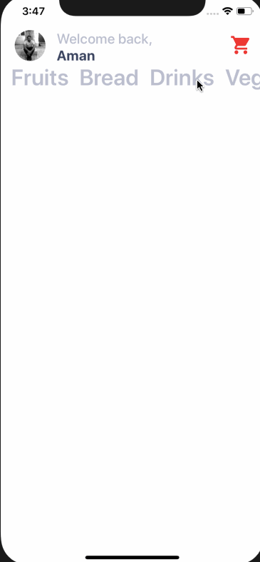
运行npm run ios并观察其运行情况。

目前,所有内容都位于屏幕中央。我们需要将Titlebar及其内容放置在手机屏幕顶部。因此,样式Container如下。
const Container = styled.View`
    flex: 1;
    background-color: white;
`;
添加用户头像
我将使用存储在assets项目根目录中的图片。您可以自由使用自己的图片,也可以从下方下载本项目的资源。
https://github.com/amandeepmittal/react-native-workspace/tree/master/03-RNgrocery-ui/assets
即使使用 ,要创建图像styled-components,也需要Image组件。您可以使用sourceprops 根据图像的位置来引用图像。
<Titlebar>
    <Avatar source={require('./assets/avatar.jpg')} />
    <Title>Welcome back,</Title>
    <Name>Aman</Name>
</Titlebar>
的样式设置Avatar将以像素为单位的宽度和高度开始44。使用border-radius宽度和高度的一半值,即可将圆形添加到图像中。border-radius您将经常使用该属性来创建角。
const Avatar = styled.Image`
    width: 44px;
    height: 44px;
    background: black;
    border-radius: 22px;
    margin-left: 20px;
`;
您将获得以下结果。

现在请注意,头像图片和文字堆积在一起了。它们占据了屏幕上相同的空间。为了避免这种情况,你需要使用position: absoluteCSS 属性。
React Native 中的绝对定位
CSS 属性(例如padding和 )margin用于在 UI 元素之间添加间距。这是默认的布局位置。但是,目前的情况是,使用 UI 元素的绝对定位并将所需的 UI 元素放置在所需的精确位置会更有利。
在 React Native 和 CSS 中,如果position将 属性设置为absolute,则该元素将相对于其父元素进行布局。CSS 还有其他 值,position但 React Native 仅支持absolute。
修改Avatar样式如下。
const Avatar = styled.Image`
    width: 44px;
    height: 44px;
    background: black;
    border-radius: 22px;
    margin-left: 20px;
    position: absolute;
    top: 0;
    left: 0;
`;
通常,对于位置绝对属性,您将使用以下属性的组合:
- 顶部
- 左边
- 正确的
- 底部
在上面的例子中,我们将top和left都设置为0像素。您将获得以下输出。

在 React Native 中添加图标
Expo Boilerplate 附带了一系列不同的图标库,例如 Ionicons、FontAwesome、Glyphicons、Material Icons 等等。完整的图标列表可以在这里找到,这是一个可搜索的网站。
要使用该库,您只需编写导入语句。
import { Ionicons } from '@expo/vector-icons';
在视图内Titlebar添加图标。
<Titlebar>
    {/* ... */}
    <Ionicons name="md-cart" size={32} color="red" />
</Titlebar>
每个图标都需要一些 props,例如名称(您可以选择)、大小和颜色。现在,如果您查看模拟器,您会注意到我们在添加头像图片时遇到的相同问题。图标与标题栏内的其他 UI 元素之间没有空格。

为了解决这个问题,让我们使用绝对定位属性作为内联样式来<Ionicons />
<Ionicons
    name="md-cart"
    size={32}
    color="red"
    style={{ position: 'absolute', right: 20, top: 5 }}
/>
为什么要使用内联样式?因为Ionicons它不是使用 styled-components 生成的。

通过列表映射
在文件夹中components/创建一个名为 的新文件Categories.js。该文件将为 Grocery UI 应用呈现类别项目列表。
import React from 'react';
import styled from 'styled-components';

const Categories = props => (
    <Container>
        <Name>Fruits</Name>
        <Name>Bread</Name>
        <Name>Drinks</Name>
        <Name>Veggies</Name>
    </Container>
);

export default Categories;

const Container = styled.View``;

const Name = styled.Text`
    font-size: 32px;
    font-weight: 600;
    margin-left: 15px;
    color: #bcbece;
`;
没错,所有数据都是静态的。导入此组件App.js并将其放置在 之后Titlebar。
import Categories from './components/Categories';

// ...

return (
    <Container>
        <Titlebar>{/* ... */}</Titlebar>
        <Categories />
    </Container>
);
您将获得以下输出。

类别数量可以有很多。为了使类别名称动态化,我们可以通过App.js文件发送。
const Items = [
    { text: 'Fruits' },
    { text: 'Bread' },
    { text: 'Drinks' },
    { text: 'Veggies' },
    { text: 'Meat' },
    { text: 'Paper Goods' }
];

// Inside the render function replace <Categories /> with

{
    items.map((category, index) => (
        <Categories name={category.text} key={index} />
    ));
}
在上面的代码片段中,你使用mapJavaScript 函数遍历数组,渲染出一个包含类别名称的项目列表。key需要添加一个 prop。
为了使其工作,还需修改Categories.js。
const Categories = props => <Name>{props.name}</Name>;
添加水平滚动视图
此列表目前不可滚动。为了使其可滚动,我们将它放在一个 中ScrollView。打开App.js文件,将类别放在 中ScrollView,但首先从 React Native 核心导入它。
import { ScrollView } from 'react-native';

// ...

<ScrollView>
    {items.map((category, index) => (
        <Categories name={category.text} key={index} />
    ))}
</ScrollView>;
您将注意到 UI 没有任何变化。默认情况下,React Native 中的可滚动列表ScrollView是垂直的。通过添加 prop 将其设置为水平horizontal。
<ScrollView horizontal={true}>
    {items.map((category, index) => (
        <Categories name={category.text} key={index} />
    ))}
</ScrollView>
它可以工作,但看起来不太好。
让我们添加一些内联样式ScrollView。
<ScrollView
    horizontal={true}
    style={{
        padding: 20,
        paddingLeft: 12,
        paddingTop: 30,
        flexDirection: 'row'
    }}
    showsHorizontalScrollIndicator={false}
>
    {items.map((category, index) => (
        <Categories name={category.text} key={index} />
    ))}
</ScrollView>
现在看起来好多了。该属性showsHorizontalScrollIndicator隐藏了默认显示在类别名称下方的水平滚动条。

添加垂直ScrollView
下一步是在视图ScrollView内部添加一个作为包装器,Container使整个区域可以垂直滚动。这样做是有原因的。现在,您将把项目分成两列,并以图像形式显示,并包含与特定类别相关的文本。
修改App.js文件。
return (
    <Container>
        <ScrollView>
            <Titlebar>{/* and its contents */}</Titlebar>
            <ScrollView horizontal={true}>
                {/* Categories being rendered */}
            </ScrollView>
            <Subtitle>Items</Subtitle>
        </ScrollView>
    </Container>
);
请注意,我们正在添加另一个名为Subtitle“text”的样式组件。
const Subtitle = styled.Text`
    font-size: 20px;
    color: #3c4560;
    font-weight: 500;
    margin-top: 10px;
    margin-left: 25px;
    text-transform: uppercase;
`;
其呈现效果如下。

构建卡片组件
在本节中,我们将创建一个卡片组件,用于保存商品的图片、商品名称以及价格文本。每个卡片组件都将带有弧形边框和阴影。它的外观如下所示。

Card.js在目录内创建一个名为 inside 的新组件文件components。组件的结构Card如下。
import React from 'react';
import styled from 'styled-components';

const Card = props => (
    <Container>
        <Cover>
            <Image source={require('../assets/pepper.jpg')} />
        </Cover>
        <Content>
            <Title>Pepper</Title>
            <PriceCaption>$ 2.99 each</PriceCaption>
        </Content>
    </Container>
);

export default Card;
目前,它包含静态数据,例如图像、标题和内容。让我们在此文件中为每个样式化的 UI 元素添加样式。
const Container = styled.View`
    background: #fff;
    height: 200px;
    width: 150px;
    border-radius: 14px;
    margin: 18px;
    margin-top: 20px;
    box-shadow: 0 5px 15px rgba(0, 0, 0, 0.15);
`;

const Cover = styled.View`
    width: 100%;
    height: 120px;
    border-top-left-radius: 14px;
    border-top-right-radius: 14px;
    overflow: hidden;
`;

const Image = styled.Image`
    width: 100%;
    height: 100%;
`;

const Content = styled.View`
    padding-top: 10px;
    flex-direction: column;
    align-items: center;
    height: 60px;
`;

const Title = styled.Text`
    color: #3c4560;
    font-size: 20px;
    font-weight: 600;
`;

const PriceCaption = styled.Text`
    color: #b8b3c3;
    font-size: 15px;
    font-weight: 600;
    margin-top: 4px;
`;
该Container视图的默认背景色为白色。这在从第三方 API 获取图像的场景中非常有用。此外,它还为图像下方的文本区域提供了背景。
在视图内部Container,添加一个Image并将其包裹在Cover视图中。在 React Native 中,有两种方法可以获取图像
如果您像本例一样从静态资源获取图像,则可以使用 use sourceprop 和关键字,require该关键字包含项目文件夹中存储的图像资源的相对路径。如果是通过网络获取图像或从 API 获取图像,则可以使用相同的 prop 和不同的关键字uri。以下是从 API 获取图像的示例。
<Image
    source={{
        uri: 'https://facebook.github.io/react-native/docs/assets/favicon.png'
    }}
/>
该Cover视图使用带有属性的圆角overflow。这样做是为了体现圆角。如果图片来自子组件,iOS 会对其进行裁剪。在我们的例子中,图片来自一个Card子组件App。
该Image组件占用整个视图的宽度和高度Cover。
现在让我们将这个组件导入到App.js文件中,然后Subtitle让我们看看我们得到了什么结果。
render() {
    return (
    <Container>
        <ScrollView>
        {/* ... */}
        <Subtitle>Items</Subtitle>
            <ItemsLayout>
                <ColumnOne>
                    <Card />
                </ColumnOne>
                <ColumnTwo>
                    <Card />
                </ColumnTwo>
            </ItemsLayout>
        </ScrollView>
    </Container>
    )
}

// ...

const ItemsLayout = styled.View`
    flex-direction: row;
    flex: 1;
`;

const ColumnOne = styled.View``;

const ColumnTwo = styled.View``;
之后Subtitle,添加一个名为 的新视图ItemsLayout。这将是一种布局,允许将不同的卡片划分到每行的两列中。这可以通过赋予此视图一个flex-direction值为 的属性来实现row。ColumnOne和ColumnTwo是两个空视图。
在渲染模拟器的屏幕时,如下所示。
结论
你之前在 React Native 中尝试过 styled-components 吗?如果没有,你打算在下一个项目中尝试一下吗?如果你styled-components在 React Native 应用中找到了合适的使用方法,或者没有找到合适的方法,请在下方评论。你也可以扩展这个应用程序!尽情发挥你的想象力吧!如果可以,请提交 PR。
您可以在 Github repo 中找到本文的完整代码👇
https://github.com/amandeepmittal/react-native-workspace/tree/master/03-RNgrocery-ui
这篇文章最初发表于此处。
我在Twitter上,所以如果你需要的话,可以随时私信我。我还会每周给有兴趣了解更多 Web 技术和 React Native 的开发者发送新闻简报。
鏂囩珷鏉ユ簮锛�https://dev.to/amanhimself/using-styled-components-with-react-native-4k15